
With over half of global web traffic now coming from mobile devices, having a website that looks great and functions well on smaller screens is no longer just an option - it's an absolute must. One of the most important elements for delivering an optimal mobile experience is your website's header navigation.

A cluttered, cramped, or difficult-to-use header can easily lead to frustration and cause visitors to quickly abandon your mobile site. In this tutorial, I'll walk through how to design a slick, fully responsive mobile header using the popular WordPress page builder Elementor.
So if you're ready to level up your mobile web design game, let's dive in. Here's how to create a responsive mobile header with Elementor.
Setting up the Header
The first thing we need to do is create a new header template in Elementor. From your WordPress admin dashboard, go to Templates > Theme Builder > Add New. Select the "Header" type for your new template.
Create Amazing Websites
With the best free page builder Elementor
Start Now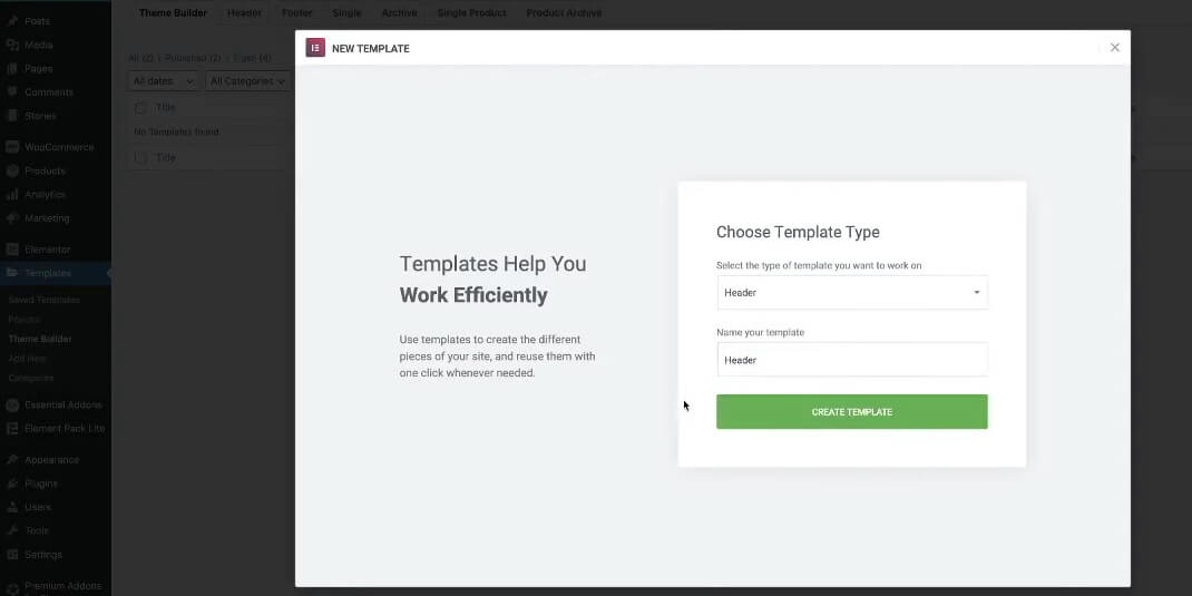
Give your header template a name (e.g. "Mobile Header") and click to create the template. This will open up the Elementor canvas where we can start building.
Add a New Section
- Click on the plus (+) icon to add a new section.
- Select the "Structure" layout with 3 columns.
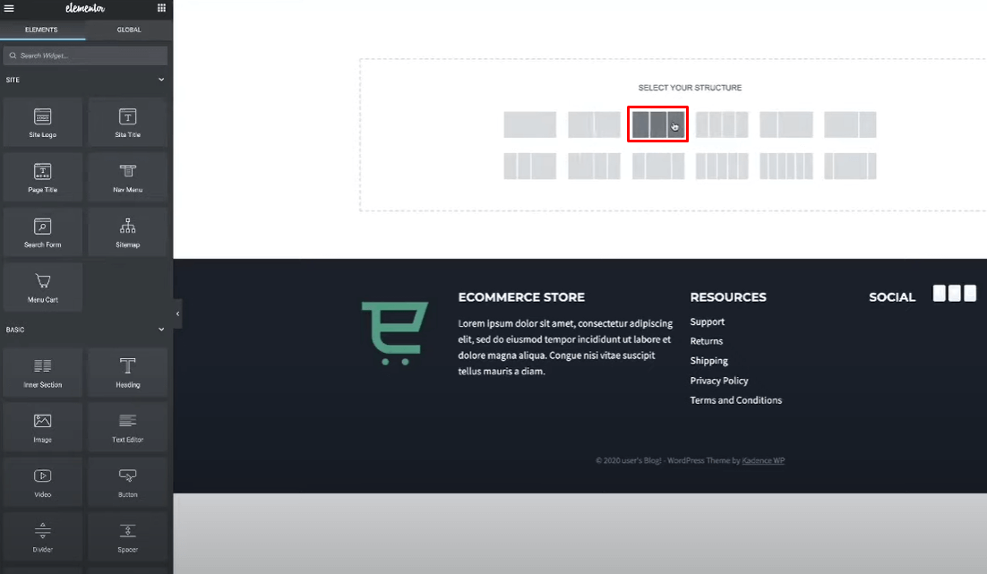
The three-column structure will allow us to have the logo on one side, the navigation menu in the middle, and a call-to-action element like a cart icon on the other side.
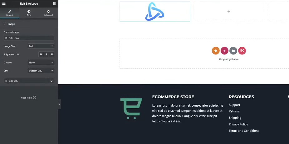
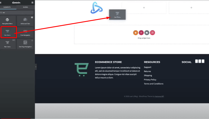
Site Logo
In the leftmost column, search for "site logo" and add the Site Logo widget.
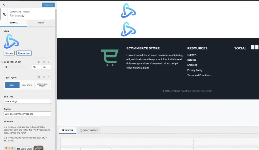
If you haven't set a logo yet, you can customize the Site Identity settings by going to Appearance > Customize > Site Identity in your WordPress admin.
Navigation Menu
In the middle column, search for "nav menu" and add the Nav Menu widget.
This will insert your primary WordPress navigation menu.
We'll style and configure the mobile menu layout later.
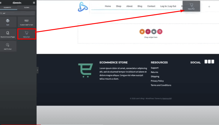
Call-to-Action
In the right-most column, add a Button or Cart widget for your call-to-action.
I'll be using Elementor's Cart widget and removing the subtotal, leaving just the cart icon.
With the basic structure in place, we now have the main elements for our desktop header - the logo, navigation menu, and cart call-to-action button.
Next, we'll move on to actually styling and setting up the mobile responsive behavior for this header layout.
Styling the Header
While the main focus is the mobile header, we'll do some basic styling for the desktop view first as a starting point.
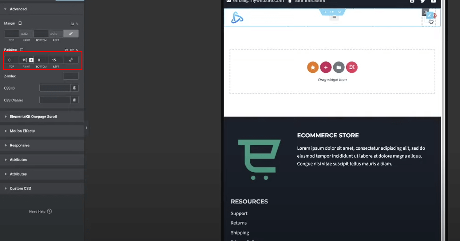
Adjust Section Padding
Select the entire section containing the three columns.
Go to the "Advanced" settings and increase the left/right padding to give some spacing from the edges.
I added 15px of padding to the left and right, but you can adjust this to your preference.
Align Navigation Menu
Select the Nav Menu widget in the middle column.
Go to the "Layout" settings and set the Horizontal Align to the center.
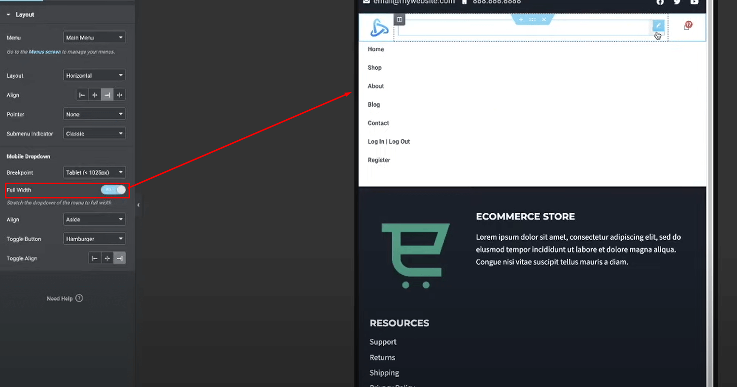
This will center the navigation menu links in the middle column for the desktop view. But for mobile, move it to the right.
Now enable the full width so just expand the mobile menu.
Style the Cart Icon
Select the Cart widget you added in the right column.
Remove the subtotal, leaving just the main cart icon.
Go to the "Style" settings and customize the icon - font size, color, etc.
I went with a solid black cart icon. But you can style this call-to-action element however you'd like.
Add Top Bar for Contacts/Social Optionally, you can add an extra top bar section above the main header for contact details and social icons:
Add a new single column section above the header.
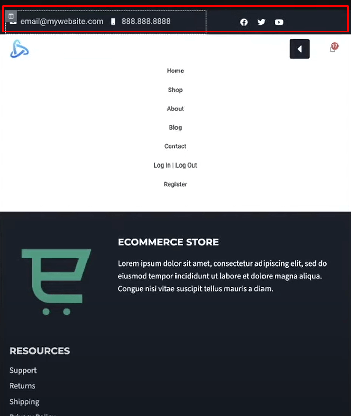
Style and position these elements how you'd like in the top bar.
This top bar could also be hidden for mobile views if desired, which I'll cover in the next section.
Here are the steps for styling the mobile header in Elementor:
Styling the Mobile Header
Now for the main event - making this header design responsive and optimized for mobile devices. We'll be working primarily in the responsive preview mode.
Switch to Responsive Mode
Click on the responsive icons at the top of the Elementor canvas to toggle between desktop, tablet, and mobile viewports.
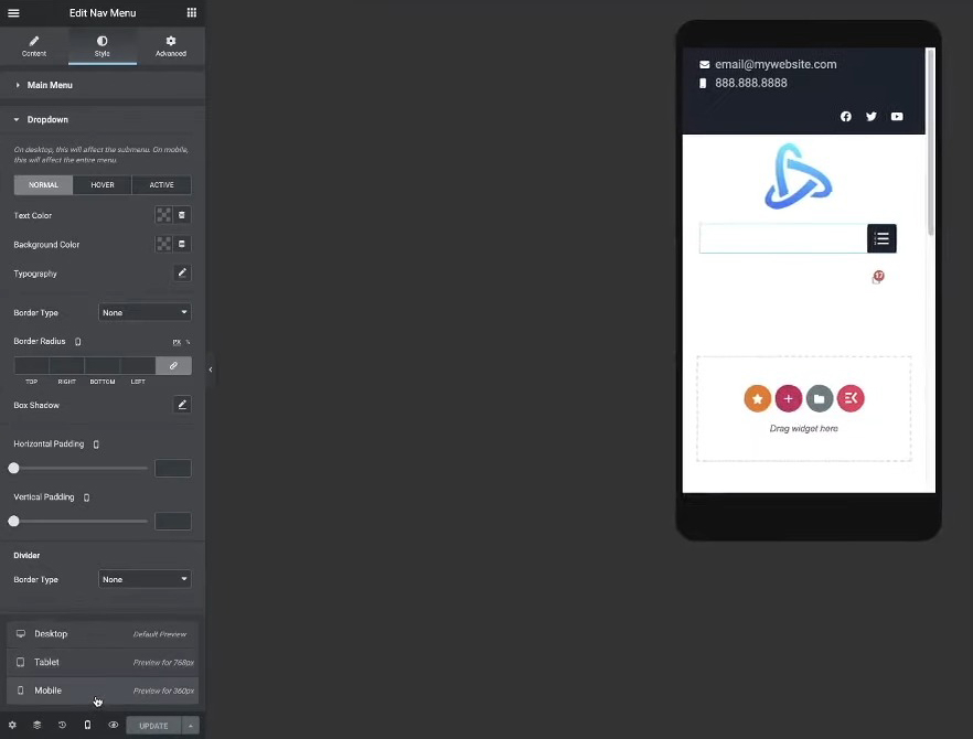
Select the mobile viewport icon to start styling for smaller screens.
Reposition Logo & Cart Icon
Select the left column containing the logo.
Go to Advanced > Responsive and reduce the Column Width to around 20-25%.
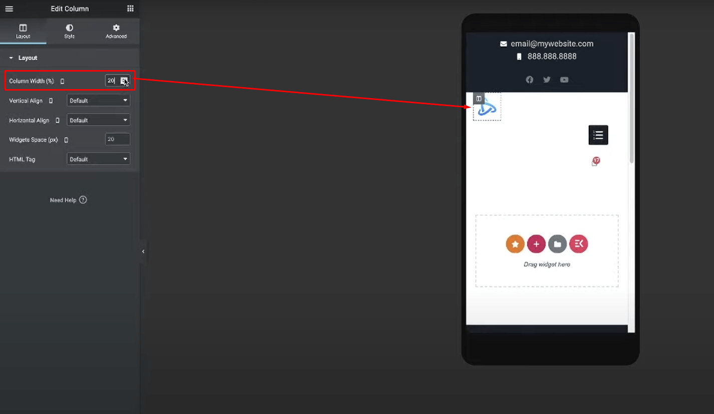
For the right column with the cart, reduce the Column Width as well until you achieve your desired spacing from the edges.
This will make the logo and cart icon take up less horizontal space, preventing them from being too широкийed out.
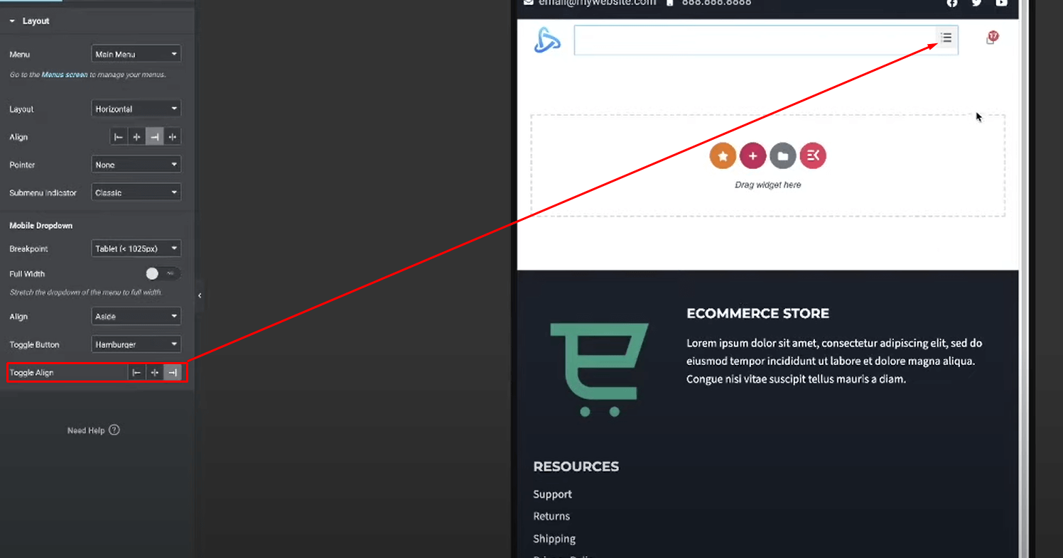
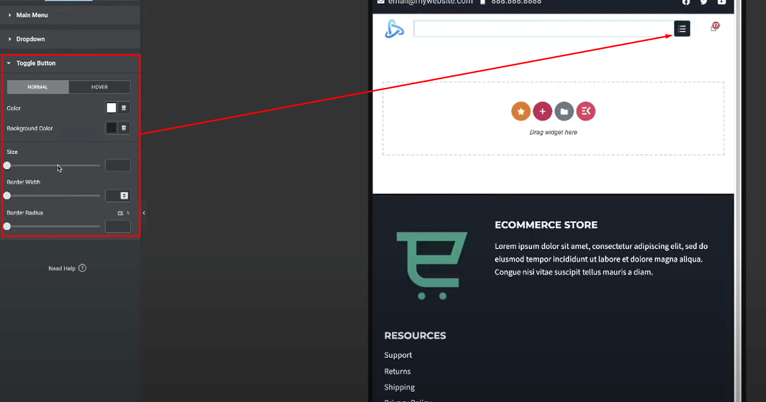
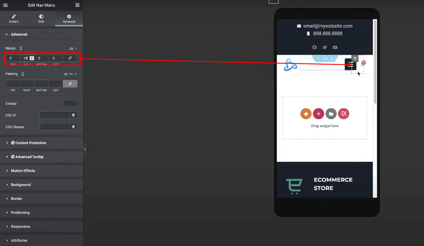
Position Hamburger Menu Icon
Select the Nav Menu widget in the middle column.
Go to Layout and set the Toggle Align to the right positioning the hamburger icon properly.

Go to Style > Toggle and style the hamburger icon (color, size, etc).
Optionally, you can adjust the margin/padding on the Nav Menu widget itself to perfectly position the hamburger icon visually.
With those key adjustments, your header should now be fully responsive! The layout will stay clean and usable when scaled down to smaller mobile screens. The next section covers some extra tips and best practices.
Closing Thoughts
There you have it! You now know how to build a clean, user-friendly, and fully responsive mobile header menu using Elementor.
Having a website that provides an optimal experience across all devices is crucial in today's mobile-driven world. By following the steps outlined in this tutorial, you'll be delivering a sleek, easy-to-navigate header to your mobile visitors.