
As a result of the Divi Theme Builder, a new era in website creation has begun. With this new functionality, you may dynamically add global footers to your pages and articles. To add a footer to any page or post, simply use Divi's Theme Builder (which is included with the Divi theme). Now, in this article, we'll show you how to create and add a global footer to your website. Additionally, you may download the JSON file for free!
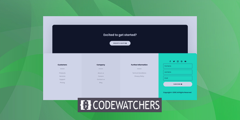
Preview
Let's first have a look at how the global footer looks on various-sized screens before we get started.
Design Procedure
First, log in to your WordPress Dashboard. In your Divi Theme Options, navigate to the Theme Builder.

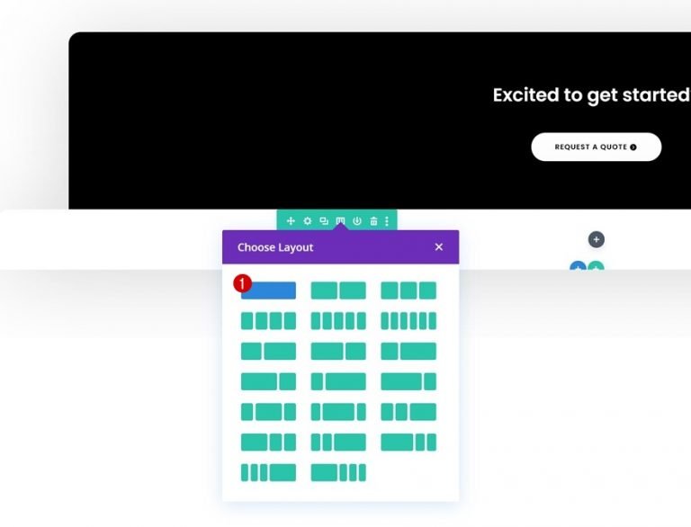
There, you have the option of using a pre-existing global footer or creating a new one from scratch using the Divi library. We'll be creating a custom footer from scratch in this lesson, so go ahead and select option one.
Create Amazing Websites
With the best free page builder Elementor
Start Now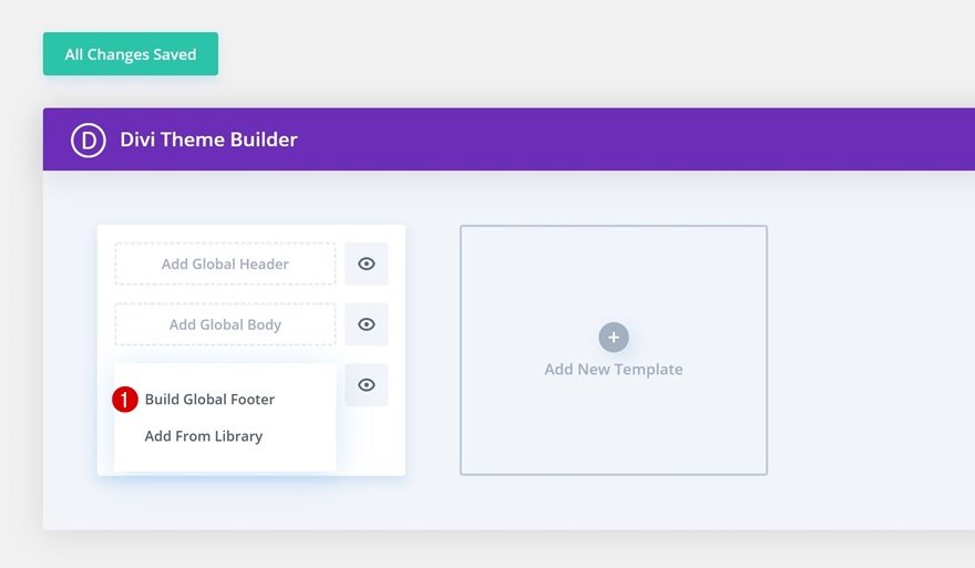
Section No 1
BG Color
Time to get creative now! Open the section on the page and alter the background color of the section.
- Background Color: #000000

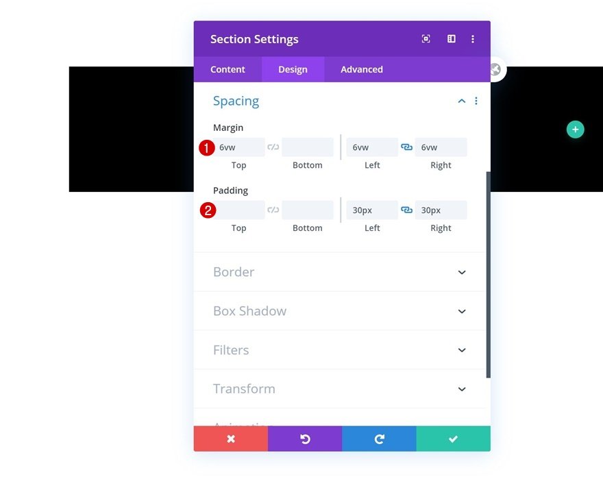
Spacing
Next, update the section spacing according to the following values.
- Top Margin: 6vw
- Left Margin: 6vw
- Right Margin: 6vw
- Left Padding: 30px
- Right Padding: 30px
Border
The next step is to add a border to the top, left, and right.
- Top Left: 20px
- Top Right: 20px

Box Shadow
A box-shadow should also be included in the section settings.
- Box Shadow Blur Strength: rgba(0,0,0,0.18)
- Shadow Color: rgba(0,0,0,0.18)

Add New Row
Now add a new one-column row to the section.
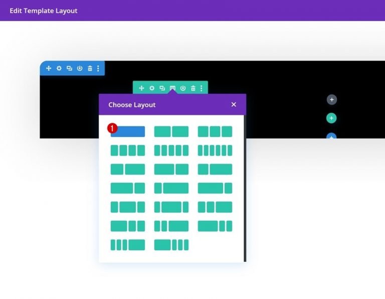
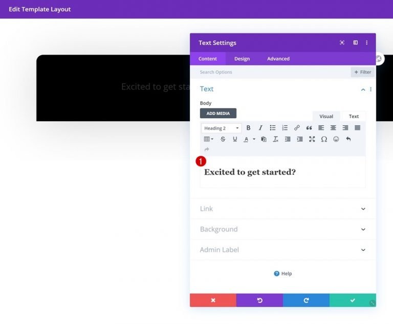
Add New Text Module
Next, add a text module and add some copy to that module.
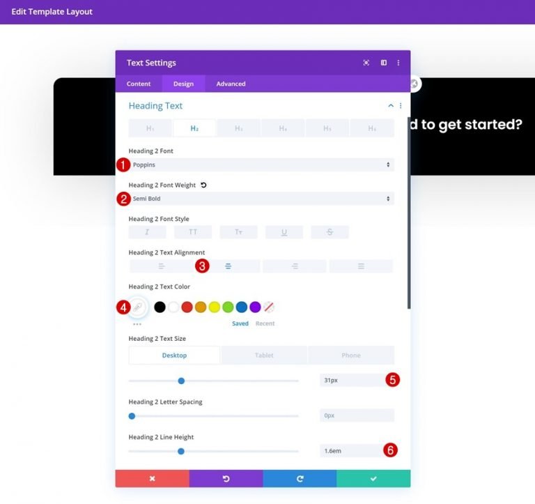
H2 Text Settings
Change the H2 text settings in the module's design tab as needed:
- Heading 2 Font: Poppins
- Heading 2 Font Weight: Semi Bold
- Heading 2 Text Alignment: Center
- Heading 2 Text Color: #ffffff
- Heading 2 Text Size: 31px (Desktop), 24px (Tablet), 18px (Phone)
- Heading 2 Line Height: 1.6em
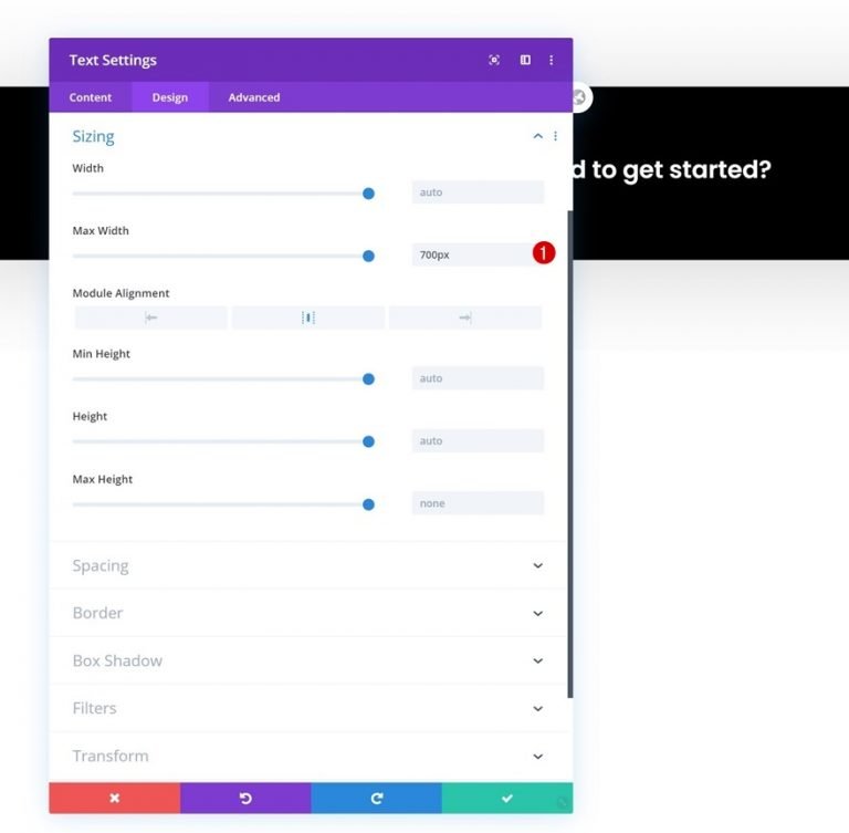
Text Module Sizing
The module should also have a maximum width.
- Max Width: 700px
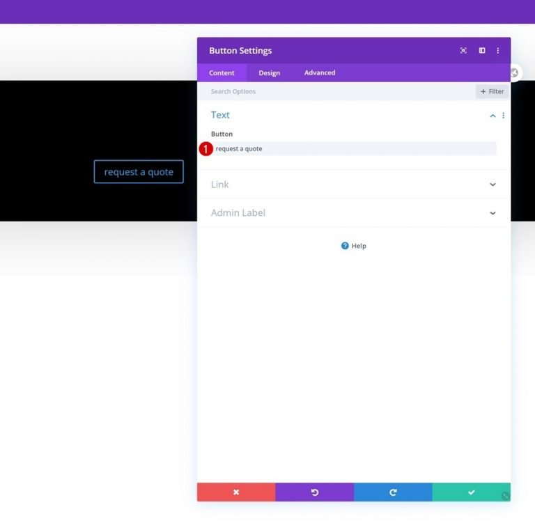
Add Button Module
Just beneath the Text Module, add a Button Module and fill it with any copy you like.
Button Alignment
Change the button alignment to the center on the module's design tab.
- Button Alignment: Center

Button Settings
Now let's style the button.
- Use Custom Styles For Button: Yes
- Button Text Size: 12px
- Button Text Color: #000000
- Button Background Color: #FFFFFF
- Button Border Width: 0px

- Button Border Radius: 100px
- Button Letter Spacing: 1px
- Button Font: Poppins
- Button Font Weight: Semi Bold
- Button Font Style: Uppercase

Button Spacing
It's time to add some custom padding.
- Top Padding: 14px
- Bottom Padding: 14px
- Left Padding: 40px
- Right Padding: 58px

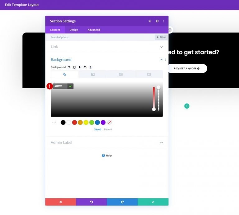
Section No 2
Background Color
The next normal chapter is here! Select a white background color for the section.
- Background Color: #ffffff
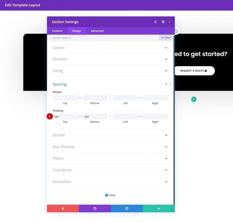
Spacing
Remove all of the cushioning from the top and bottom.
- Top Padding: 0px
- Bottom Padding: 0px
Border
The section should also have a border-radius added to it.
- Top Left: 20px
- Top Right: 20px

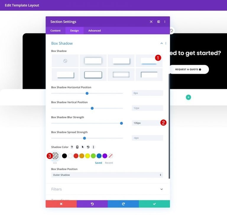
Box Shadow
Now finish the section editing by adding a box shadow.
- Box Shadow Blur Strength: 135px
- Shadow Color: rgba(0,0,0,0.18)
Add New Row
You can now add a new row to your section by following these instructions:
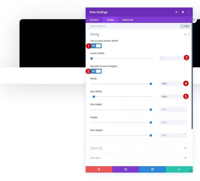
Row Sizing
Open the row settings and enable the row to take up the entire screen without adding additional modules.
- Use Custom Gutter Width: Yes
- Gutter Width: 1
- Equalize Column Heights: Yes
- Width: 100%
- Max Width: 100%
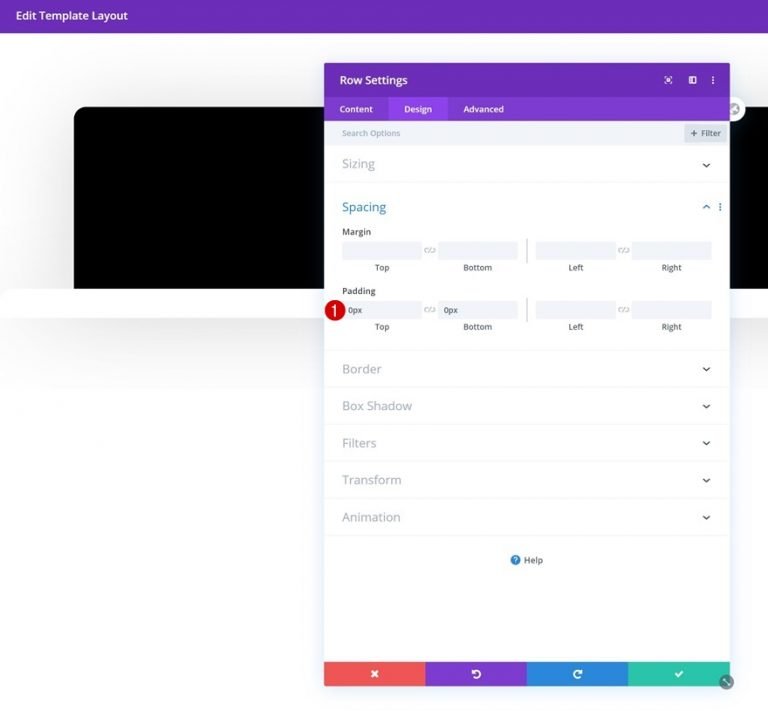
Row Spacing
Remove the row's padding at the top and bottom.
- Top Padding: 0px
- Bottom Padding: 0px
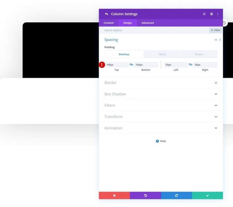
Column Spacing
Go to the column settings and add specific padding values for the different screen widths.
- Top Padding: 100px (Desktop), 50px (Tablet & Phone)
- Bottom Padding: 100px (Desktop), 50px (Tablet & Phone)
- Left Padding: 50px
- Right Padding: 50px
Text Module 1
It's now or never for module additions! Add a standard Text Module to column 1 and fill it with whatever you choose.
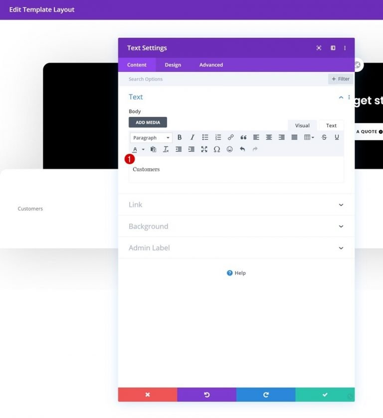
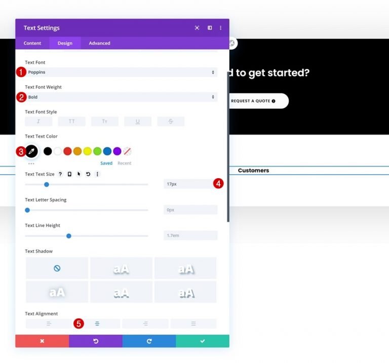
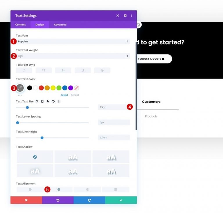
Text Settings
Change the text settings in the module's design tab as needed:
- Text Font: Poppins
- Text Font Weight: Bold
- Text Color: #000000
- Text Size: 17px
- Text Alignment: Center
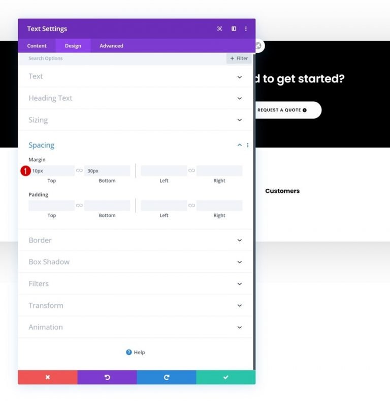
Spacing
The next step is to add some unique top and bottom margins.
- Top Margin: 10px
- Bottom Margin: 30px
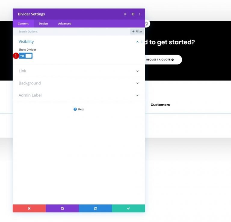
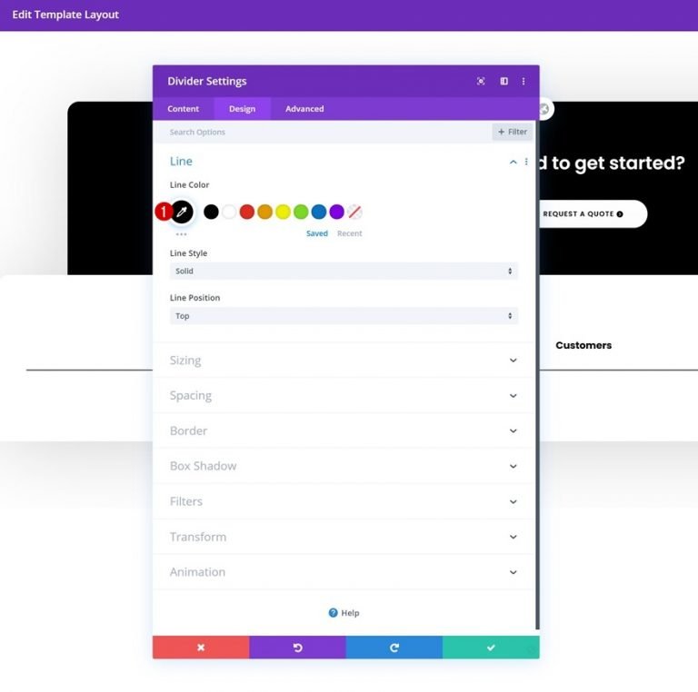
Divider Module Visibility
Divider Modules can be added just below the Text Module if the 'Show Divider' option is checked.
- Show Divider: Yes
Line
Now change the color.
- Line Color: #000000
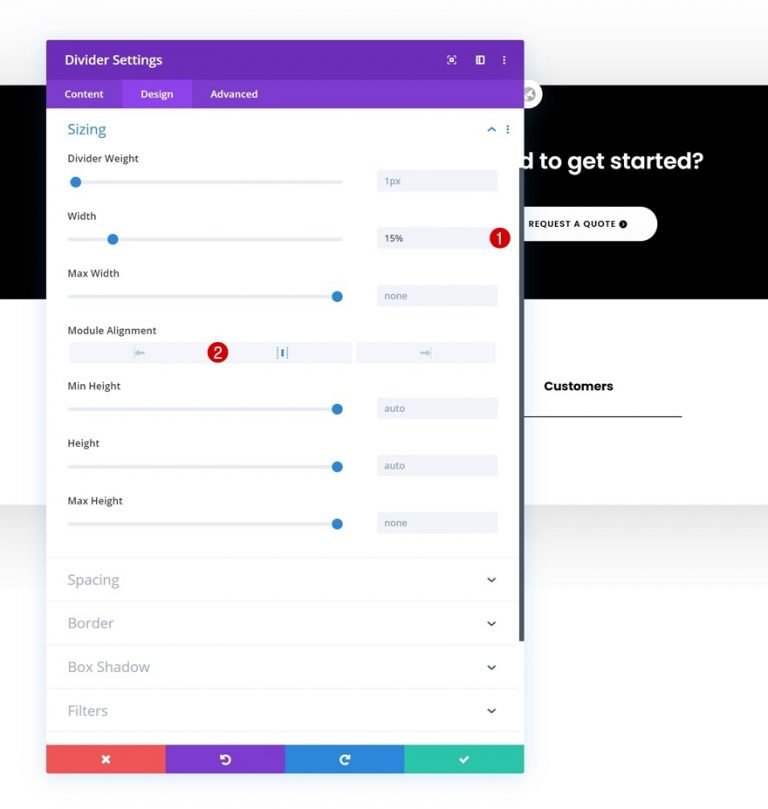
Sizing
The divider's sizing can also be changed.
- Width: 15%
- Module Alignment: Center
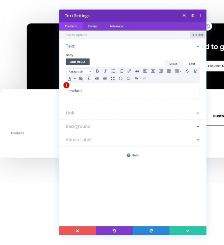
Text Module 2
Text Modules can now be added to the column.
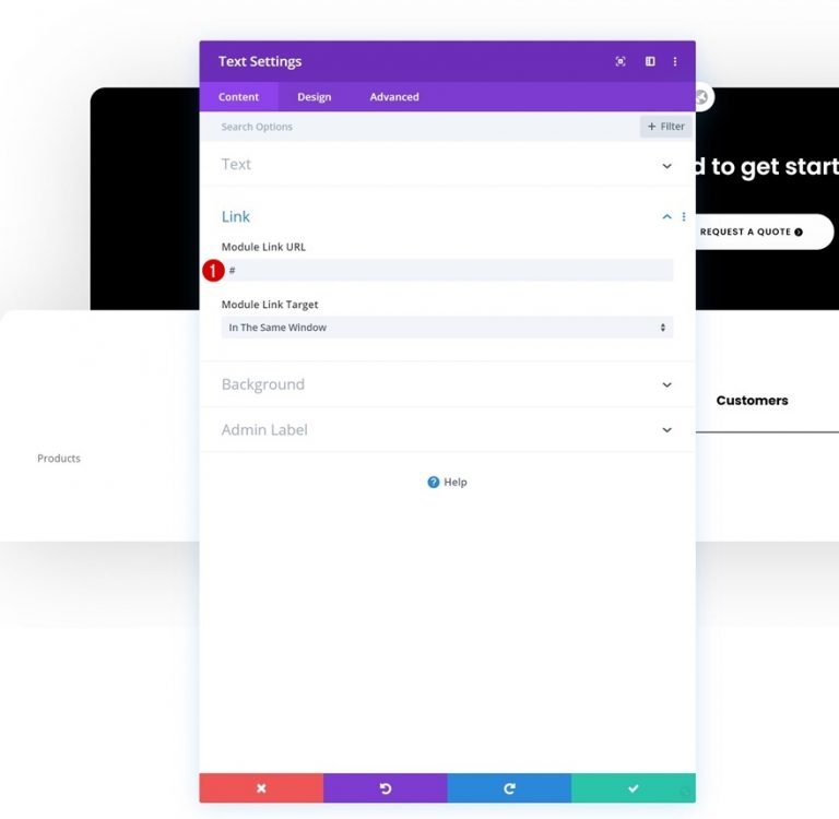
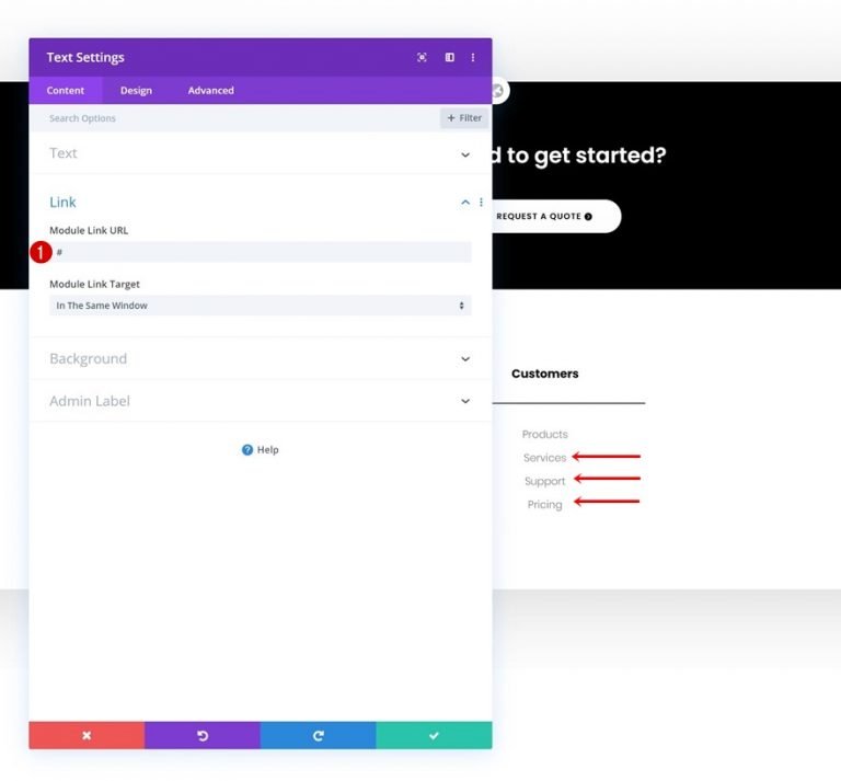
Link
Include a URL to the page to which you want to point this module.
Text Settings
In the design tab, adjust the text settings as follows:
- Text Font: Poppins
- Text Font Weight: Light
- Text Color: #777777
- Text Size: 15px
- Text Alignment: Center
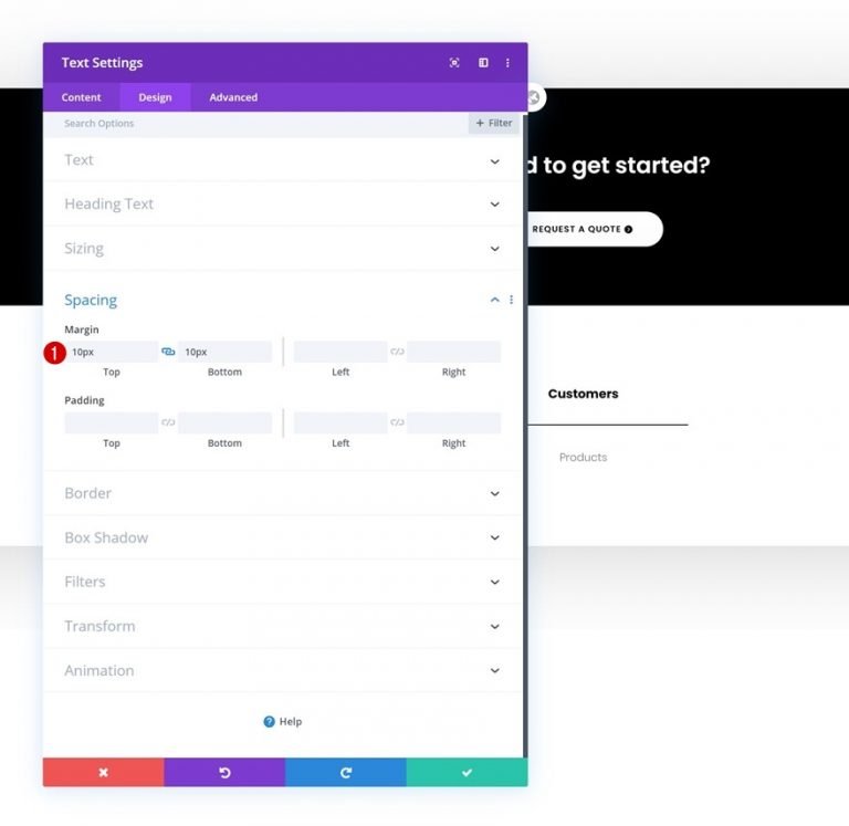
Spacing
Also include some space at the top and bottom of the page.
- Top Margin: 10px
- Bottom Margin: 10px
Text Module 2 Cloning
It's possible to clone the second Text Module in the column an unlimited number of times once it's finished being constructed (depending on how many clickable footer items you want to include).
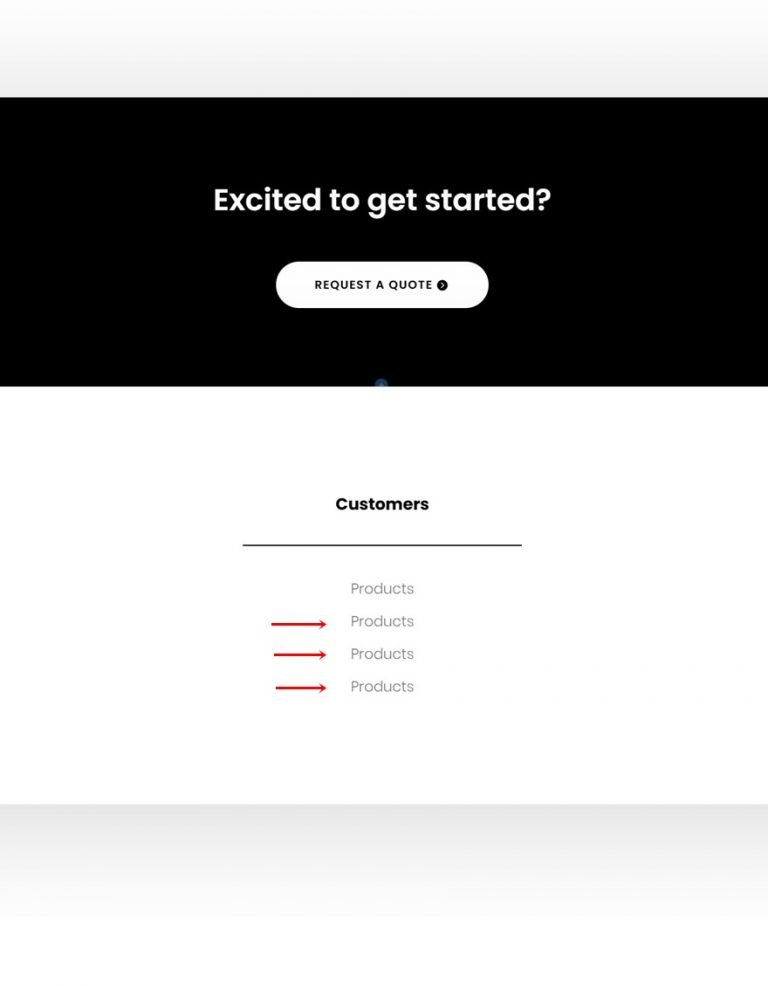
Change Links
For each copy, be sure to update the module's content and links.
Clone Column Twice
You can clone a column two times once you've finished building it and all of its modules.
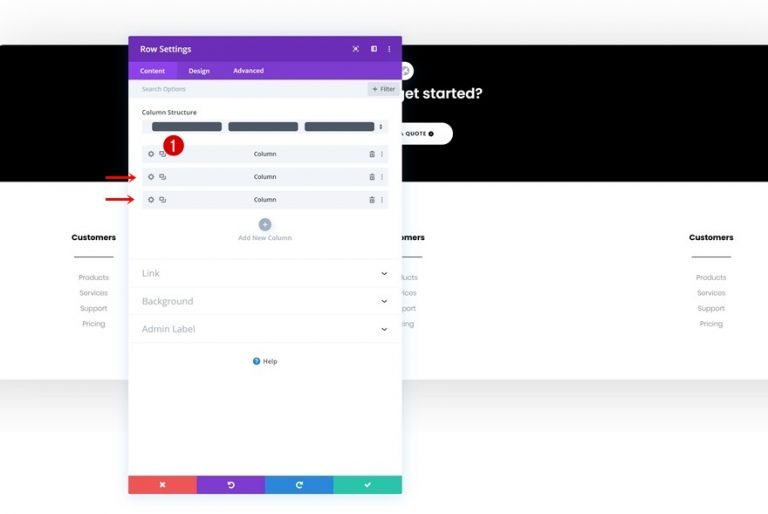
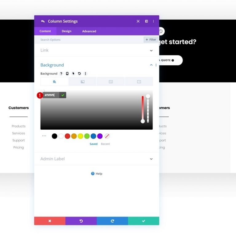
Column 2 BG Color Change
You can clone a column two times once you've finished building it and all of its modules.
- Column 2 Background Color: #f9f9f9
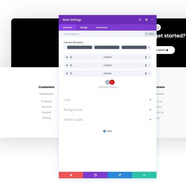
Add New Column
A fourth column should then be added.
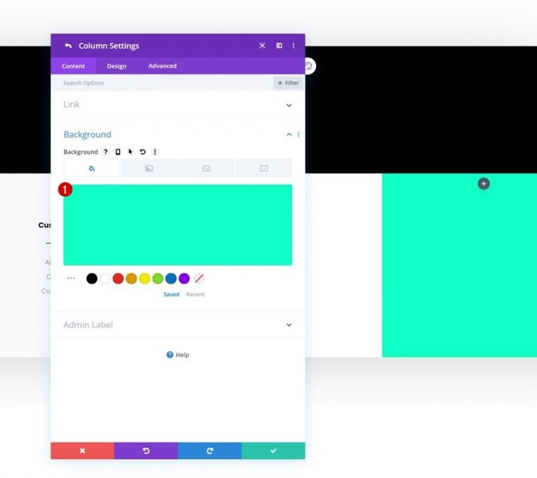
Background Color
Colorize the backdrop of the new column.
- Background Color: #0fffc7
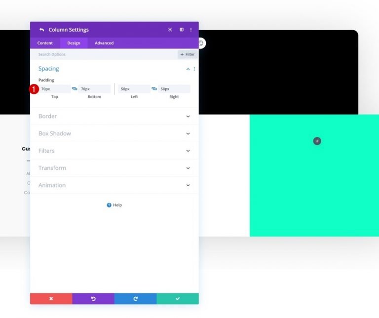
Spacing
In addition to the padding values in the column.
- Top Padding: 70px
- Bottom Padding: 70px
- Left Padding: 50px
- Right Padding: 50px
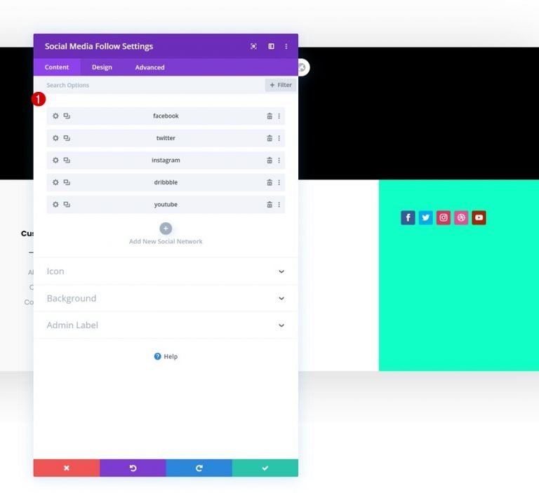
Social Media Icon
Add a Social Media Follow Module to Column 4 to complete the table.
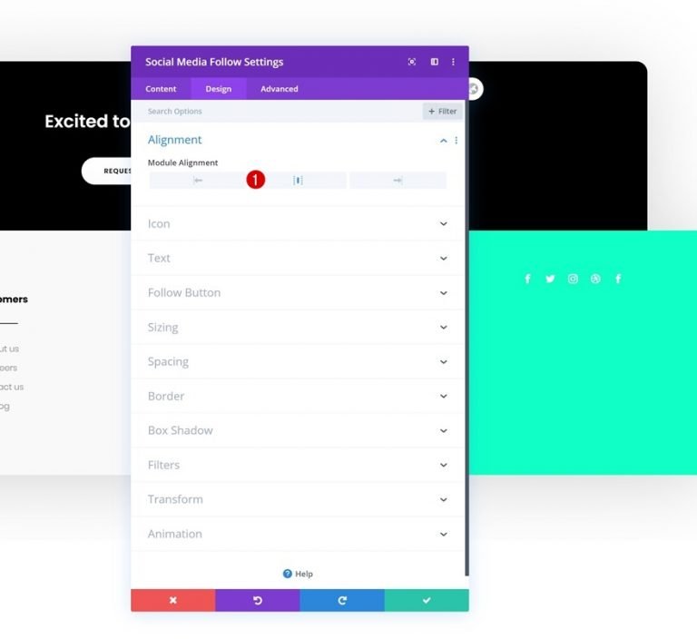
Alignment
On the Design tab, adjust the module's position.
- Module Alignment: Center
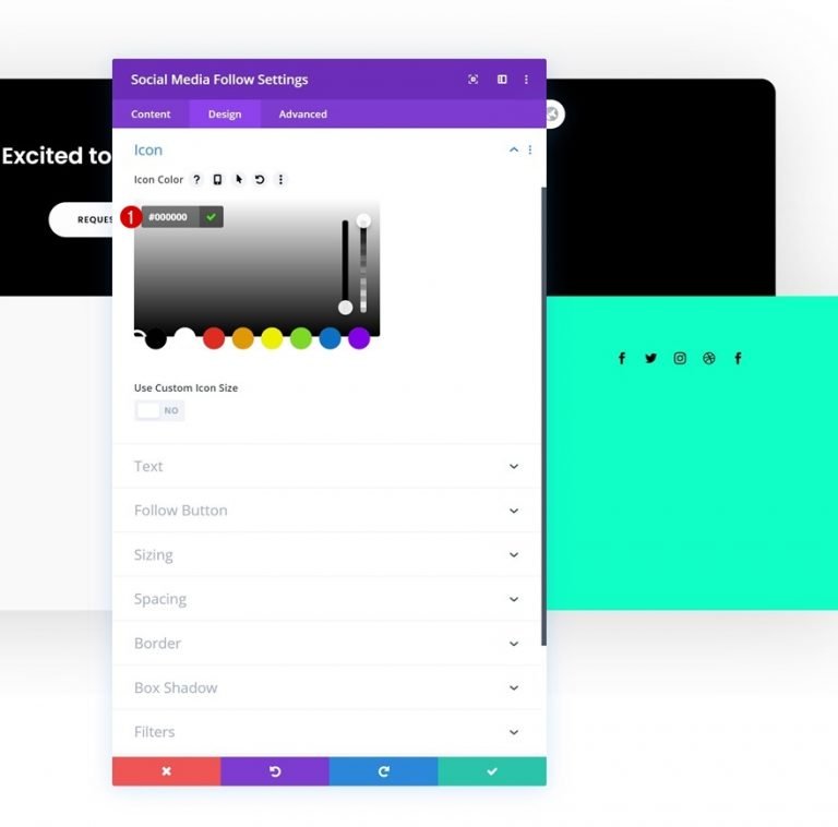
Icon
Now modify the icon color.
- Icon Color: #000000
Email Module
Keep going by inserting an email opt-in module in column 4, then deleting the title and body content. Next, link a personal email account. If the email account isn't added, the module won't appear once you quit the builder.
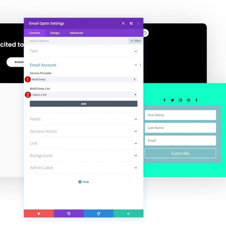
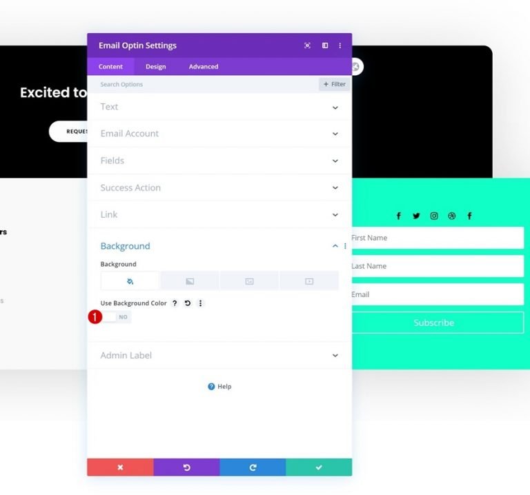
Also, remove BG from the email module.
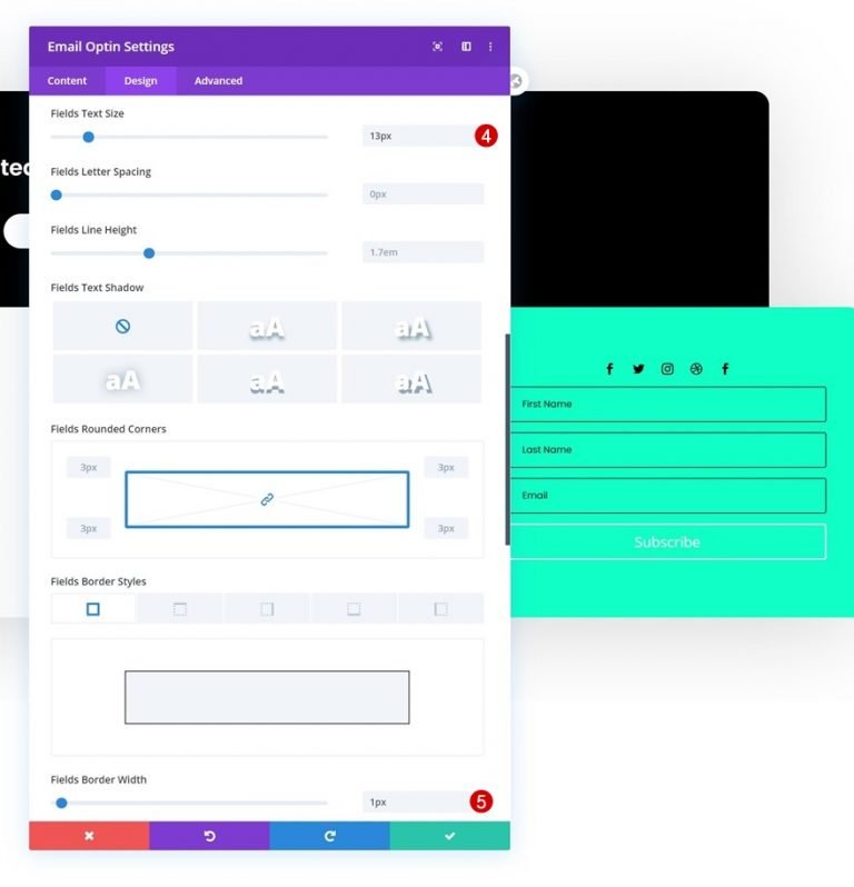
Fields Setting
Go to the design tab and make the following adjustments to the fields:
- Fields Background Color: rgba(0,0,0,0)
- Fields Text Color: #000000
- Fields Font: Poppins
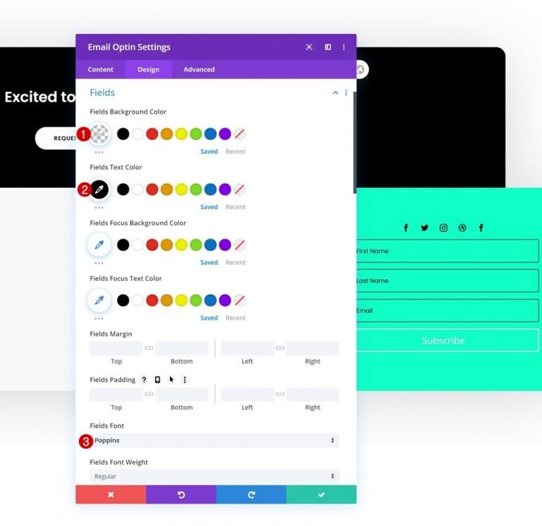
- Fields Text Size: 13px
- Fields Border Width: 1px
- Fields Border Color: #000000
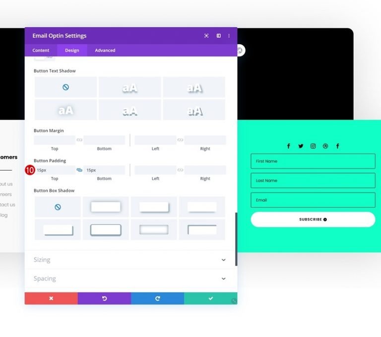
Button
Now change the button style.
- Use Custom Styles For Button: Yes
- Button Text Size: 12px
- Button Text Color: #000000
- Button Background Color: #FFFFFF
- Button Border Width: 0px
- Button Border Radius: 100px
- Button Letter Spacing: 1px
- Button Font: Poppins
- Button Font Weight: Semi Bold
- Button Font Style: Uppercase
- Top Padding: 15px
- Bottom Padding: 15px
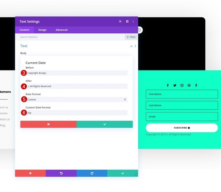
Add Dynamic Text Module
Finally, we need to add a Text Module to finish this design. In the content box, select the dynamic content option. From there make the following changes.
- Dynamic Content: Current Date
- Before: Copyright ©
- After: | All Rights Reserved
- Date Format: Custom
- Custom Date Format: 20y
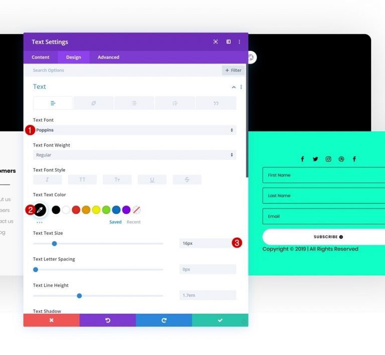
Text Settings
From the design tab, change the following settings.
- Text Font: Poppins
- Text Color: #000000
- Text Size: 16px
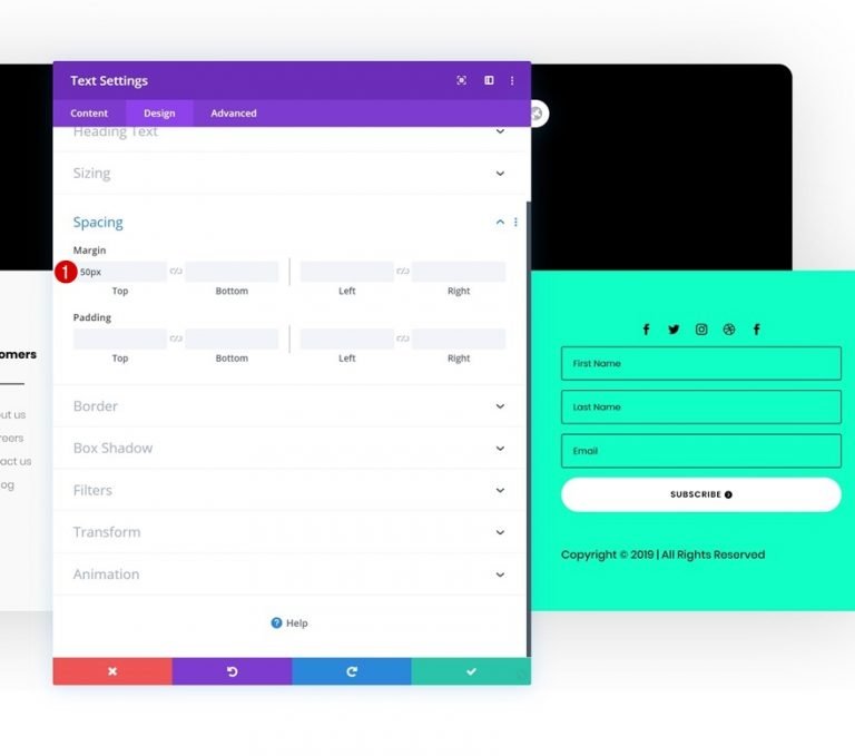
Spacing
You're done with the module's settings if you add some top margin.
- Top Margin: 50px
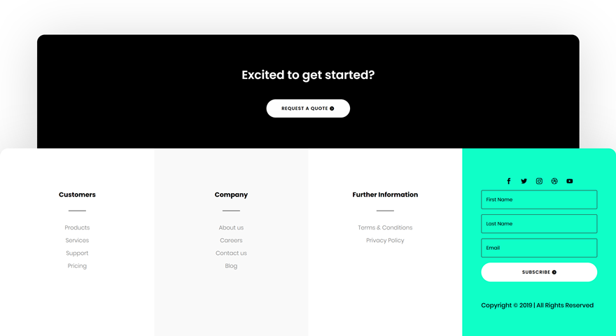
Final Preview
Let's take a final look at the results on various screen sizes now that we've completed all the processes.
Closing Thoughts
We've taught you how to use Divi's new Theme Builder to create a stunning custom global footer in this guide. With the help of the Theme Builder and Divi's built-in modules and design options, you can create beautiful websites in a matter of hours. It's our goal that you'll use this tutorial to construct some lovely Divi global footers in the future. Feel free to leave any questions or comments in the comment section below!