
Blending scroll animation with icons may improve the look of your website in surprising ways. In this article, we'll look at how to add scroll-animated icons to Divi section backgrounds. With hundreds of icons to select from and various built-in animation effects in Divi, we'll demonstrate to you how to build limitless background animations to take our designs to the next level.
Let's get this ball rolling!
Concept Explaination
The procedure of adding scroll-animated icons to section backgrounds consists of four significant steps.
To begin, we must construct a fullscreen canvas by modifying a section, row, and column such that each fills the whole width and height of the browser. This will provide us with the type of available creative area we need to fill with symbols.
Create Amazing Websites
With the best free page builder Elementor
Start Now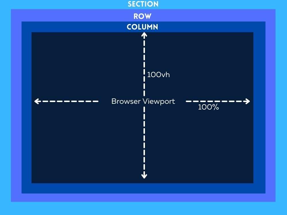
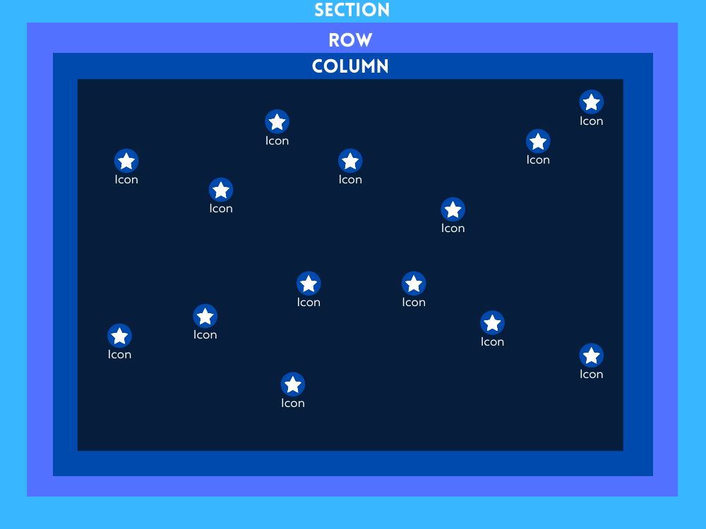
Second, we can develop our scroll-animated icon background design by carefully placing the icons inside the fullscreen canvas (or column).
Then, To create our scroll-animated icon backdrop design, you need to carefully place the icons inside the fullscreen canvas (or column).
Finally, after the backdrop design with scroll-animated icons is ready, we can add the material we need to the display in the foreground.
Now that we have an idea, let's get started with the design.
Designing The Scroll Animation In Divi Section Background
Part 1: Creating the Fullscreen Canvas
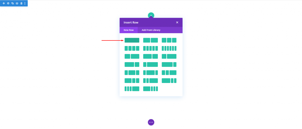
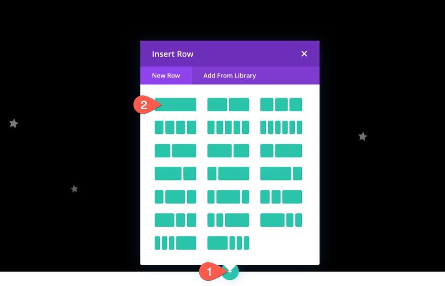
Here in this section, we will be setting up the section, row and column. First, let's add a one-column row to our section.
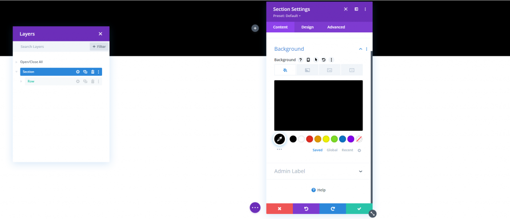
Open the section setting and change the background color.
- Background Color: #000
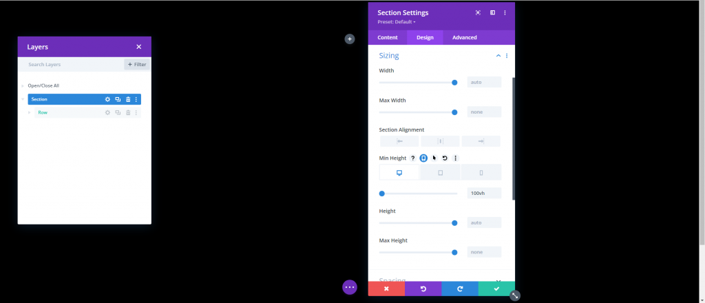
From the design tab, change the following.
- Min Height: 100vh (desktop), 600px (tablet and phone)
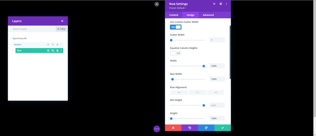
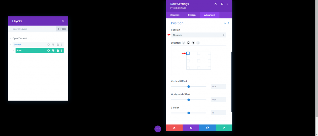
Row Settings
Next up is row. Open the setting for row and update the following.
- Use Custom Gutter Width: YES
- Gutter Width: 1
- Width: 100%
- Max Width: 100%
- Height: 100%
- Padding: 0px top, 0px bottom
From the advance tab, update the position.
- Position: Absolute
Column Height
Now since our section and row are in position, we need to give the column a min-height of 100% so that it spans the whole width and height of the section/viewport. With this, we've practically generated a fullscreen canvas that enables us to fill the column with icons at this point. Add the code on the "Main Element" box of column settings.
min-height:100;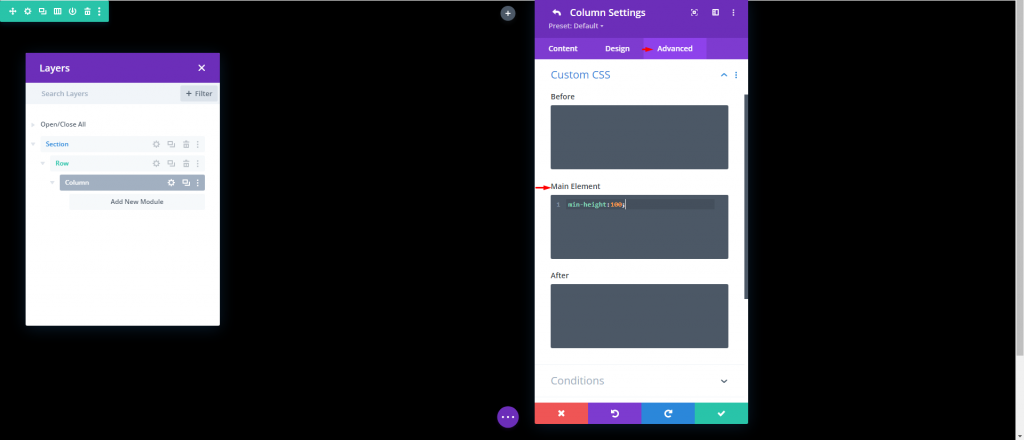
Part 2: Creating and Positioning the Icons
We are now ready to begin constructing and arranging the icons in the column. The aim is to strategically put the icon inside this fullscreen column to create our scroll-animated icon backdrop design.
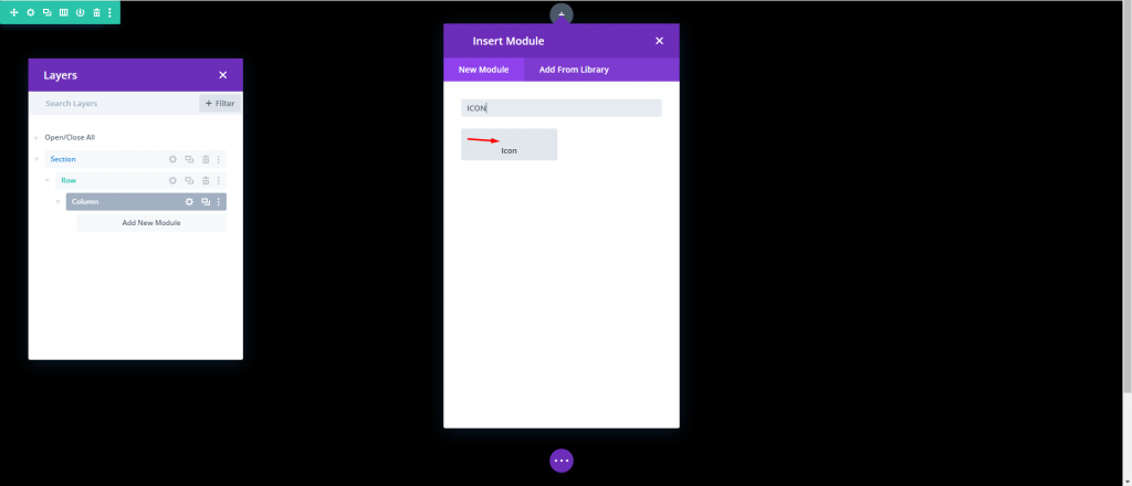
Creating and Placing Icon 1
We'll begin by making our first icon and placing it using the Divi Builder. Insert an Icon Module into the column.
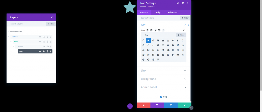
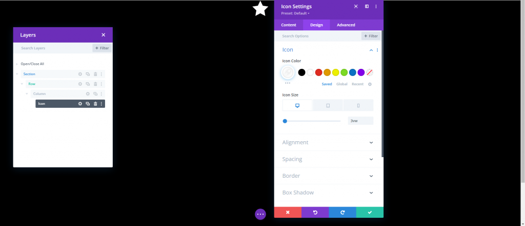
Select an icon from the icon picker by opening the Icon Settings
Update the icon color and size under the design tab as follows:
- Icon Color: #ffffff
- Icon Size: 3vw (desktop), 40px (tablet), 30px (phone)
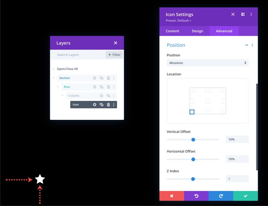
Update the position and offsets under the Advanced tab as follows:
- Position: Absolute
- Location: Bottom Left
- Vertical Offset: 10%
- Horizontal Offset: 10%
Remember that the percentage length unit, in this case, is related to the bottom and left CSS Properties. In this scenario, a 10% vertical offset is identical to "bottom: 10%" in CSS, while a 10% horizontal offset is comparable to "left: 10% ". Because our column is fullscreen, icons will stay responsive when the browser height and width are changed. In other words, they will maintain their place across a range of screen sizes.
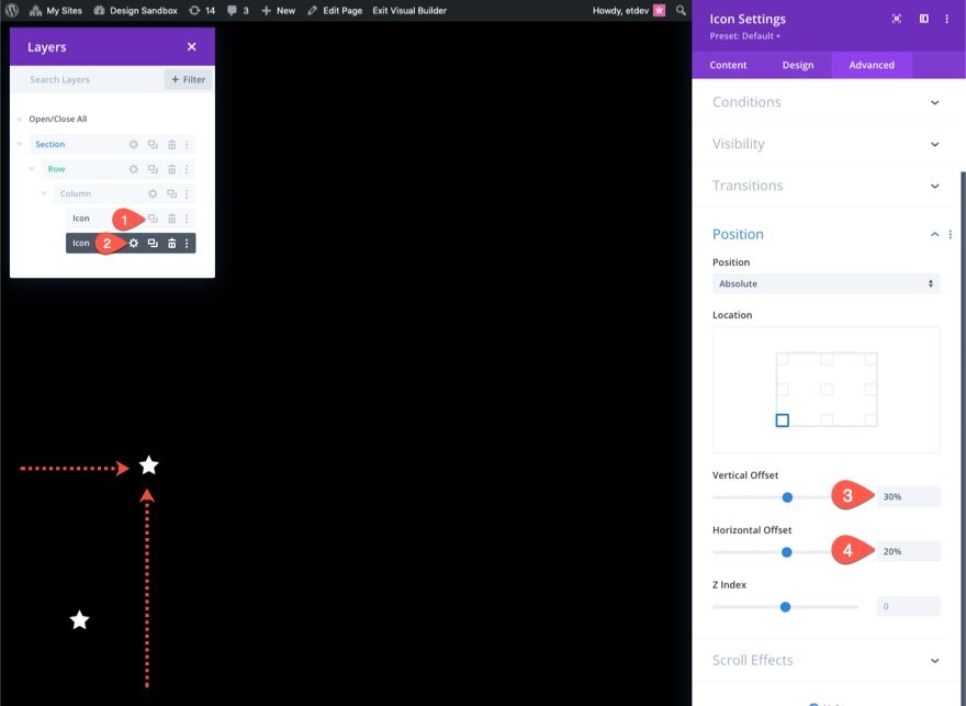
Creating and Placing Icon 2
Duplicate the current icon to make the second one. Then, access the duplicate icon's properties and alter the position settings as follows:
- Vertical Offset: 30%
- Horizontal Offset: 40%
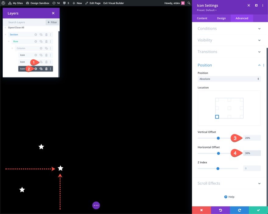
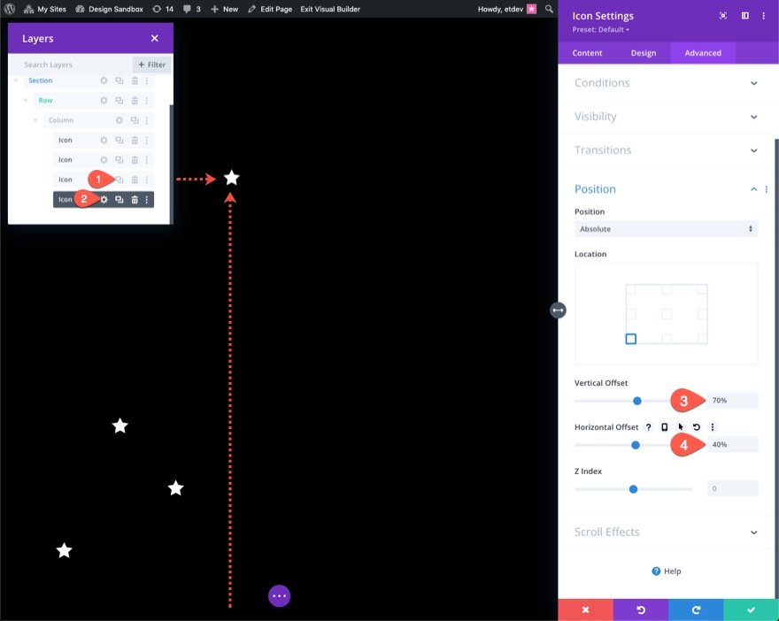
Creating and Placing Icon 3
Duplicate the previous icon to make the third. Then, access the duplicate icon's properties and alter the position settings as follows:
- Vertical Offset: 20%
- Horizontal Offset: 30%
Creating and Placing Icon 4
Duplicate the previous icon to make the fourth. Then, access the duplicate icon's properties and alter the position settings as follows:
- Vertical Offset: 70%
- Horizontal Offset: 40%
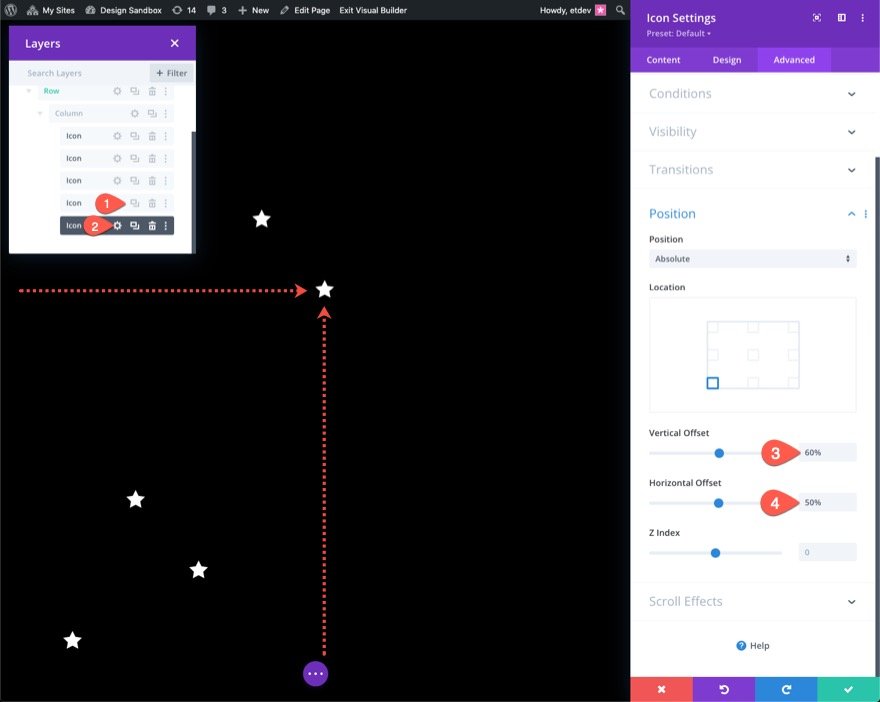
Creating and Placing Icon 5
Duplicate the preceding icon to make the fifth. Then, access the duplicate icon's properties and alter the position settings as follows:
- Vertical Offset: 60%
- Horizontal Offset: 50%
Creating and Placing Icon 6
Duplicate the preceding icon to make the sixth. Then, access the duplicate icon's properties and alter the position settings as follows:
- Vertical Offset: 65%
- Horizontal Offset: 60%
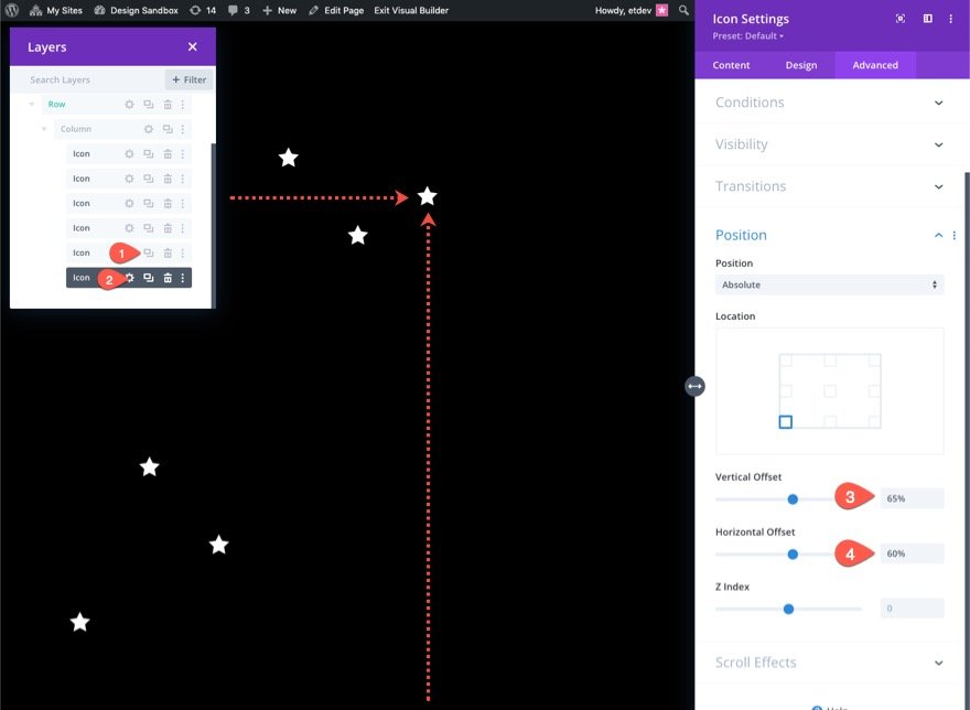
Creating and Placing Icon 7
Duplicate the preceding icon to make the seventh. Then, access the duplicate icon's properties and alter the position settings as follows:
- Vertical Offset: 28%
- Horizontal Offset: 70%
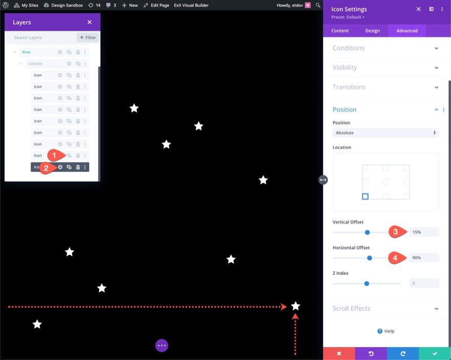
Creating and Placing Icon 8
Duplicate the preceding icon to make the eighth. Then, access the duplicate icon's properties and alter the position settings as follows:
- Vertical Offset: 50%
- Horizontal Offset: 80%
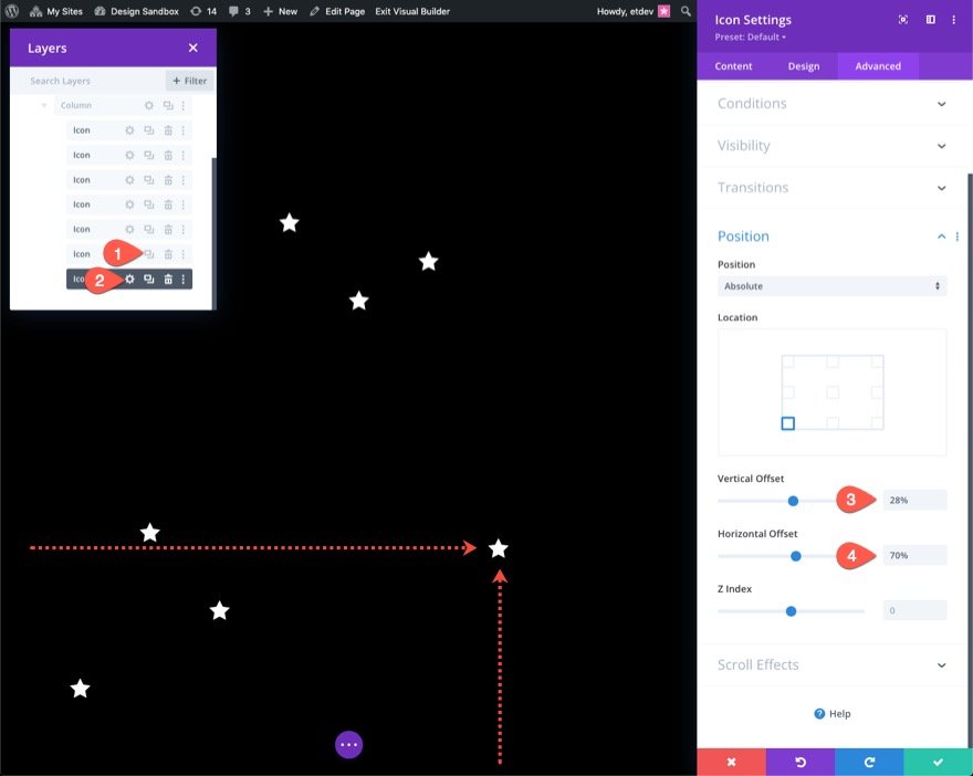
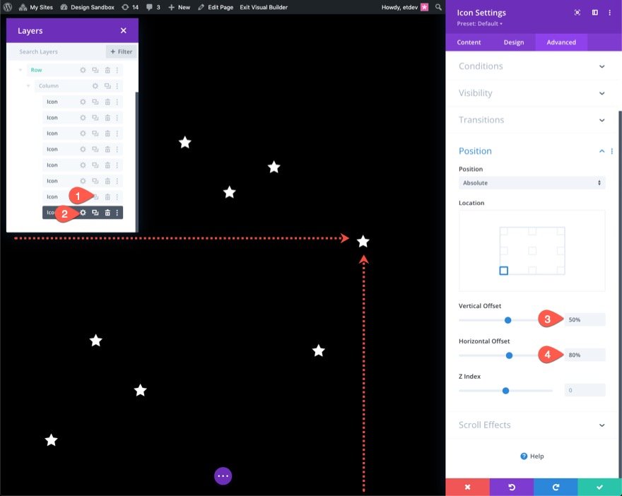
Creating and Placing Icon 9
Duplicate the last icon to make the ninth. Then, access the duplicate icon's properties and alter the position settings as follows:
- Vertical Offset: 15%
- Horizontal Offset: 90%
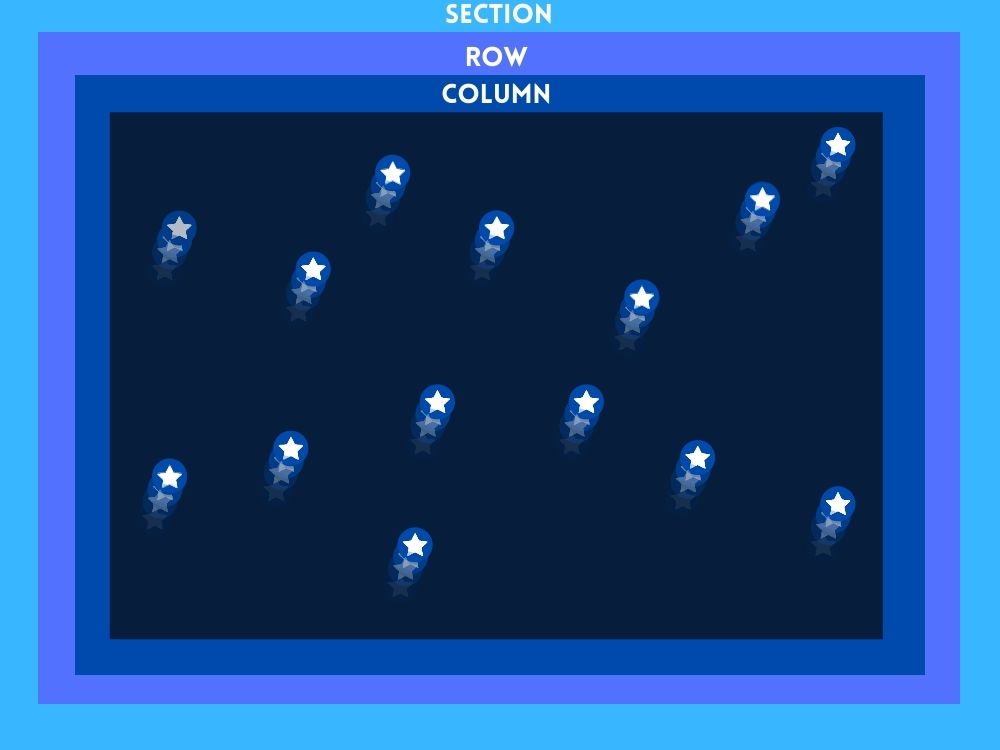
Part 3: Creating The Scroll Animation
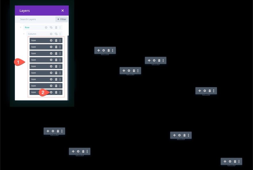
We'll apply similar scroll motions to all nine icons for this example. You may give each of them a different scroll animation if you like. To apply scroll animations to all icons at once, use multi-select (hold ctrl or cmd when picking the icon modules) to choose all of the icons in the column at once. Then, open the settings for one of the modules you've chosen.
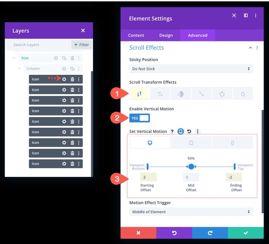
The element settings modal will appear as a result. Next, toggle the Scroll Effects option group toggle under the advanced tab. The Scroll Transform Effects may be found there. We will be adding all six accessible effects (Vertical Motion, Horizontal Motion, Fade In and Out, Scaling Up and Down, Rotating, and Blur).
Adding Scroll Transform Effects : Vartical
Open the vertical motion tab update the following:
- Enable Vertical Motion: YES
- Starting Offset: 2 (at 0%)
- Ending Offset: -2 (at 100%)
For tablet display update the offsets as follows:
- Starting Offset: 1 (at 0%)
- Ending Offset: -1 (at 100%)
For phone display update the offsets as follows:
- Starting Offset: 0.5 (at 0%)
- Ending Offset: -0.5 (at 100%)
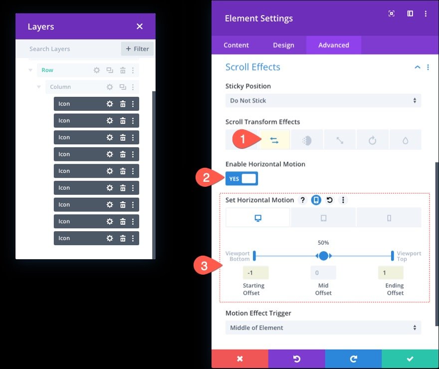
Adding Scroll Transform Effects : Horizontal
Next up, open the Horizontal Motion tab and update the following:
- Enable Horizontal Motion: YES
- Starting Offset: -1 (at 0%)
- Ending Offset: 1 (at 100%)
For tablet display, update the offsets as follows:
- Starting Offset: 0 (at 0%)
- Ending Offset: 0 (at 100%)
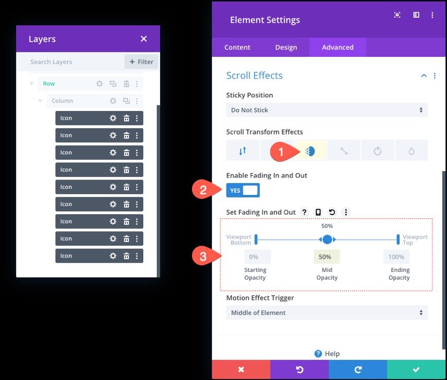
Adding Scroll Transform Effects : Fading in and out
Open the Fading In and Out tab and update the following:
- Enable Fading In and Out: YES
- Mid Opacity: 50% (at 50%)
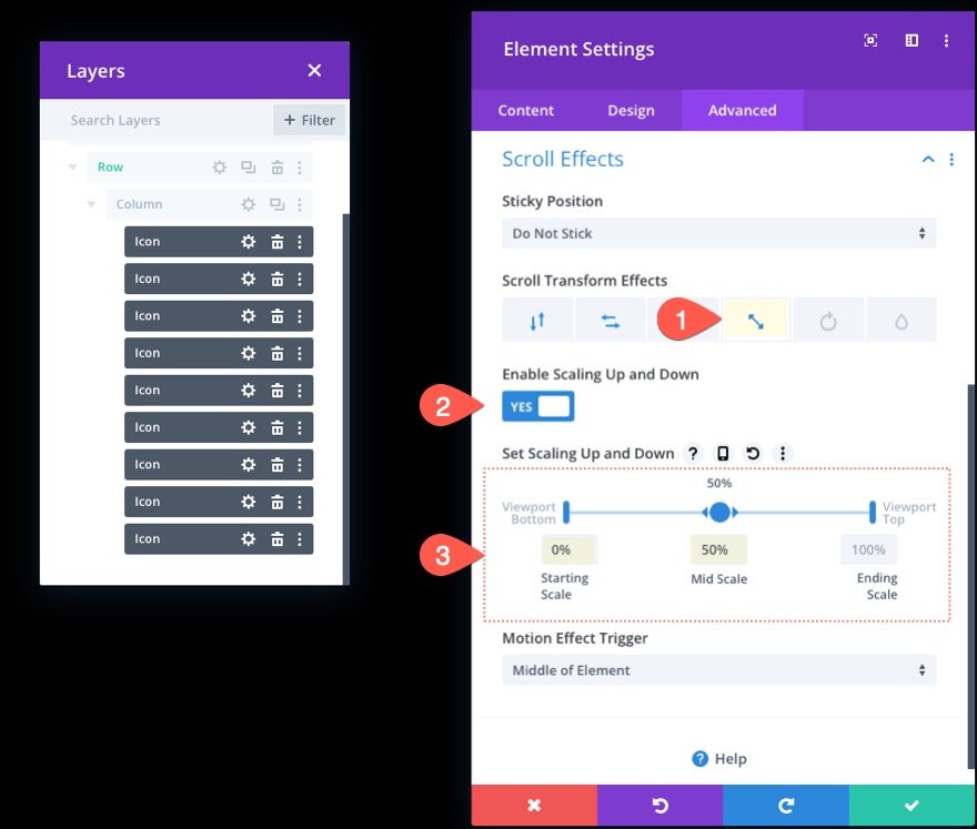
Adding Scroll Transform Effects : Scaling Up and Down
Next, open the Scaling Up and Down tab and update the following:
- Enable Scaling Up and Down: YES
- Starting Scale: 0% (at 0%)
- Mid Scale: 50% (at 50%)
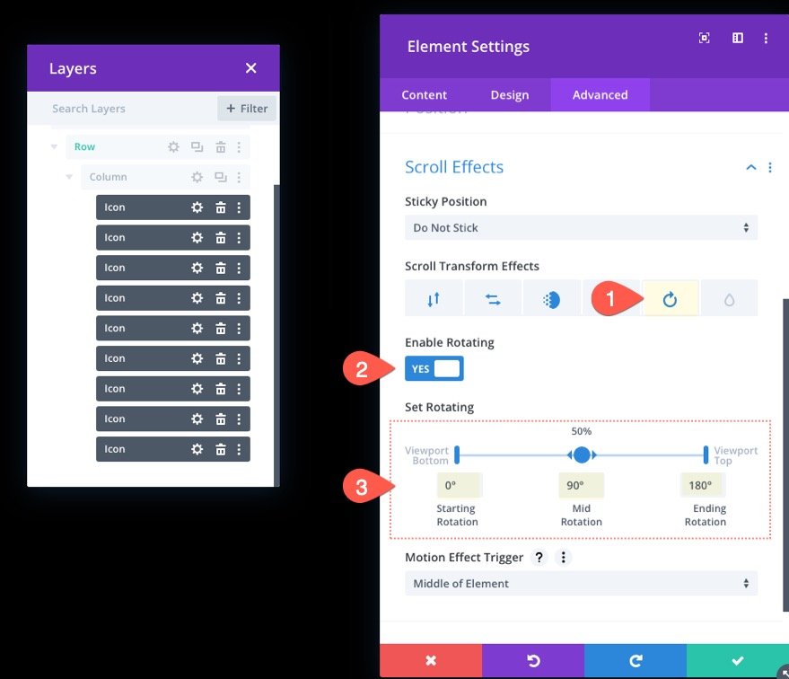
Adding Scroll Transform Effects : Rotating
Next, pick the Rotating tab and update the following:
- Enable Rotating: YES
- Starting Rotation: 0% (at 0%)
- Mid Rotation: 90% (at 50%)
- Ending Rotation: 180% (at 100%)
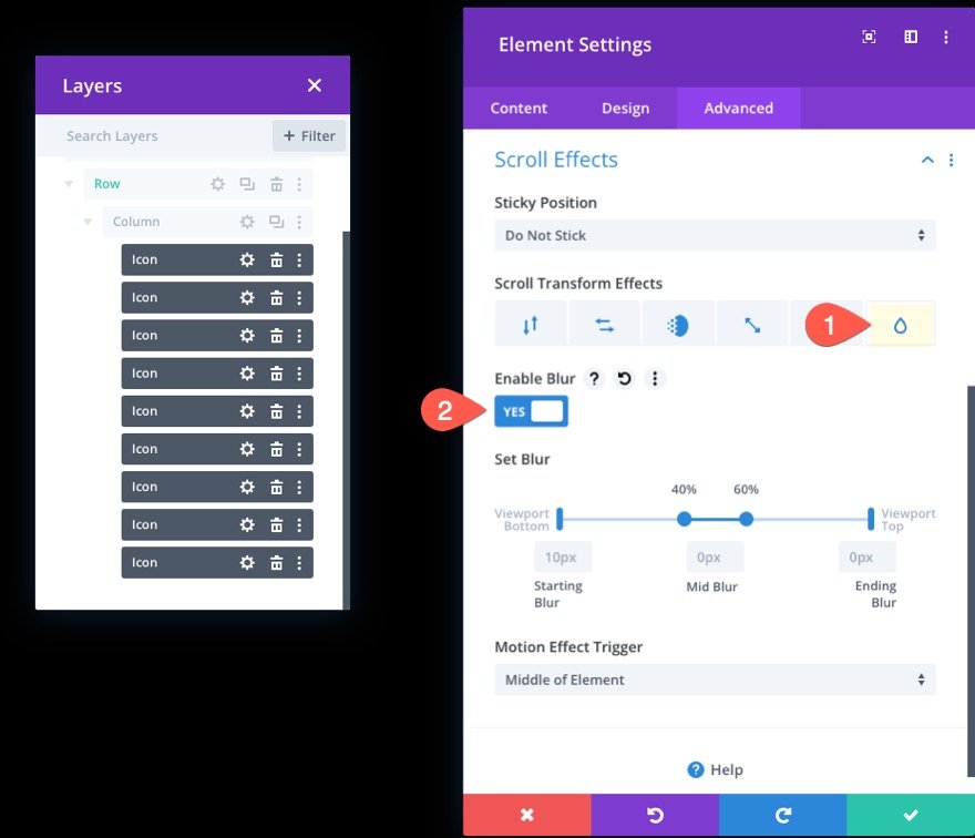
Adding Scroll Transform Effects : Blur
Finally open the Blur tab and enable the blur effect:
- Enable Blur: YES
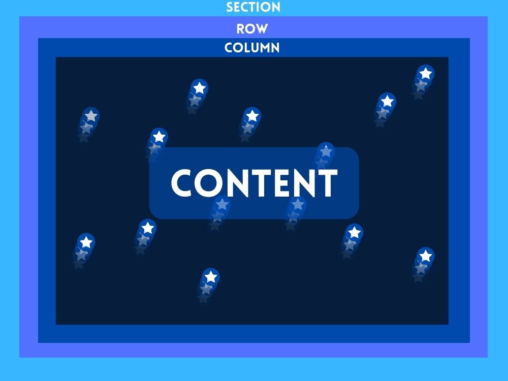
Part 4: Adding Content to the Section Front
With our scroll-animated symbols in place for the backdrop, we can add the material we wish to show in the foreground. The aim is to maintain the row (with the column and icons) behind any extra row(s) of material we wish to show in front of that backdrop.
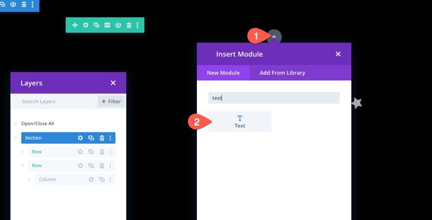
We'll construct a single-column row with a basic header in this example. First, insert a new one-column row exactly underneath the old one.
Because the present row has an absolute location, adding another one will put it at the top of the section, as intended. Insert a text module into the new row.
On the text body, enter the following HTML code.
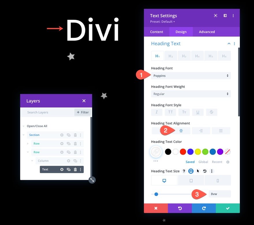
<h1>Divi</h1>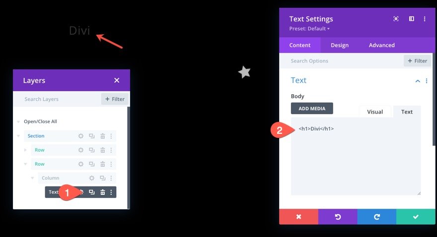
From the design tab of the text module, change the settings:
- Heading Font: Poppins
- Heading Text Alignment: Center
- Heading Text Size: 8vw (desktop), 40px (tablet and phone)
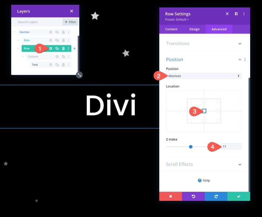
Row Position
To ensure that the row (and header) are centered in the section, access the row settings and alter the position as follows:
- Position: Absolute
- Location: Center
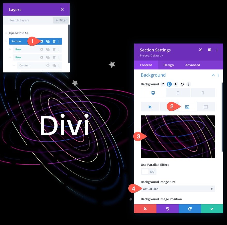
Retouching The Design
Go to the section settings and insert a background picture to complete the design. Here, we are using an image from our Artificial Intelligence Layout Pack for this example.
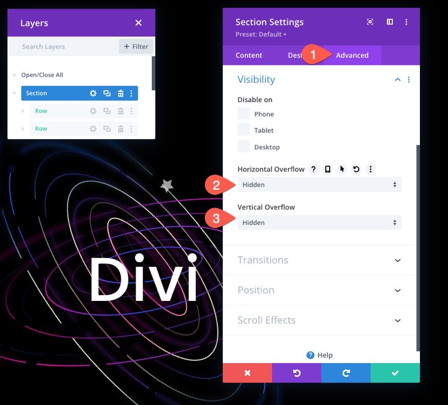
Make sure the overflow is hidden by adjusting the visibility choices under the advanced tab:
- Horizontal Overflow: Hidden
- Vertical Overflow: Hidden
This prevents the vertical scroll bar from appearing when an icon is animated outside of the section.
Final Design
Here is how our final design looks like.
Here is another design you may also like.
Final Word
It's sometimes fun to be creative and show how intense and enjoyable Divi can be as a visual page builder. This lesson, we believe, has shown how successful Divi can be in bringing website backdrop parts to life. In addition, the ability to apply scroll transform effects to hundreds of distinct icons allows for a wide range of creative designs and animations. Hopefully, this has inspired you to utilize scroll-animated symbols in even more innovative ways.


