
Divi is a massively customizable theme because there are plenty of opportunities in each section to implement new unique designs. A website has many sections like header, footer, body, etc. Among them, the header section is one of the most important because it contains links to important pages on your site that potential customers will often want to visit. Also, it delivers key points about your website that encourage your customer to explore further. In today's tutorial, you will see how you can add a hamburger menu toggle on the top navigation header menu. We generally know that the hamburger menu is used for small screen sizes. But today, we will see it in desktop mode. Let's not waste more time and start our today's tutorial.
Sneak Peek
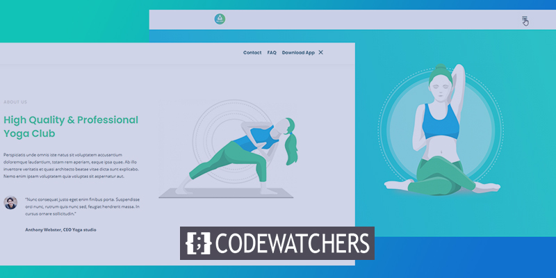
Today we will create this design where the navigation menu will be hidden behind the hamburger menu.
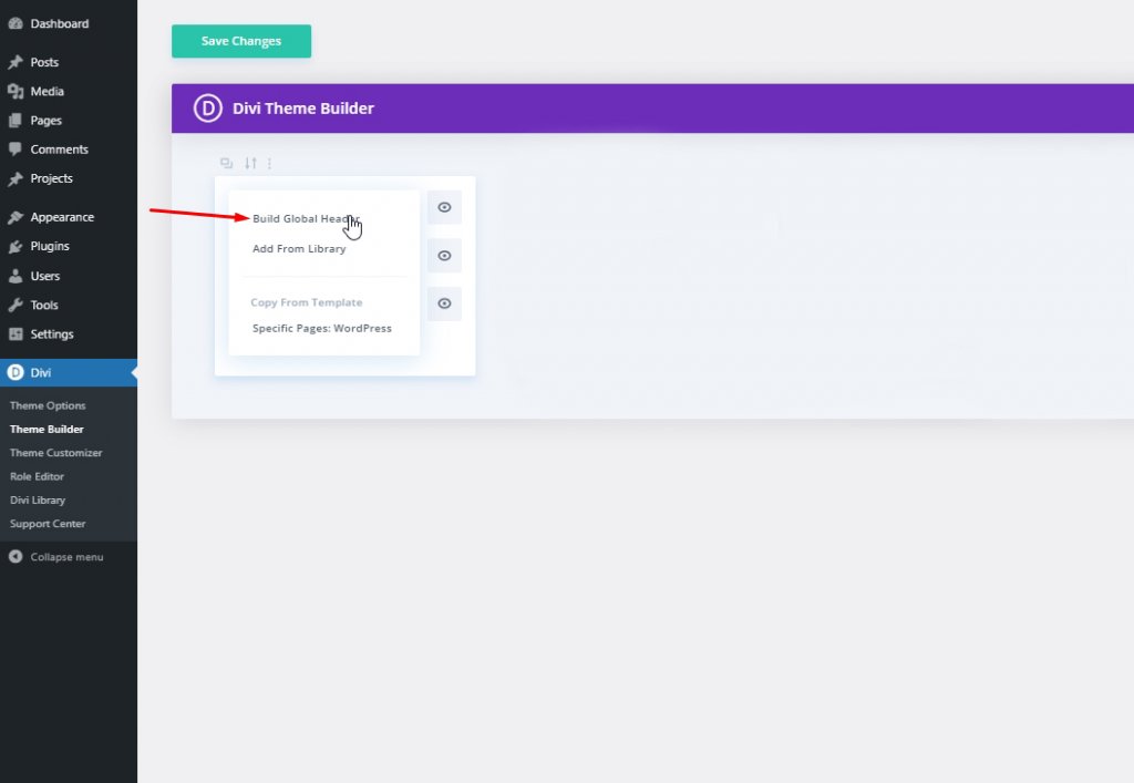
Part One: Global Header Template.
We'll start by going to Divi theme builder and click on "Add Global Header". A menu will pop up and select "Build Global Header".
Select "Build From Scratch" and move forward.
Create Amazing Websites
With the best free page builder Elementor
Start Now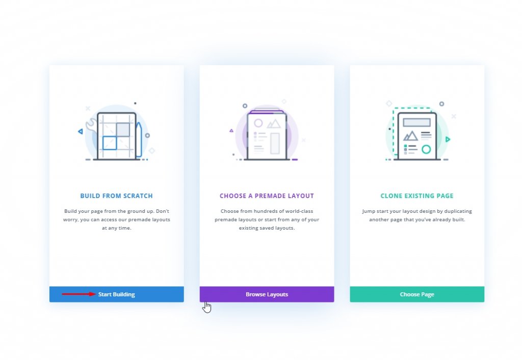
Part Two: Global Header Designing
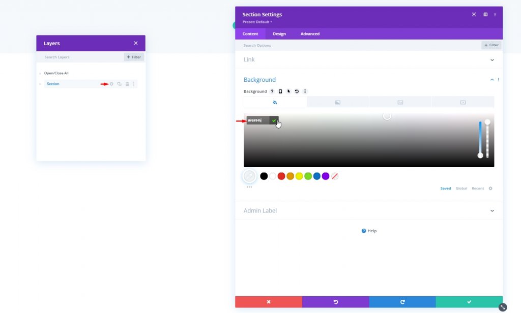
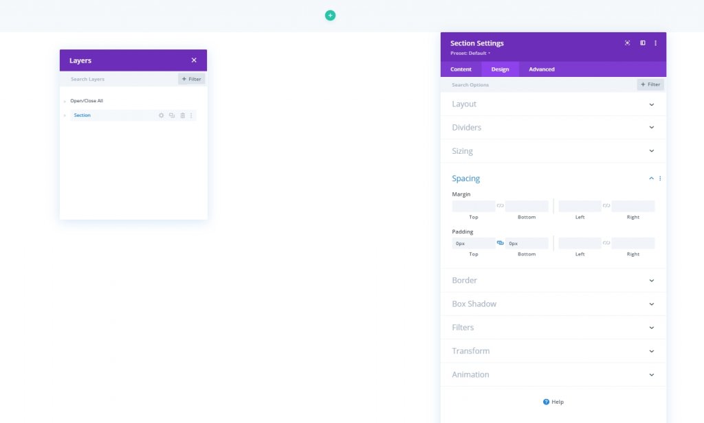
Settings: Main Section
Background Color
We'll now start to design the header. First, change the background color of the initial section.
- Background Color: #f6f9fb
Spacing
Then, move to the spacing settings under design tab and make top and bottom padding zero.
- Top Padding: 0px
- Bottom Padding: 0px
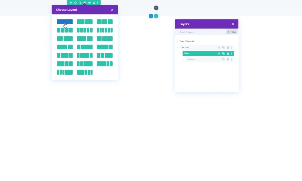
Adding: New Row
Lets move further by adding a new row to our design. Pick the row mention in image.
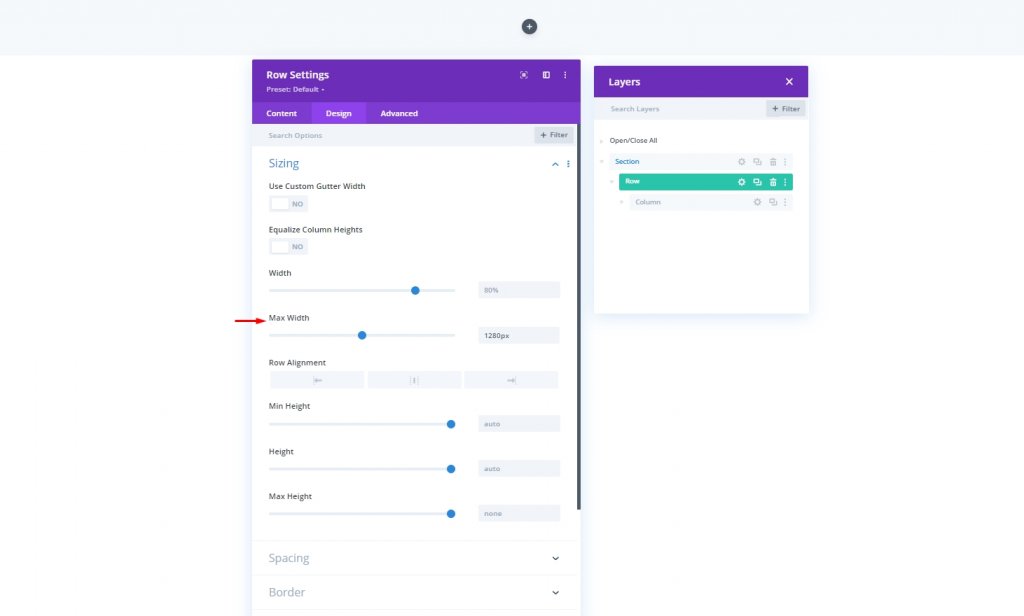
Sizing
Before adding any more modules, change the row sizing.
- Max Width: 1280px
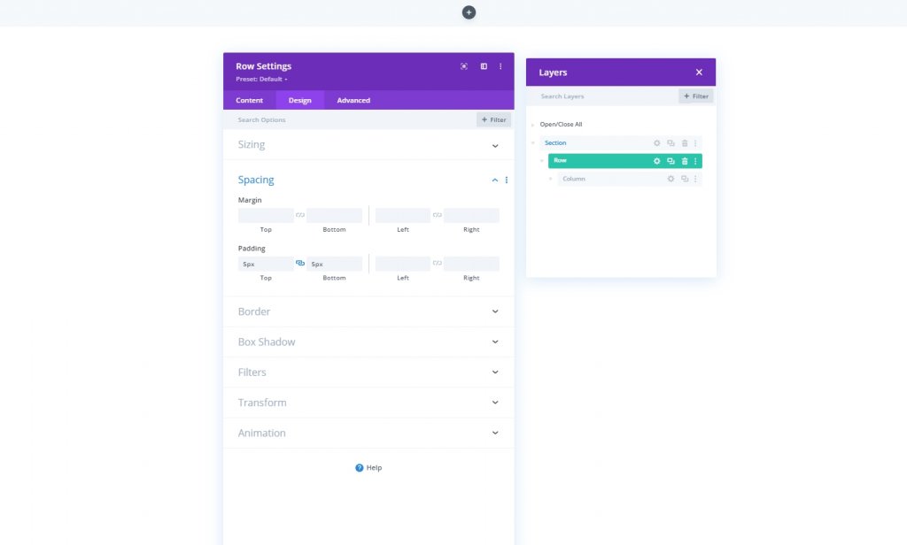
Spacing
Adjust the top and bottom padding.
- Top Padding: 5px
- Bottom Padding: 5px
Adding: Menu Module to Column
Menu Selection
Now add a menu module to the new row's column and select a menu.
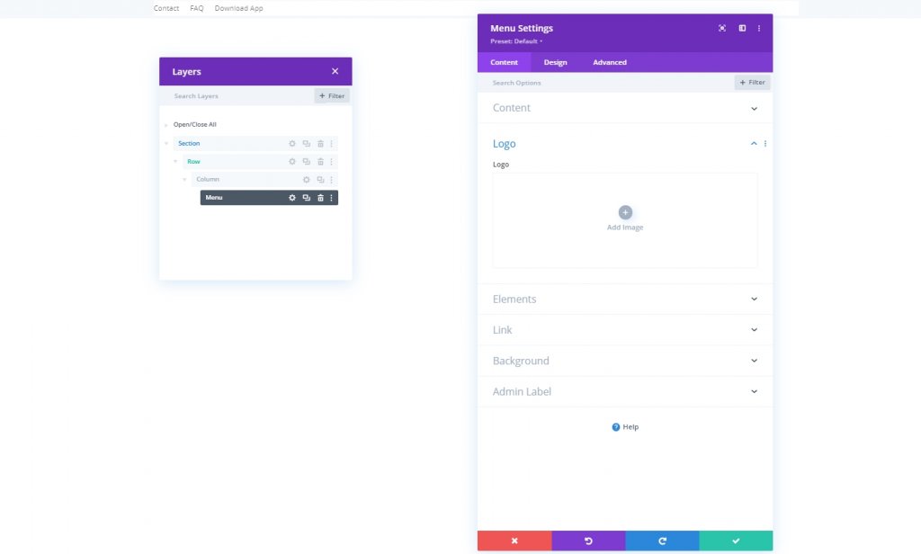
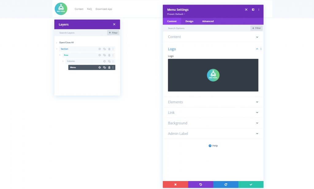
Add Logo
Now add a logo to the module.
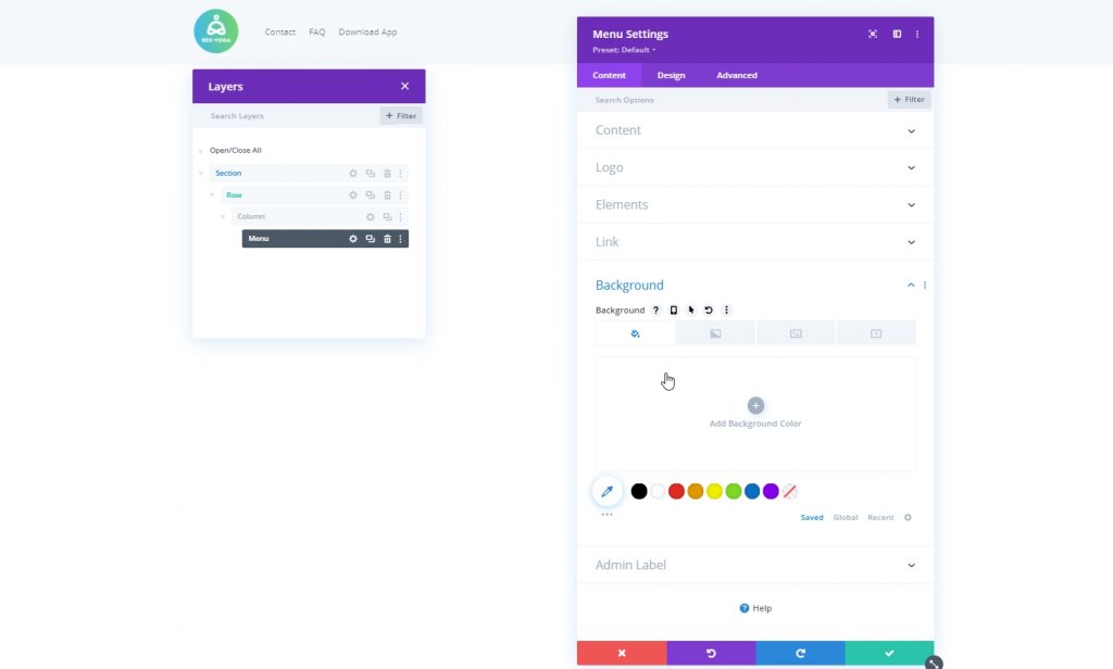
Remove Background Color
Then, remove the module’s default background color.
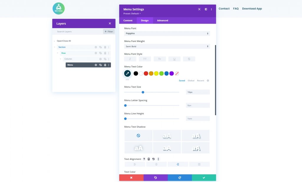
Settings: Menu Text
From the design tab of this module and change the menu text settings accordingly:
- Menu Font: Poppins
- Menu Font Weight: Semi Bold
- Menu Text Color: #003e51
- Menu Text Size: 16px
- Text Alignment: Right
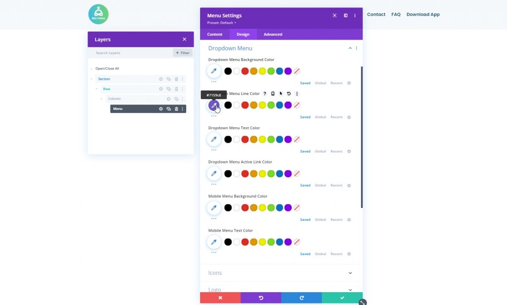
Settings: Dropdown Menu
Change the dropdown menu settings next.
- Dropdown Menu Line Color: #7159c8
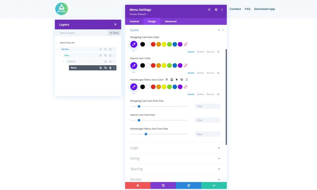
Settings: Icons
Change the icons settings too.
- Shopping Cart Icon Color: #670fff
- Search Icon Color: #670fff
- Hamburger Menu Icon Color: #670fff
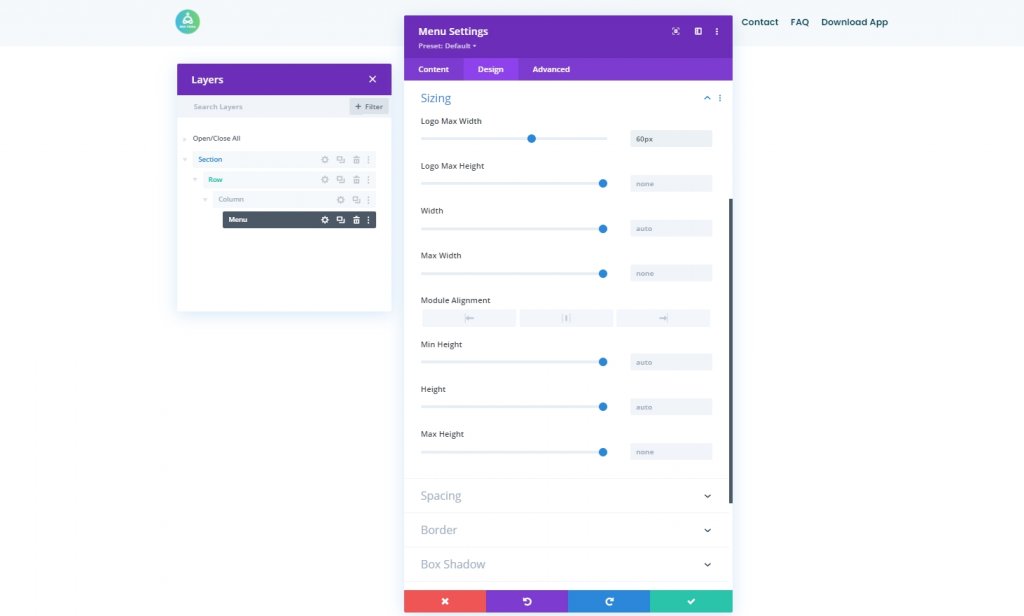
Sizing
From sizing settings, change the max width for logo.
- Logo Max Width: 60px
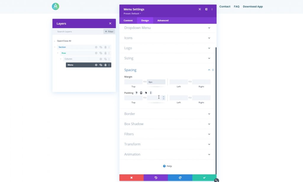
Spacing
Make some adjustments to spacing.
- Bottom Margin: 0px
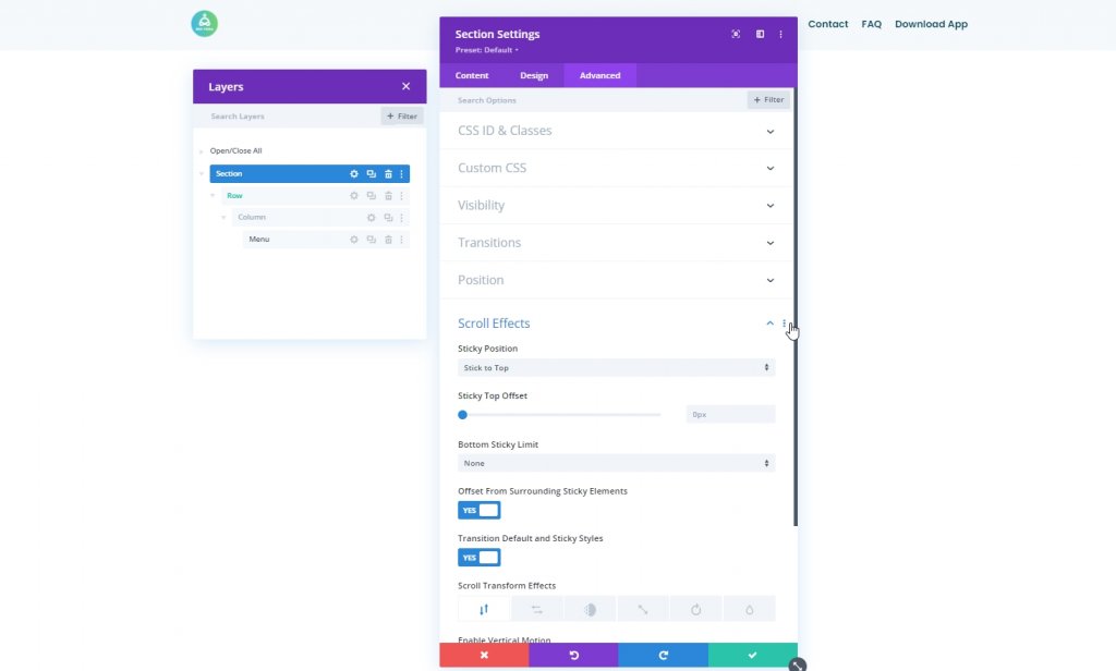
Turn Section Sticky
Our manu is polaced now. So, it's time to make the section sticky. From the section settings, go to the advanced tab and do the setting mentioned below.
- Sticky Position: Stick to Top
- Offset From Surrounding Sticky Elements: Yes
- Transition Default and Sticky Styles: Yes
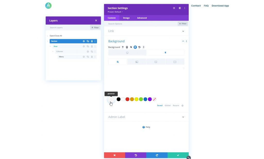
Background Color: Sticky Mode
Now, modify the background color of the entire section in sticky condition.
- Background Color: #ffffff
Shadow: Sticky Mode
Apply a box shadow to the section as well from design tab.
- Default Shadow Color: rgba(0,0,0,0)
- Sticky Shadow Color: rgba(0,0,0,0.04)

Part Three: Hamburger Icon Toggle
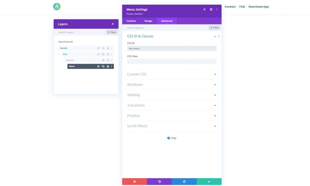
Menu Module CSS ID
We’ll focus on creating the desktop hamburger icon toggle icon in the next part of the tutorial. First, open the Menu Module’s settings, go to the advanced tab and assign a CSS ID.
- CSS ID: divi-menu
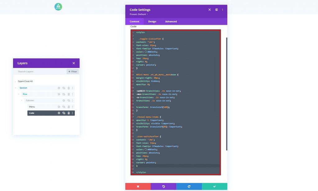
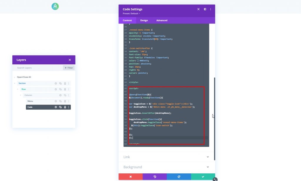
Add Code Module
Now add a code module beneath the menu module.

CSS Code
Now, add Style tag and put the code inside the tag.
.toggle-icon:after {
content: "\61";
font-size: 32px;
font-family: ETmodules !important;
color: #003e51;
position: absolute;
top: 26px;
right: 0;
cursor: pointer;
}

#divi-menu .et_pb_menu__menu>nav {
margin-right: 38px;
visibility: hidden;
opacity: 0;

-webkit-transition: .1s ease-in-out;
-moz-transition: .1s ease-in-out;
-o-transition: .1s ease-in-out;
transition: .1s ease-in-out;

transform: translateY(50%);
}

.reveal-menu-items {
opacity: 1 !important;
visibility: visible !important;
transform: translateY(0%) !important;
}

.icon-switch:after {
content: '\4d';
font-size: 32px;
font-family: ETmodules !important;
color: #003e51;
position: absolute;
top: 26px;
right: 0;
cursor: pointer;
}
JQuery Code
Then, add Script tag and put the code inside the tag.
jQuery(function($){
$(document).ready(function(){

var toggleIcon = $('<div class="toggle-icon"></div>');
var desktopMenu = $('#divi-menu .et_pb_menu__menu>nav');

toggleIcon.insertAfter(desktopMenu);

toggleIcon.click(function(){
    desktopMenu.toggleClass('reveal-menu-items');
  $(this).toggleClass('icon-switch');
});

});
});
Now save the progress and get back to divi builder option by pressing the top-right cross.
Final Result
Since we have successfully passed all the steps, this is what our today's design looks like.
Final Thoughts
You can be creative in a lot of ways with Divi. It gives you complete freedom to architect your website just as you need it. Today you have seen adding a top navigation menu inside the hamburger menu on the desktop view. I hope this will help you make more creative headings, and if you find this tutorial helpful, a share with your friends will be AMAZING!