
Divi's built-in sticky settings offer a powerful capability that allows you to effortlessly keep a specific element "sticky" or fixed in place while you navigate through the rest of the page content. This feature becomes even more exciting when combined with other non-sticky elements, as it opens up a world of possibilities to create visually stunning and captivating layouts that take your website design to new heights.
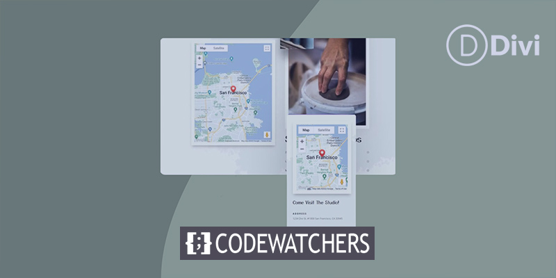
In this comprehensive tutorial, we will walk you through the step-by-step process of adding a sticky map module to your Divi page. By making the map module sticky, you can provide users with a seamless browsing experience, ensuring that the map remains prominently visible even as they scroll down. To enhance the overall user experience, we will also show you how to incorporate relevant information that dynamically scrolls alongside the sticky map.
So, whether you're designing a travel website, a real estate portal, or any other type of site that requires interactive and engaging maps, this tutorial is your gateway to creating a professional and eye-catching web design. Without further ado, let's dive right in and discover the fascinating world of Divi's sticky settings!
Preview
Here is what out design will look like after coming to life.
Create Amazing Websites
With the best free page builder Elementor
Start NowAdd a Sticky Map Module to Your Divi Page
Create New Page From Layout
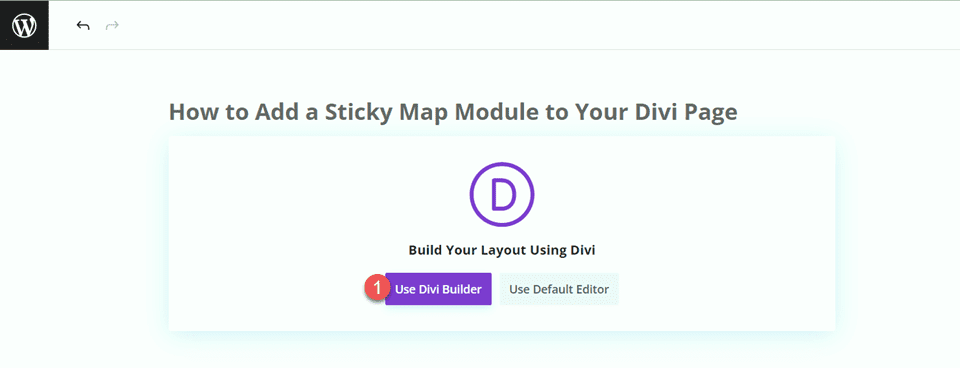
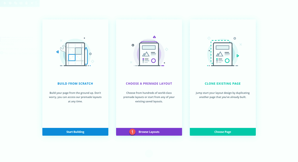
Use a readymade layout from the Divi library to get things started. We'll utilize the Craft School Landing Page from the Craft School Layout Pack for this design. Give a new page on your website a title, then choose to use the Divi Builder option.
For this example, we'll utilize a readymade layout from the Divi library, so choose Browse Layouts.
Search for the Craft School Landing Page and select it.
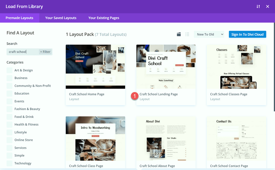
Now select "Use This Layout" and we are ready for the next step.

Modifying the Layout
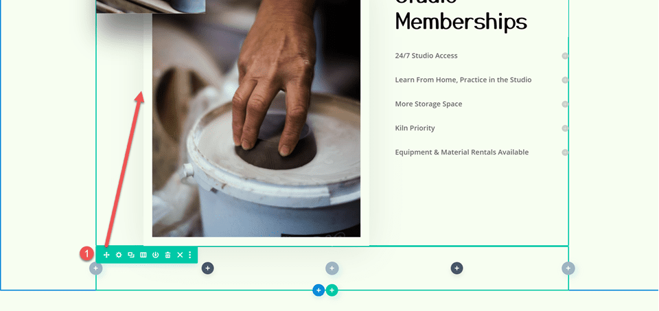
Navigate to the page's "Studio Memberships" section by scrolling. Add a new section below after that.
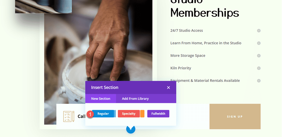
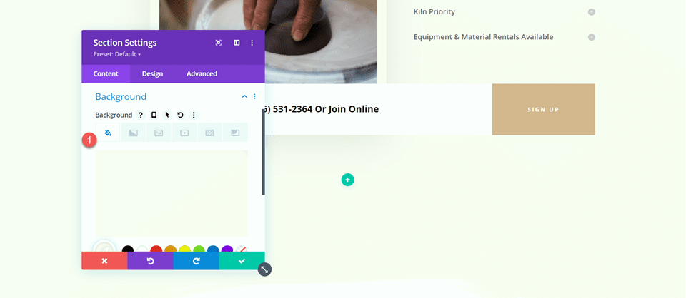
Add a background color by opening the section settings.
- Background: #fcf8f3
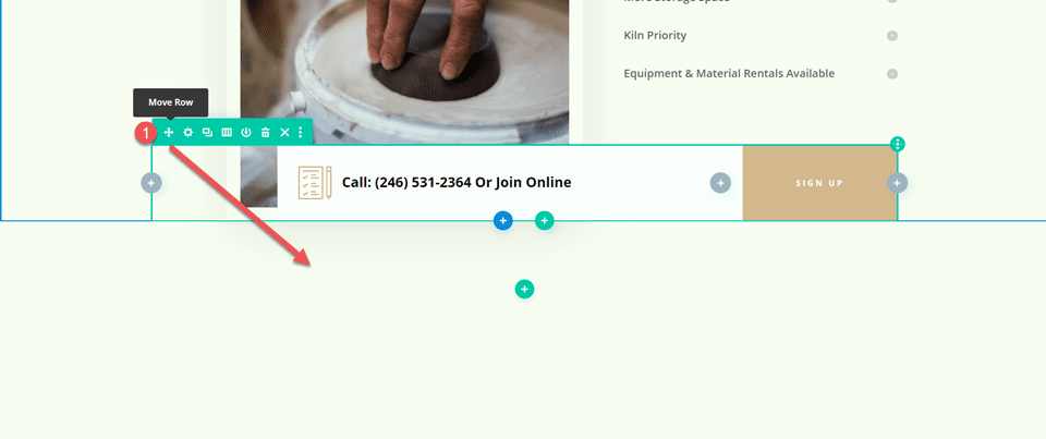
The "Call or Join Online" row should then be moved to this new section.
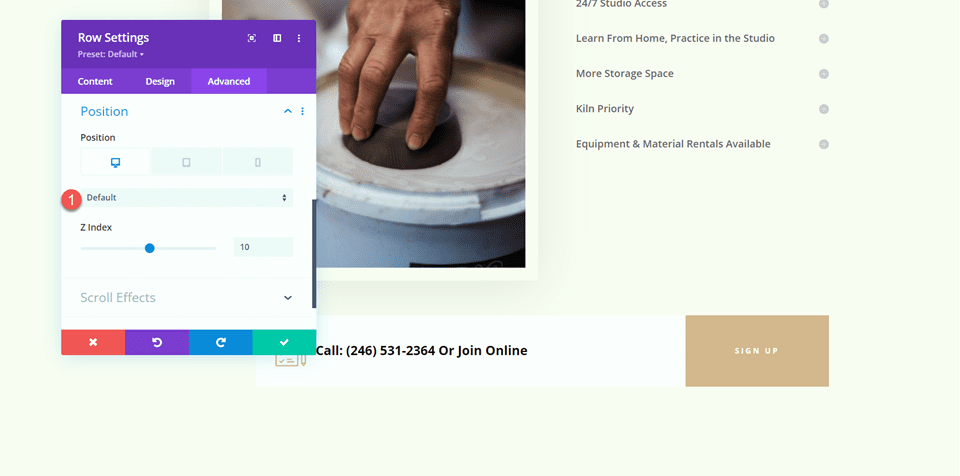
Go to the Advanced tab after opening the row settings. Set the position to Default rather than Absolute under the Position options.
- Position: Default
Below the Studio Memberships section, add a new row with two columns.
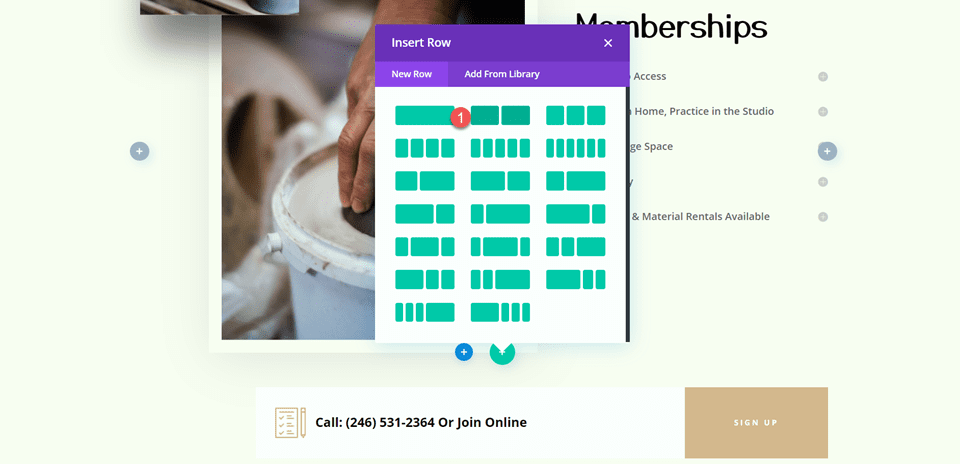
Move that row over to the Studio Memberships section after that.
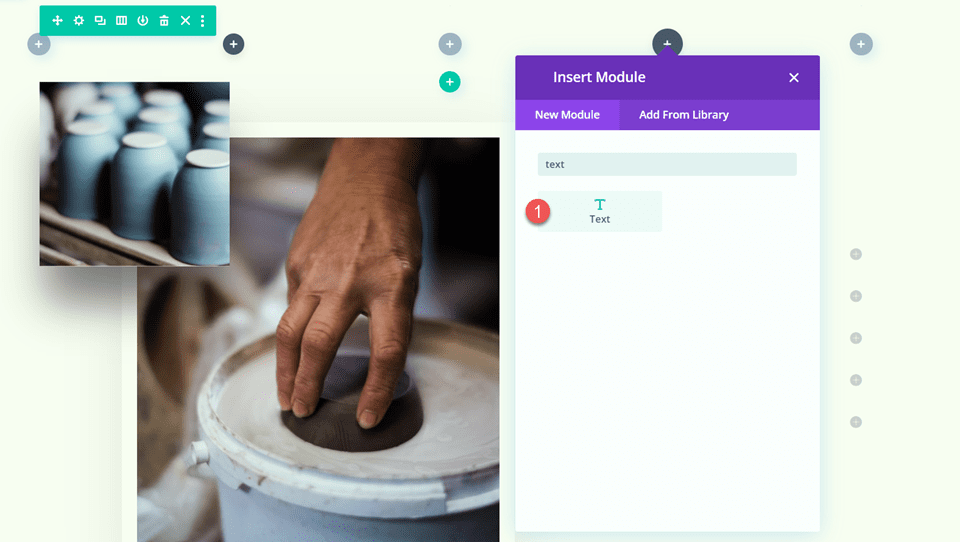
To the right column, insert a text module.
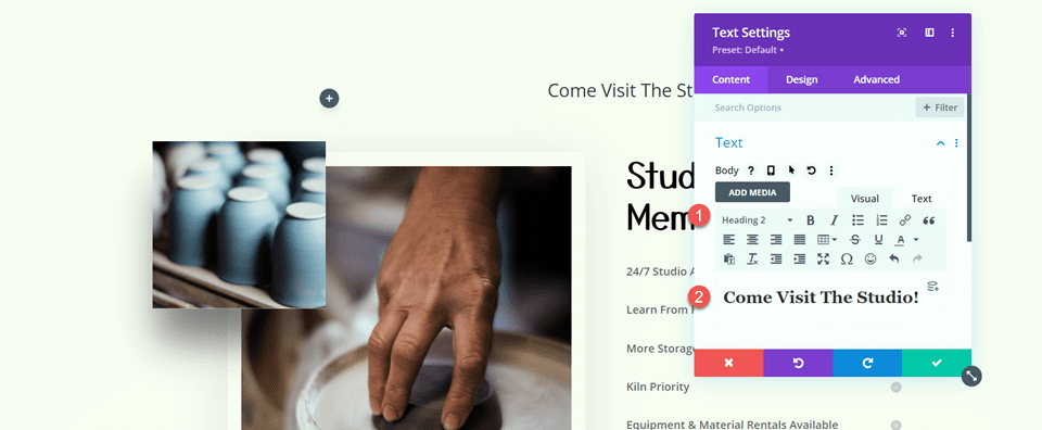
Now add the following text on H2 section - "Come Visit The Studio!"
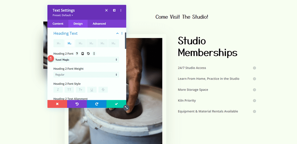
The header text options can then be accessed by going to the Design tab. Change the font as needed:
- Heading 2 Font: Yusei Magic
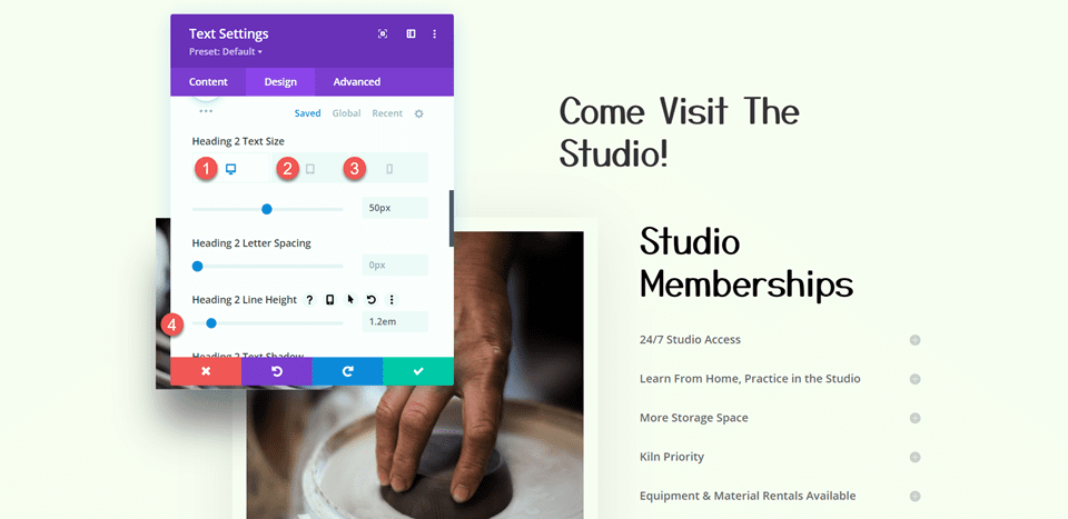
The font size and line height can then be modified. To add multiple font sizes for tablets and mobile devices, use the built-in responsive options.
- Heading 2 Text Size Desktop: 50px
- Heading 2 Text Size Tablet: 30px
- Heading 2 Text Size Mobile: 24px
- Heading 2 Line Height: 1.2 em
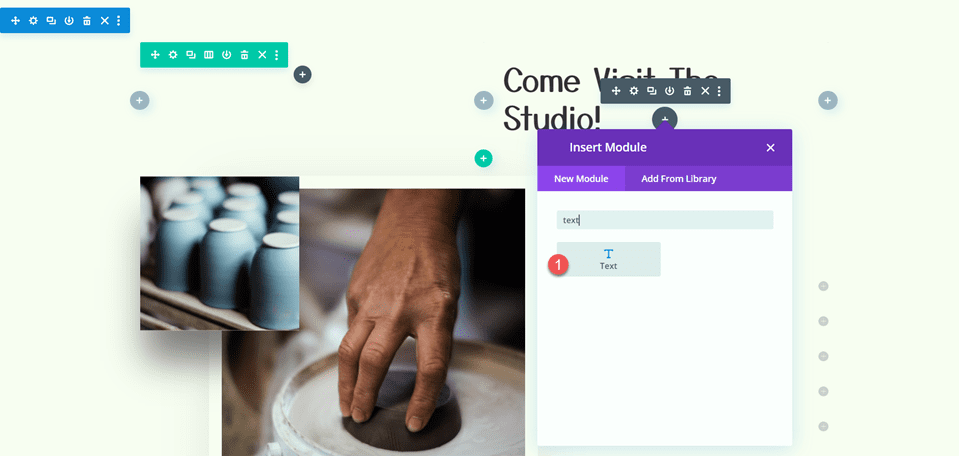
Now add another text module below the previous text module.
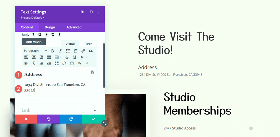
Now add the following text.
- H3: Address
- Paragraph: 1234 Divi St. #1000 San Francisco, CA 33945
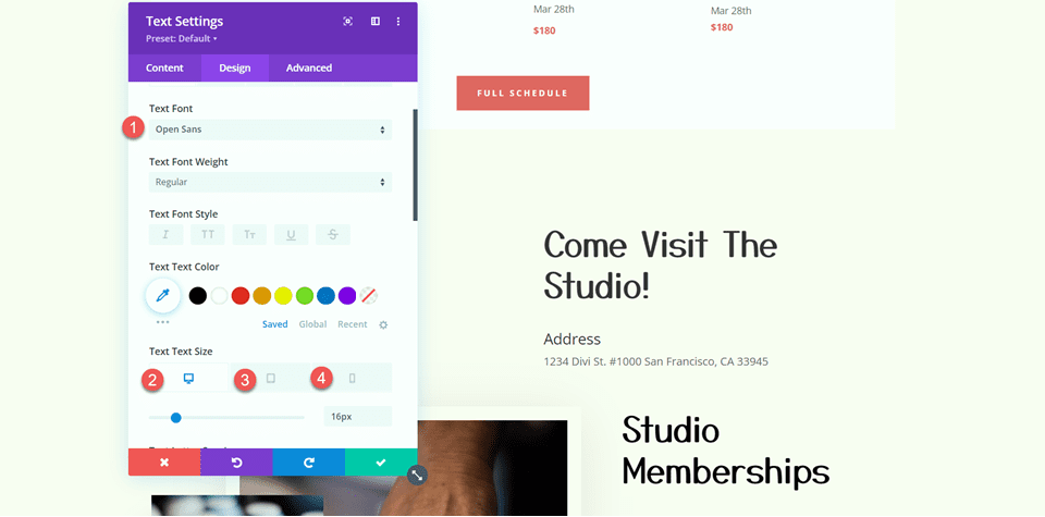
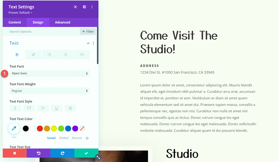
From the design tab, change style for the text.
- Text Font: Open Sans
- Text Size Desktop: 16px
- Text Size Tablet: 15px
- Text Size Mobile: 13px
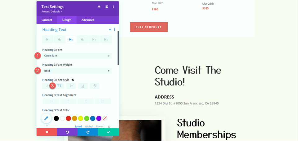
Now change the heading style.
- Heading 3 Font: Open Sans
- Heading 3 Font Weight: Bold
- Heading 3 Font Style: Capitalized (TT)
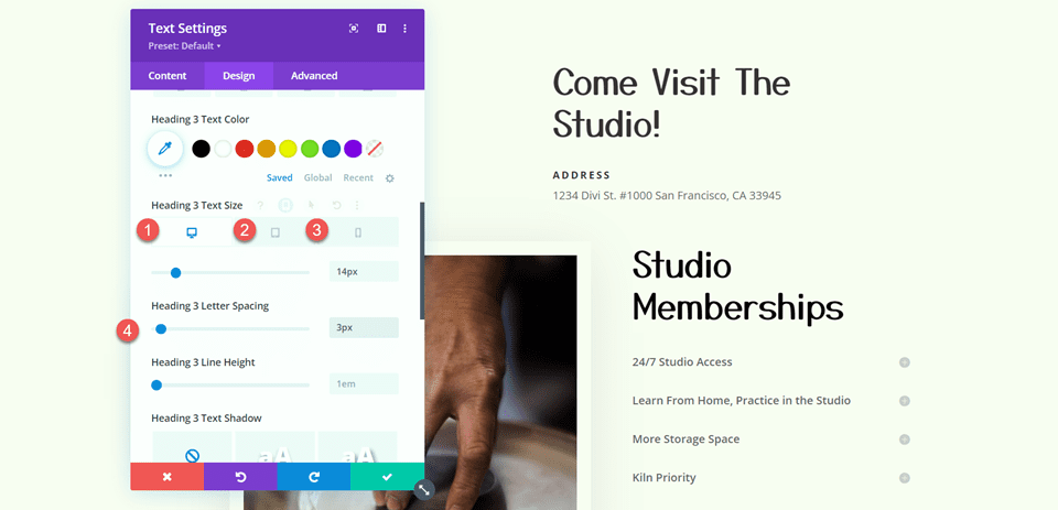
Change the font size and letter spacing after that. Again, select different font sizes for various screen widths using the responsive settings.
- Heading 3 Text Size Desktop: 14px
- Heading 3 Text Size Tablet: 13px
- Heading 3 Text Size Mobile: 12px
- Heading 3 Letter Spacing: 3px
Now add another text module below it and add some text.
From the design tab, change the font style.
- Text Font: Open Sans
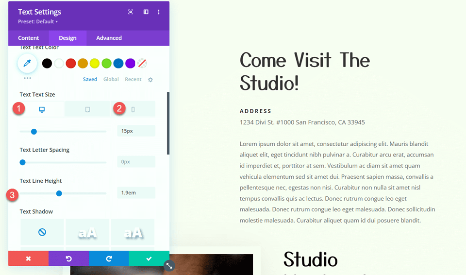
Now change the size of the text and the line height.
- Text Size Desktop: 15px
- Text Size Mobile: 13px
- Text Line Height: 1.9em
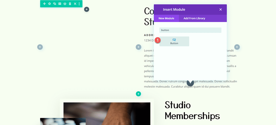
Now we will add a button below the text.
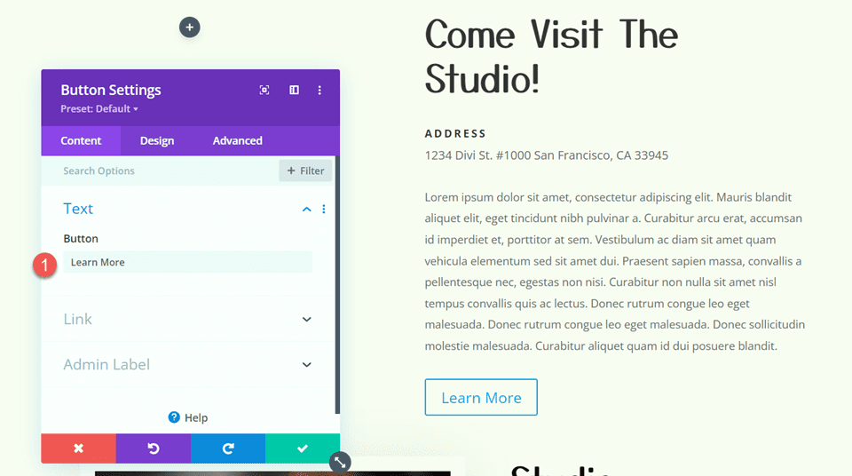
Change the button text to "Learn More"
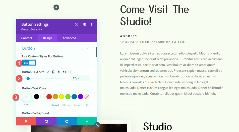
Now from the design tab, open settings for the button and enable custom styles. Also, make the following changes.
- Use Custom Styles For Button: Yes
- Button Text Size: 12px
- Button Text Color: #FFFFFF
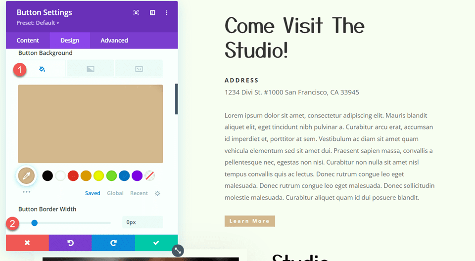
Change the button background and it border width.
- Button Background: #d5b38e
- Button Border Width: 0px
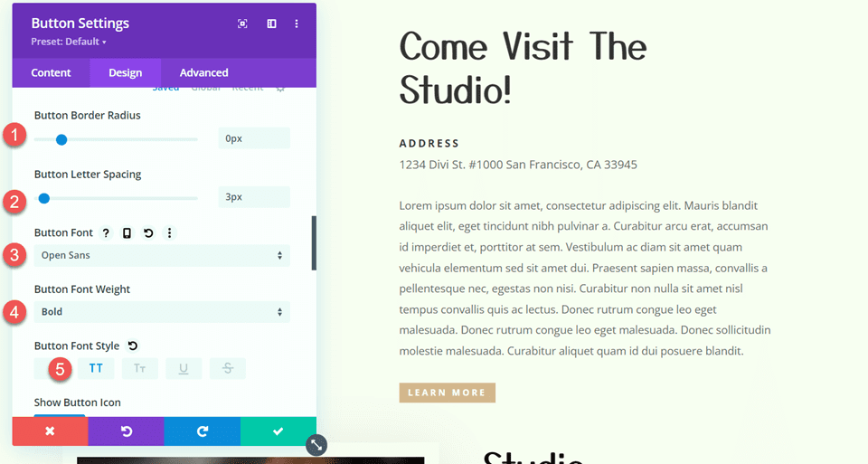
Also make the following changes, mentioned below.
- Button Border Radius: 0px
- Button Letter Spacing: 3px
- Button Font: Open Sans
- Button Font Weight: Bold
- Button Font Style: Capitalized (TT)
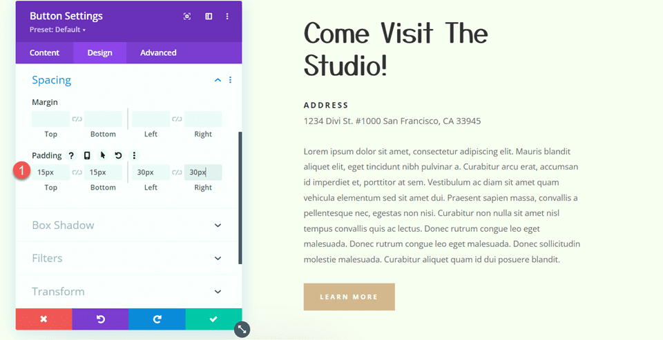
Also, add padding to the button.
- Padding-Top: 15px
- Padding-Bottom: 15px
- Padding-Left: 30px
- Padding-Right: 30px
We will now make changes to the Studio Memberships area. The row layout should first be changed to two equal columns.
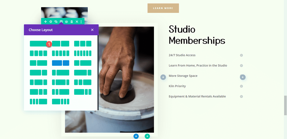
Place the huge image above the text module that says "Studio Memberships" in the right column.
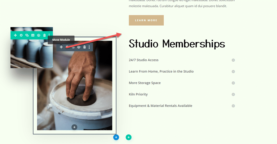
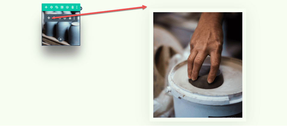
In the right column, place the small scrolling image of the pottery above the sizable picture we relocated.
For the small image, access the module settings. Use the responsive options under Sizing to establish a different width for mobile devices.
- Width-Mobile: 35%
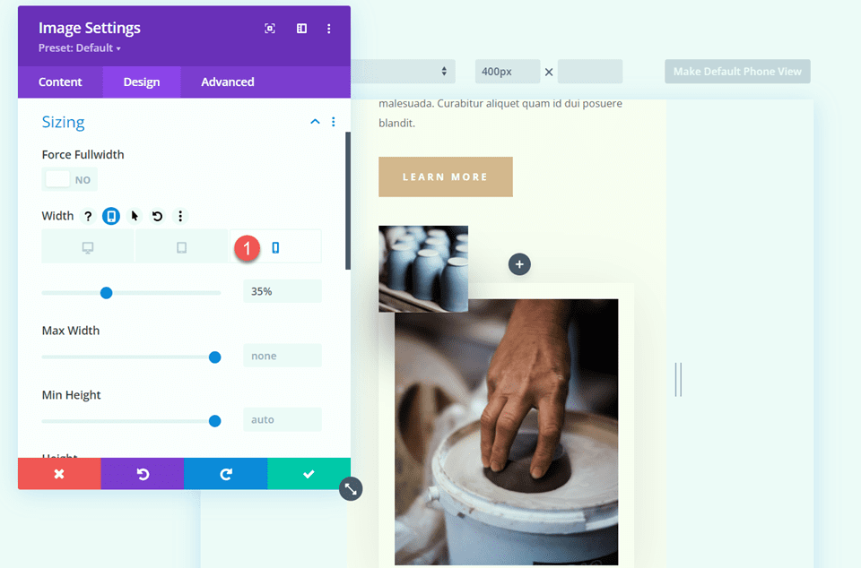
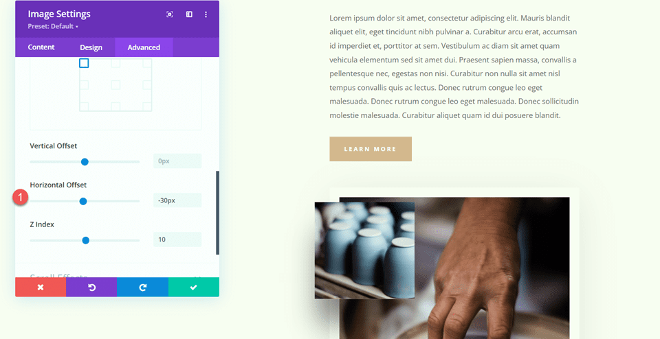
Open the Position settings in the Advanced tab and add some horizontal offset. As a result, the layout is more interesting and the small image can dangle over the edge of the larger image, adding dimension.
- Horizontal Offset: -30px
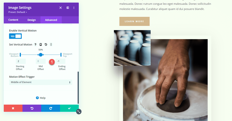
Open the scroll effects, then modify the vertical motion's ending offset.
- Ending Offset: -1
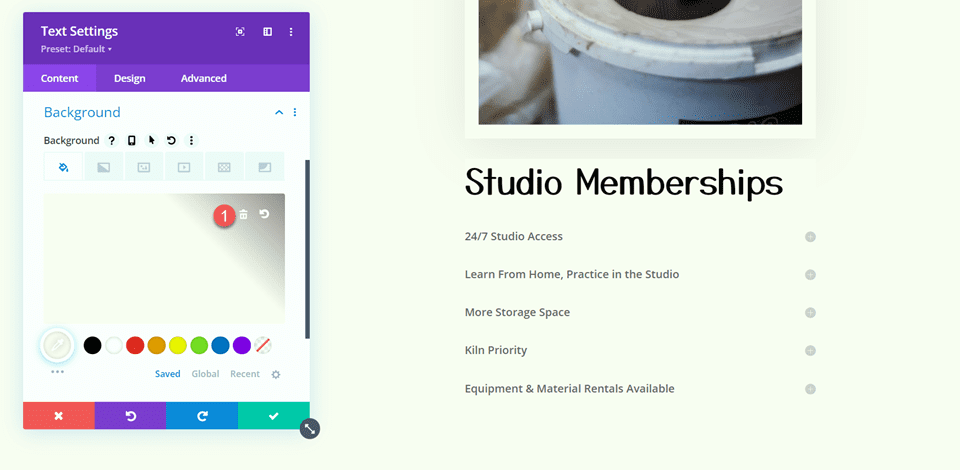
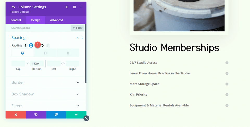
Open the text module settings for Studio Memberships. Take out the backdrop from the module.
Access the row configurations and access the settings for column 2.
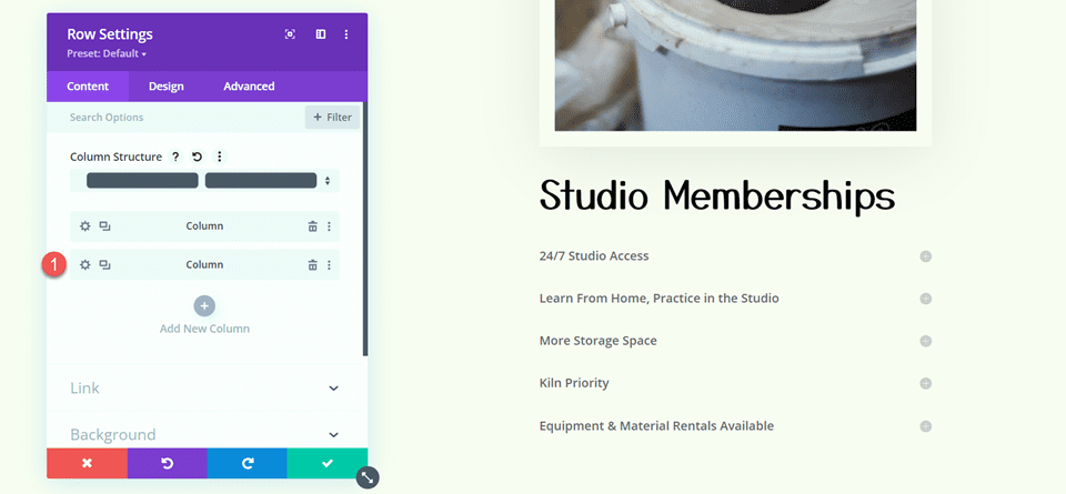
From the Design tab, within the Spacing settings, eliminates the current padding at the bottom.
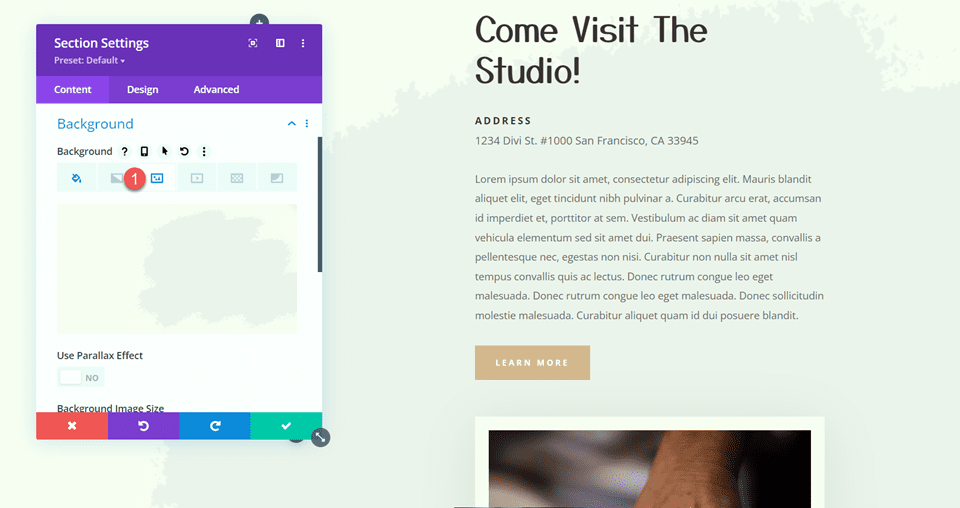
Next, from the section settings, we need to do some modifications. In the background options, include an image as the backdrop. Choose the image craft-school-24.png from your collection of media.
Sticky Map Module
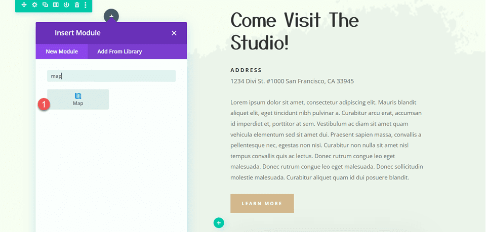
Now that we've changed our layout, we can add the sticky map module. The map module will appear in the left column and will stay there while you browse through the items on the right. Let's get this party started. First, add a map module to the "Come Visit The Studio" row's left column.
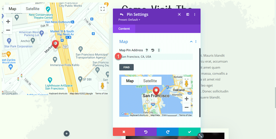
Open the map settings and input the address of the map center. We will center the map on San Francisco, CA for this example.
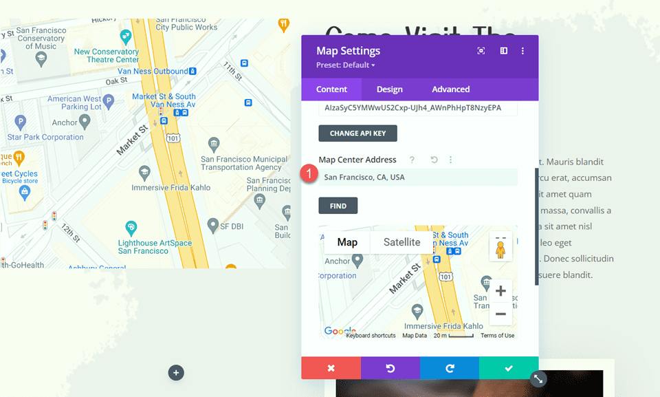
Then, place a pin on the map. This will also be set to San Francisco, CA.
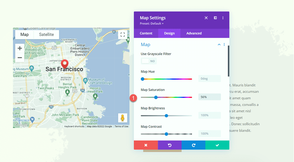
Open the map options under the design tab. These options allow you to totally change the appearance of your map. For this tutorial, we'll change the map saturation to reflect the muted hues of this website.
- Map Saturation: 56%
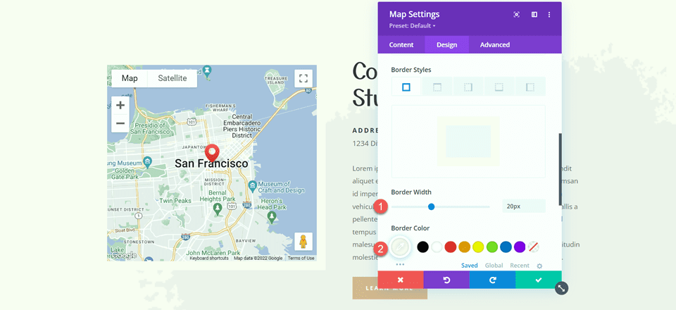
Next, enter the border settings and make the following changes to the border:
- Border Width: 20px
- Border Color: #fcf8f3
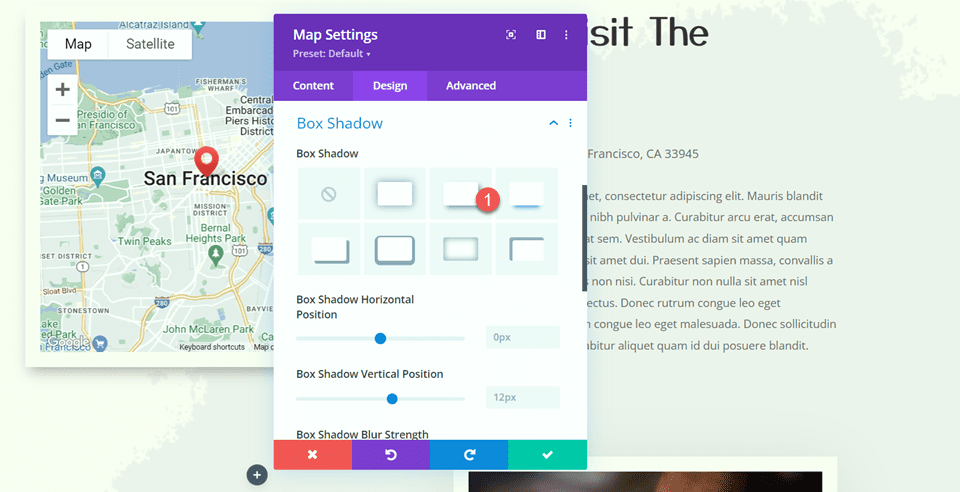
Add a shadow to the map module by opening the Box Shadow options.
- Box Shadow: Below
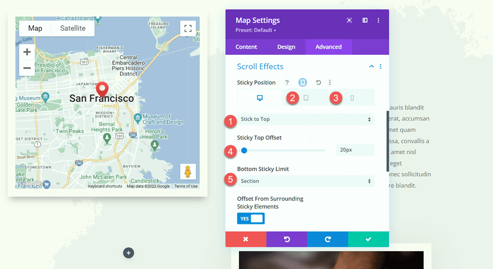
Now, let's add the sticky settings to keep the map in place while you scroll. Navigate to the Advanced tab and click the Scroll Effects Settings button. Because the map will not be sticky on mobile devices, use responsive options to adjust the sticky position settings.
- Sticky Position Desktop: Stick to Top
- Sticky Position Tablet and Mobile: Do Not Stick
- Sticky Top Offset: 20px
- Bottom Sticky Limit: Section
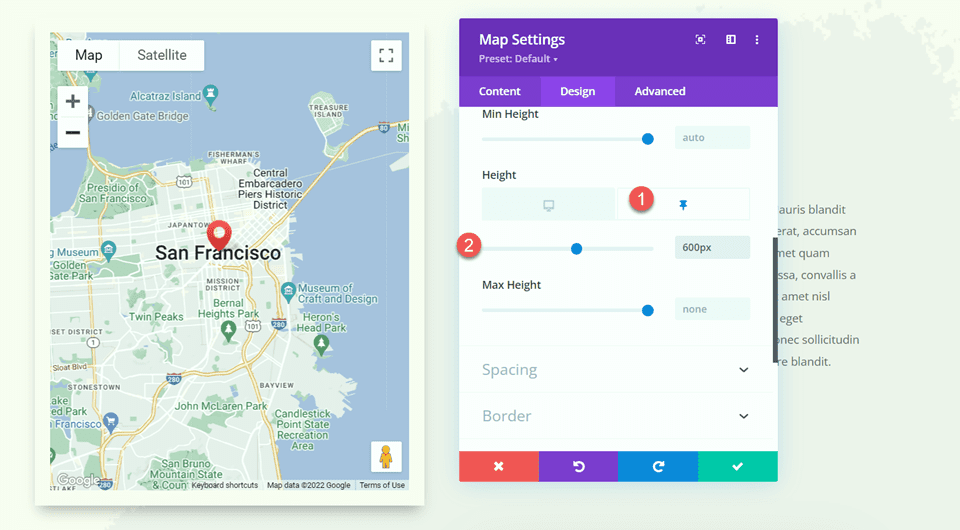
Return to the Design tab and open the sizing options. When the map gets sticky, we want its height to increase. To change the height, use the sticky settings.
- Height when Sticky: 600px
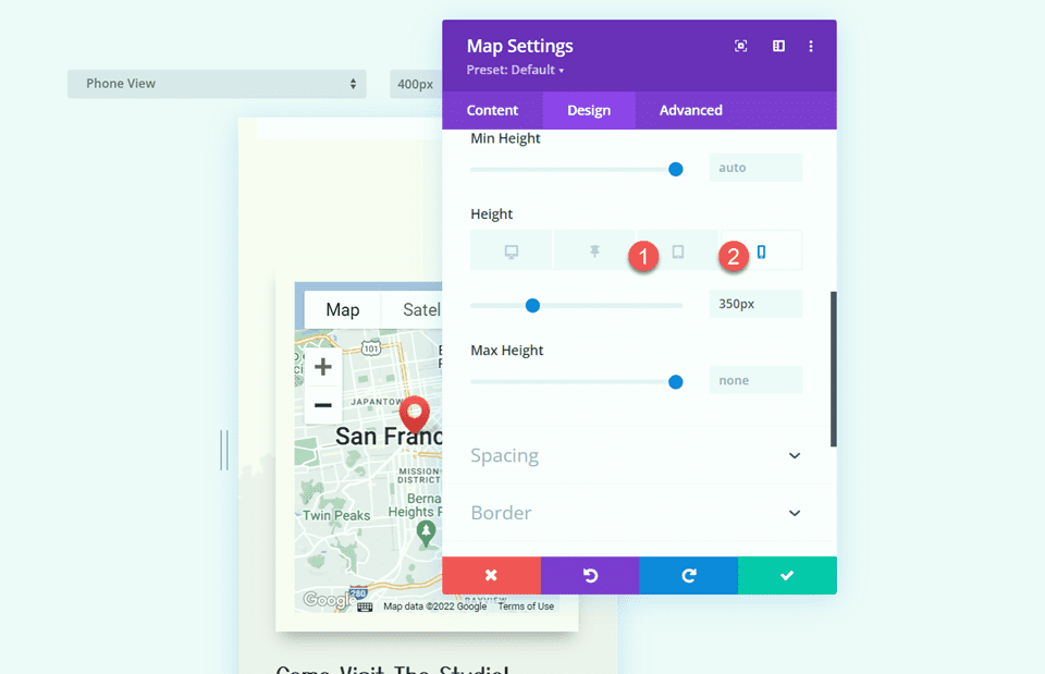
Finally, on tablet and mobile, alter the map size using the responsive settings.
- Height Tablet and Mobile: 350px
Final Output
Now let's see how our sticky map module works.
Wrapping Up
The sticky settings in Divi allow you to create dynamic website layouts that capture your attention with movement. You may make any element on your website sticky and adjust the look exactly to your desire with all of the customization tools provided. We highlight the location information for the website and provide a distinctive design feature to the page by making the map module sticky in this design.