
In various scenarios, there might be a need to place Divi buttons side by side. For instance, in landing page headers, presenting an attention-grabbing call-to-action is effective, and dual buttons are a popular choice. When working with Divi, there are multiple approaches to achieve this desired outcome. You can use columns, apply some CSS, or opt not to use the native Divi Button Module at all. Let's go through the best method to assist you in getting your Divi buttons to align seamlessly.

Adding Button Module Side By Side In Divi
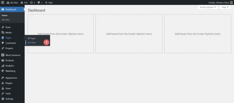
To begin, let's install the page layout where we are going to work. Start by creating a new page in WordPress. In the WordPress dashboard, hover over the Pages menu on the left-hand side, then click on Add New.
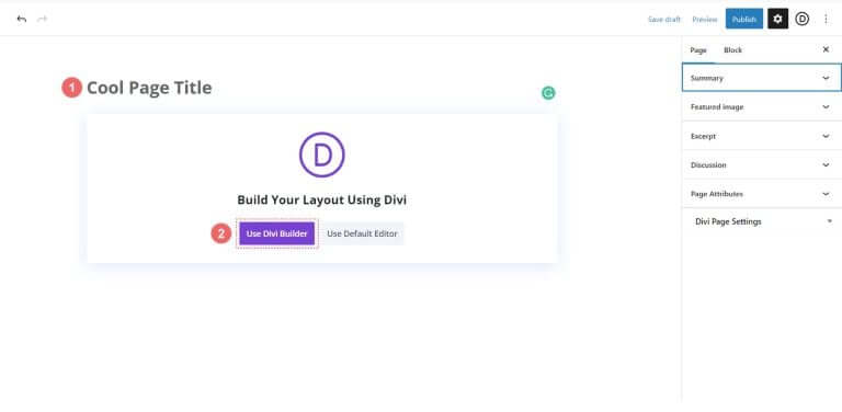
Once in the default WordPress editor Gutenberg, give your new page a title. Next, click on the purple Use Divi Builder button.
You'll see three options. Click on the purple middle button, Browse Layouts.
Create Amazing Websites
With the best free page builder Elementor
Start Now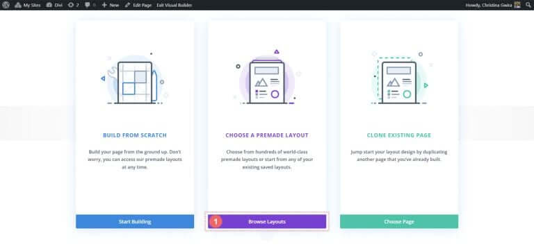
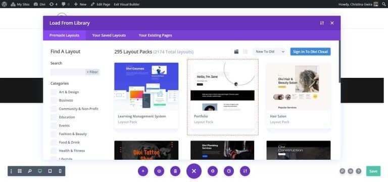
This action will open Divi's extensive layout library, which includes pre-designed pages for you to choose from. Choose the Portfolio Layout Pack.
From the Portfolio Layout Pack, select the About Page Layout.
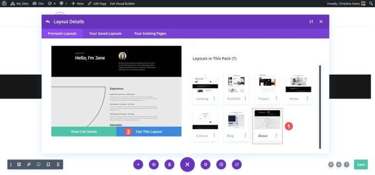
Then, click on the blue Use This Layout button. Wait for the layout to be installed on your new page.
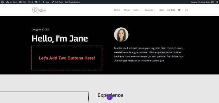
Finally, click the green Publish button to make your page and the new layout live. We'll focus on the layout's black Header section for most of our tutorial. Let's get started!
Use Columns to Add Divi Buttons
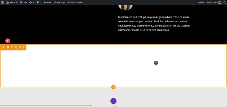
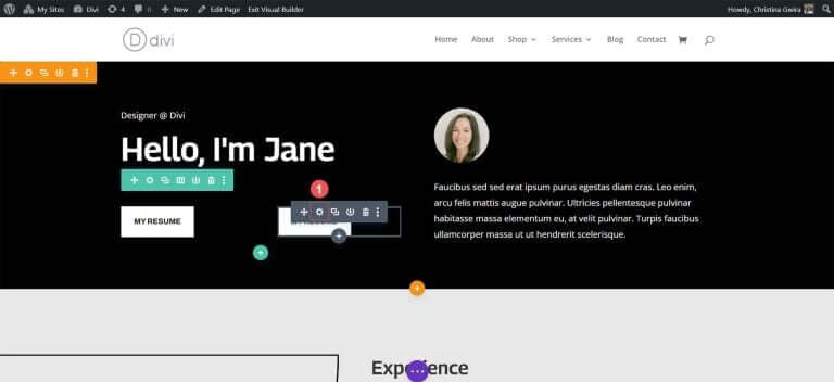
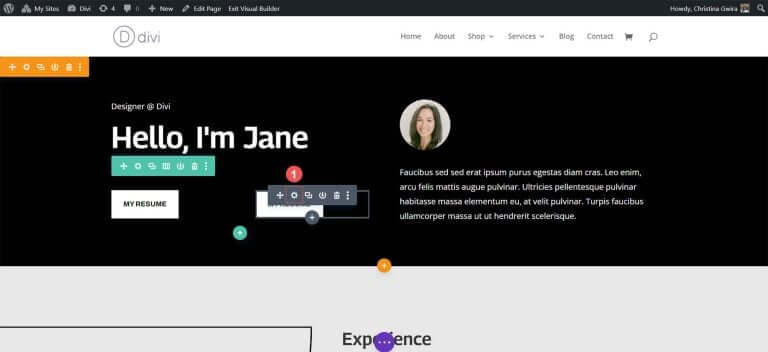
In our page layout, the header section has two columns. We'll redesign this section using a Specialty Section to add two Button Modules side by side in the first column.
First, click on the blue plus icon to add another section. Choose a Specialty Section by clicking on the red and orange Specialty Section icon.
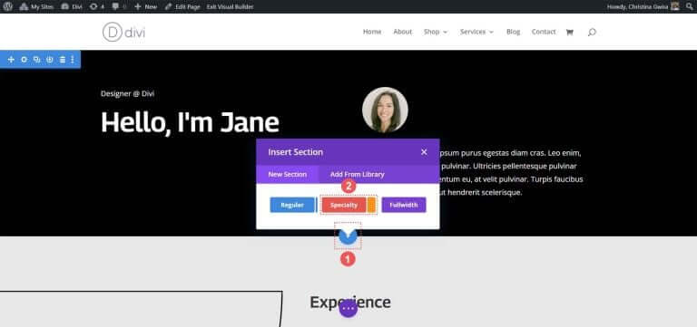
Upon clicking, you'll see a selection of sections. Specialty sections, unlike regular ones, allow you to combine different column structures within a column. This is how we'll place two Button Modules side by side. Select the first row and column combination.
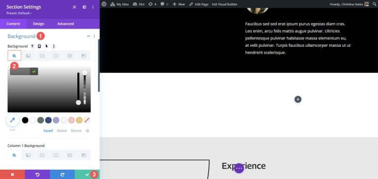
This setup enables us to extend our page header across the full width of the column and place two Button Modules side by side underneath. Since we are recreating the default header within this layout pack, let's give the section a black background color. Hover over the orange section and select the gear icon to open the section settings.
Scroll down to the Background tab. Pick the color #000000 for the section background. Click the green checkmark at the bottom to save your styling choice.
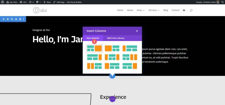
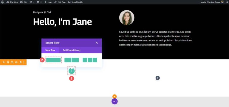
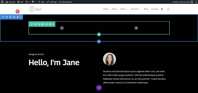
With our section created and styled, click the green plus icon in the first column. Next, select a one-column layout.
Now that our first row is in place, drag the contents of the first column from the initial header section into this row.
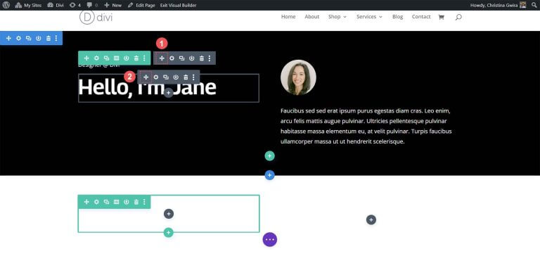
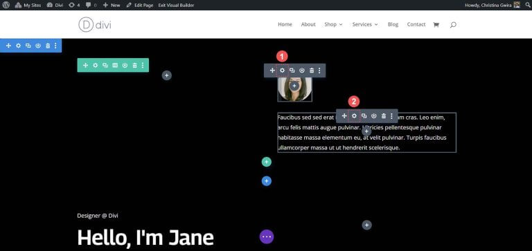
Repeat this process for the contents of the second column. Click on the move arrow icon, drag the Image Module and the Text Module into the second column of the new specialty section.
After moving the necessary modules, you can delete them from the original section. Hover over the section menu and click on the trash can icon. This will remove the section along with its row.
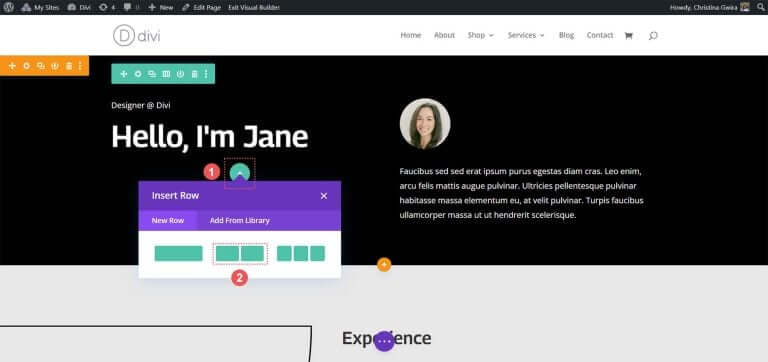
In the first column of our specialty section, click on the green plus icon to add a second row. Choose the two-column layout icon.
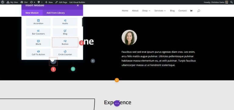
Now, add a Button Module to each column of this new row. Click the grey plus icon, then select the Button Module icon to add a button to the first column.
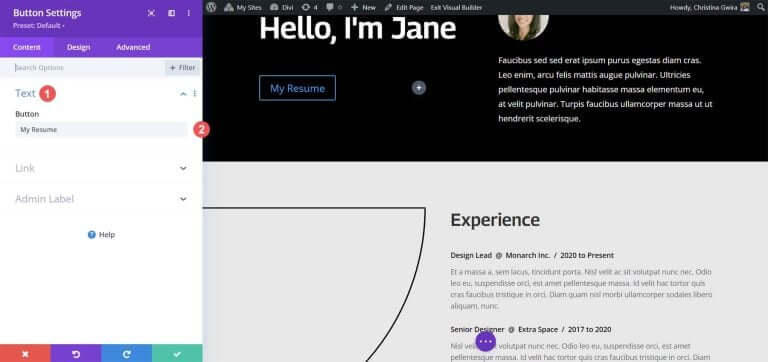
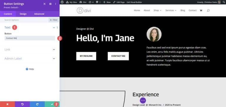
In the Content tab, update the button’s Text to suit your needs. For example, we changed the text to say "My Resume."
Next, go to the Design tab, then click on the Button tab. Use the following settings to style the button.
Button Design Settings:
- Use Custom Styles for Button: Yes
- Button Text Size: 14px
- Button Text Color: #000000
- Button Background: #ffffff
- Button Border Width: 0px
- Button Font: Archivo
- Button Font Style: All Caps
- Show Button Icon: Yes
- Button Icon: Default
- Button Icon Placement: Right
Now, add padding to the Button Module. Click on the Spacing tab and set the following padding settings:
Spacing Design Settings:
- Top and Bottom Padding: 16px
- Left and Right Padding: 24px
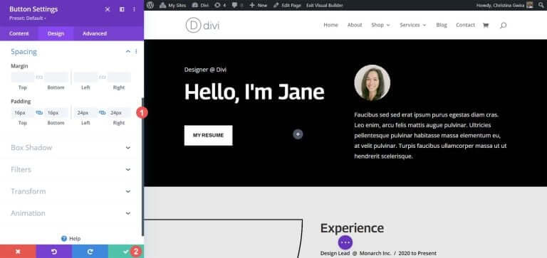
Click the green check mark to save your styling options.
Let’s create and place our second button next to the first one. Hover over the first button, click the copy icon to duplicate the module.
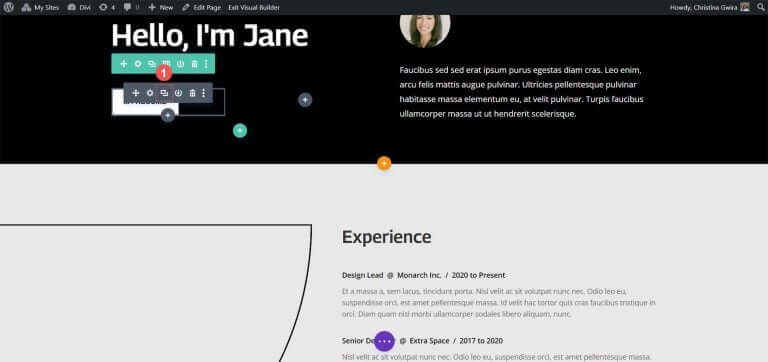
Drag the duplicated module to the second column.
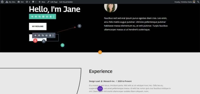
Now, with the second Button Module in place, click on the gear icon to open the settings for this button.
In the Content tab, edit the button’s text to fit your needs.
Once in the Button Module’s settings, update the button’s text. Finally, click the green check mark to save your edits to the second button.
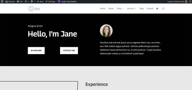
In the end, you will have two Button Modules side by side.
Wrapping Up
Divi provides built-in tools for customizing its native modules. Whether you're using a regular section or one of the specialty sections, you can easily add buttons next to each other. If you prefer a more technical approach to design without compromising user-friendliness, CSS is at your disposal. For those who want to avoid dealing with multiple modules, the Fullwidth Header module comes in handy for placing buttons side by side. Additionally, you can explore the Divi Marketplace to discover plugins featuring dual or multiple buttons or call-to-action modules, enabling you to have your buttons positioned next to each other.


