
Divi's new background masks and patterns are one of the most exciting new design elements they added to the theme. Each mask and pattern can be mixed with various backdrop elements (such as colors, photos, and gradients) to create an infinite number of unique combinations in a matter of clicks.
Today, we're going to demonstrate how to create a hero section using Divi's new background masks and patterns. We'll cover the critical stages required to build backdrop masks and patterns in this lesson. Additionally, we'll demonstrate how to arrange background pictures to complement a mask design. This should provide you with the necessary tools to quickly design the ideal hero section for your site.
Design Layout
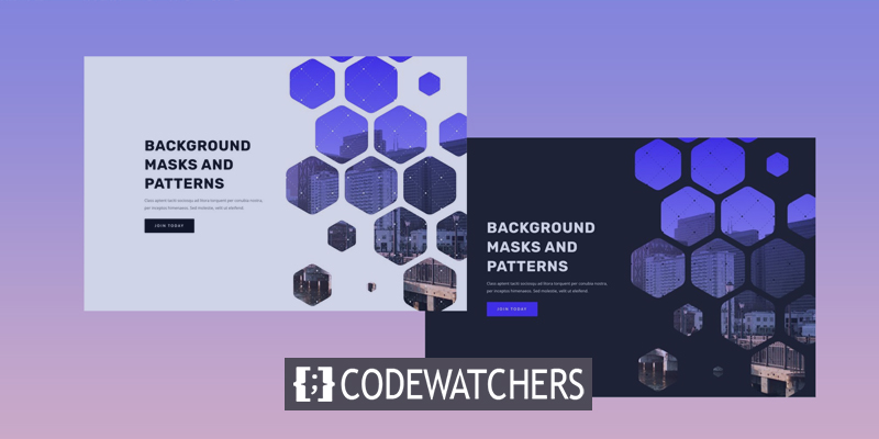
This is a brief overview of the design we'll construct in this tutorial.
The following is an illustration of a hero section with a white mask and pattern.
Create Amazing Websites
With the best free page builder Elementor
Start Now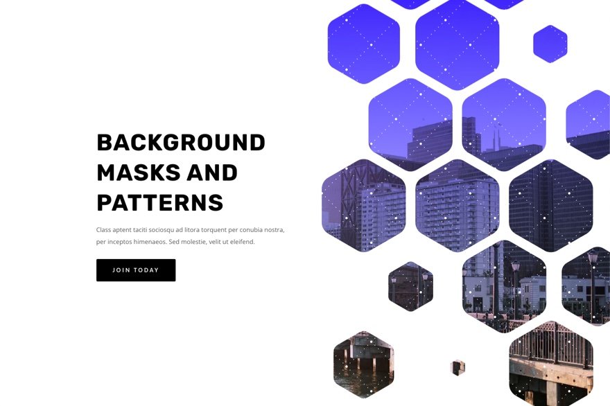
With this design in place, changing masks and mask positions is as simple as a few clicks!
Design Procedure
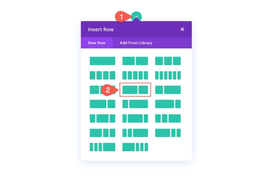
Create a new page and select to edit with Divi builder. Then select build from scratch.
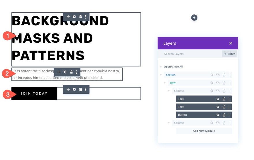
Create the Layout Structure
We're going to use a classic layout structure for this hero section, with the headline and call to action on the left and a picture (or visual design) on the right. For this design, we'll utilize Divi's background options. But before we do so, we need to establish a two-column row to provide room on the right side of the page for our section backdrop masks and patterns design.
Add Content
Text modules for your main heading, text modules for your subheadings, and a button module for your button should all be placed in the left column (column 1).
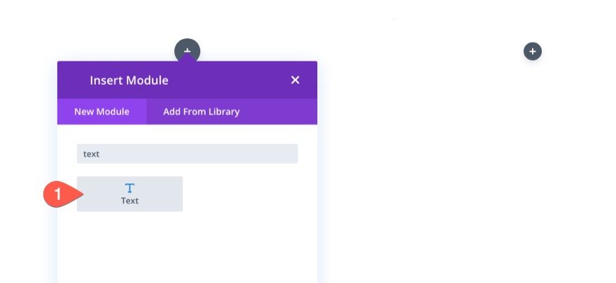
Add content to all the modules.
You can download the layout and look at it at a later time if you want to learn more about the individual design parameters. We'll focus on the background design for the time being.
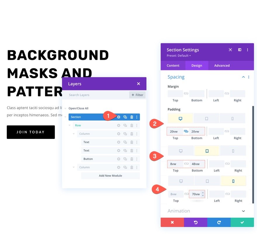
Vertical Spacing
Adding vertical height to the section is necessary to make our background design appear larger and more appealing. To accomplish this, simply add padding to the top and bottom of the area. To accommodate our backdrop design when the columns stack vertically, we will need to change the padding for tablet and phone displays.
Go to the section's settings page. The padding in the design tab should be changed as follows:
- Padding: 20vw top, 20vw bottom
- Padding (tablet): 8vw top, 48vw bottom
- Padding (phone): 8vw top, 70vw bottom
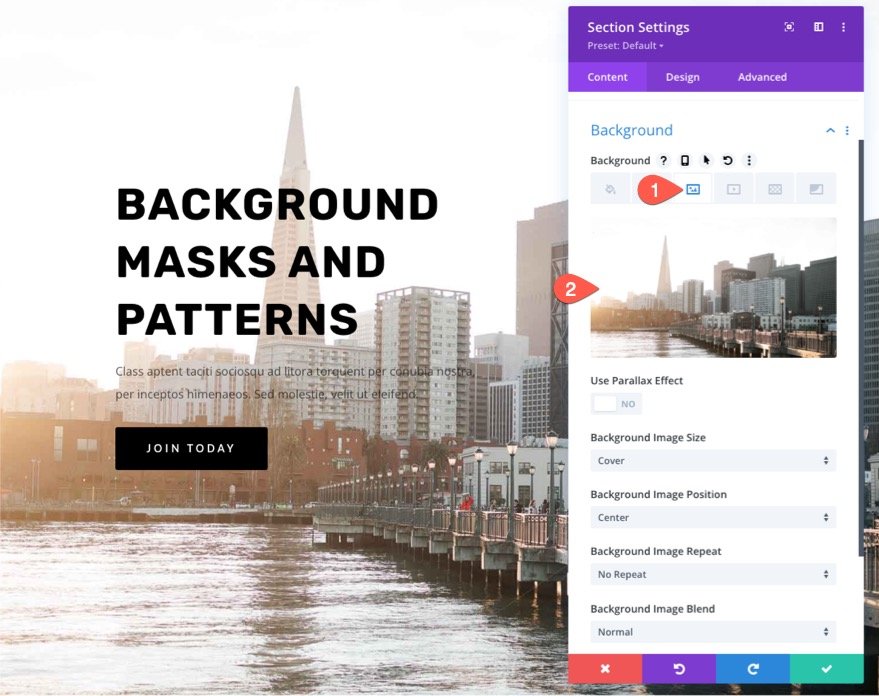
Background Image and Gradient
Next, we'll decorate the area with a background image and gradient. Remember that the right side of the section will display the major focal point of the backdrop image, so choose an image with the right side showing what you want to view. We'll use a picture of a city skyline for this example. There are a lot of visually appealing structures on the right side of the photograph thus it's a good fit.
Upload the image to the background section under the image tab.
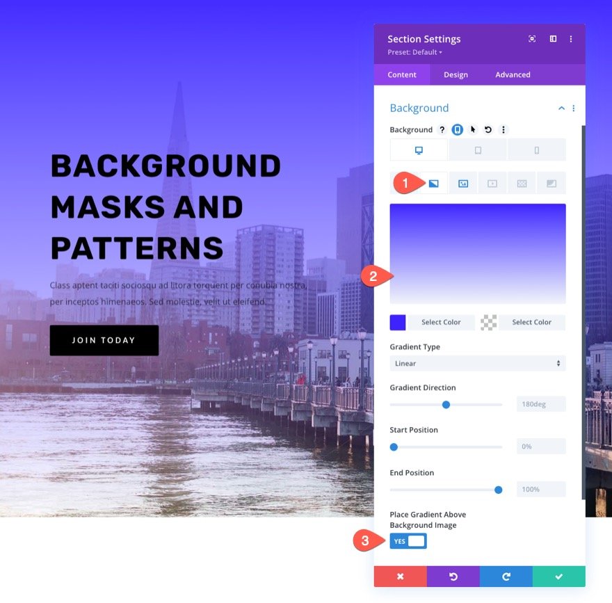
Adding a color gradient to a backdrop image is a cinch with Divi. Add the following gradient to the section background in the gradient tab:
- Left Gradient Color: #3e22ff
- Right Gradient Color: transparent
- Place Gradient Above Background Image: YES
Background Pattern for the Section
It is time to finish the design by adding a backdrop pattern to go along with the gradient we created for our background image. Using a minor pattern that merely adds a touch of texture, we'll create a more unique look in this example.
Below the patterns tab, update the following:
- Background Pattern: Tufted
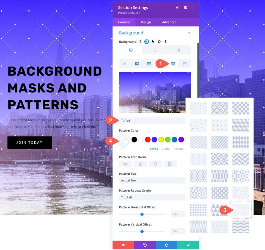
In general, it's recommended to maintain background patterns as modest as possible. The opacity of the color can be reduced by utilizing custom sizes for smaller patterns.
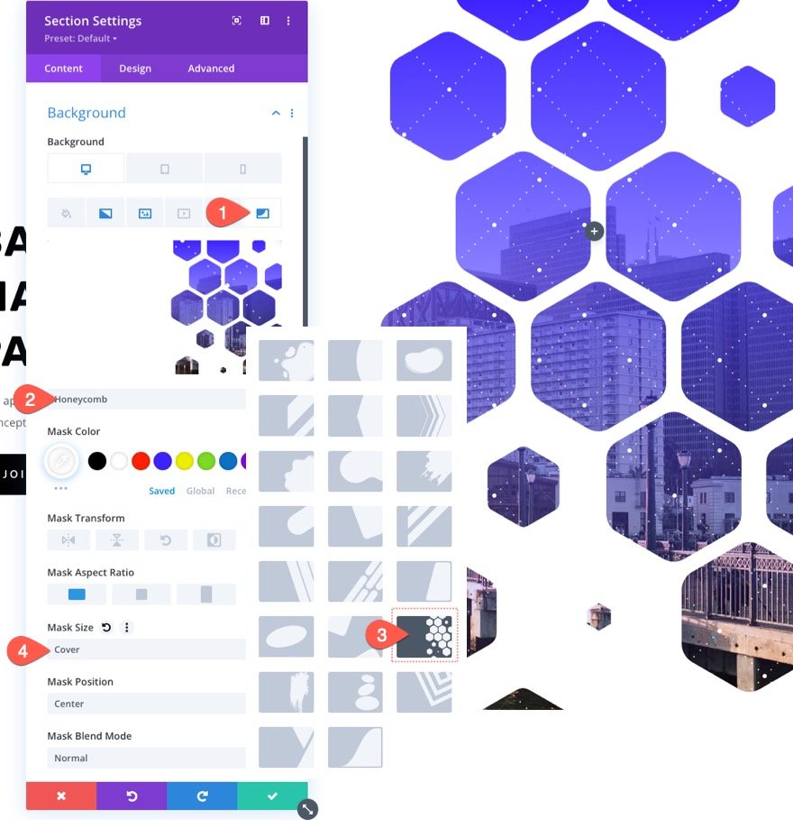
Background Mask for the Section
We're finally ready to test out a new background mask for our design now that we've got our background pattern in place. Many options and variations are available. We'll use a honeycomb mask as an example here.
The masks tab should be updated as follows:
- Mask: Honeycomb
- Mask Color: #ffffff
- Mask Size: Cover
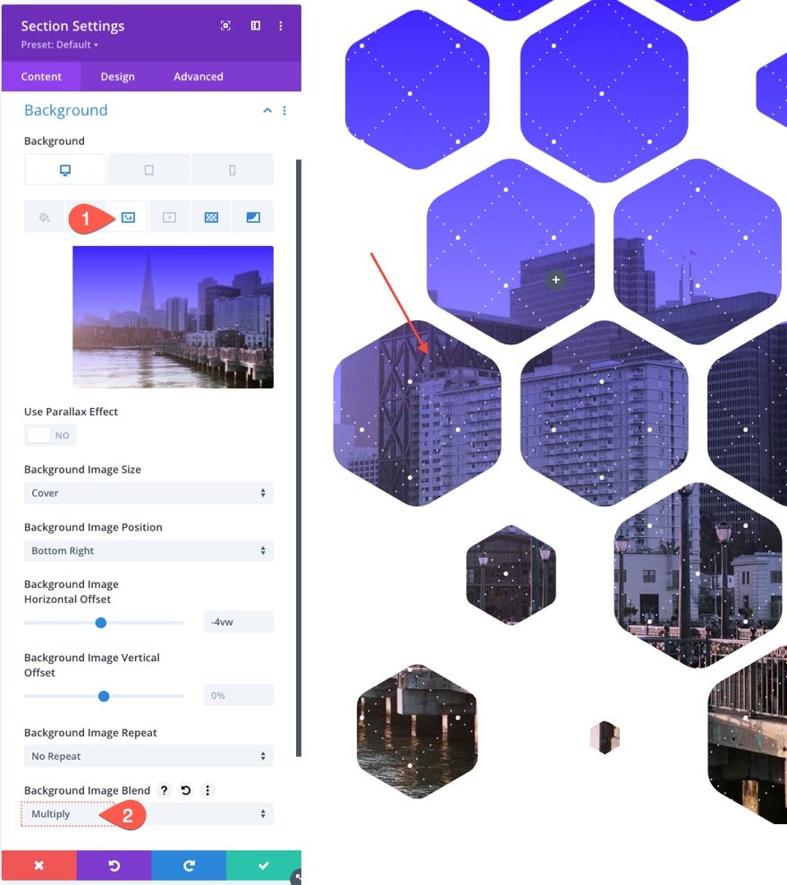
Adjust Background Image
Backdrop masks allow us to hide (or "masked") parts of our background image. In this case, it's possible that you'll have to move the backdrop image so that the mask can see a certain region of it. An easy and effective method of re-positioning the background image is by using the image position and offset controls.
If you look closely at this picture, you'll notice that we've moved it slightly to the right so that more of the structures can be seen.
Under the image, the tab changes the following settings.
- Background Image Position: Bottom Right
- Background Image Horizontal Offset: -4vw
Use a Blend Mode
Adding a blend mode to all of these backdrop pieces is one way to get creative. Blend modes can be used to creatively blend together numerous backdrop layers (images, gradients, masks, etc.) in any of the available backgrounds.
In this case, the gradient color will be used to merge the backdrop image. This may be done by going to the backdrop picture tab, selecting the gradient color, and then adding a blend mode as follows:
- Blend Mode: Multiply
The background gradient is multiplied by the current layer's current blend mode (in this case, the background image). To visualize the effect, think of a slide projector with two slides stacked on top of each other. A darker blend of the two images would be created if you projected them onto a screen.
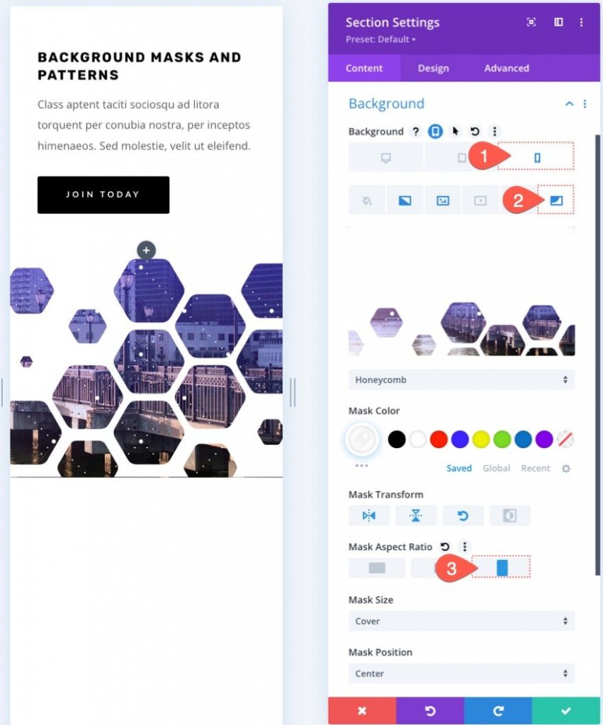
Responsiveness
Designing the backdrop mask in such a way that it appears excellent on mobile devices is also critical. Because of the built-in options, this process is really simple. To make room for our backdrop design, we've already padded tablet and phone screens with an extra layer of padding. The mask can now be optimized for mobile devices simply by adjusting the background transform and aspect ratio parameters.
Activate the responsive options under the mask tab and make the following changes:
On tablet…
- Mask Transform: Flip Vertical, Flip Horizontal, Rotate
- Mask Aspect Ratio: Square
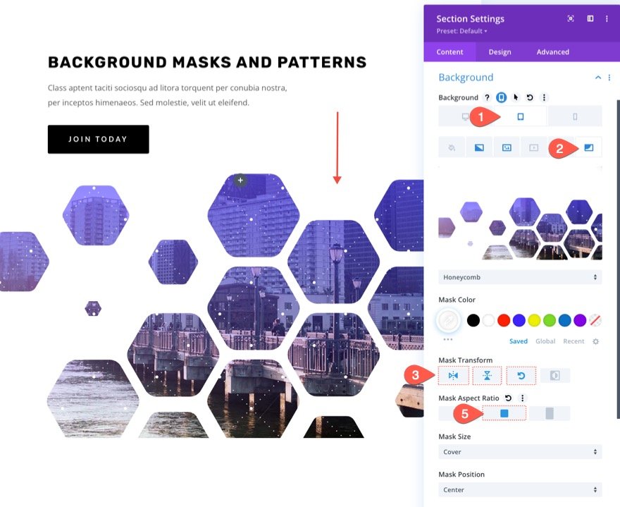
On Mobile…
- Mask Transform: Flip Vertical, Flip Horizontal, Rotate
- Mask Aspect Ratio: Portrait
Dark Version
Simply change the background mask color to a dark hue if you want a dark version of this design (like black). Then, adjust the color of the pattern. To make the headline and subheader text stand out, use white. You may also want to change the color of the buttons. Here's a peek at the dark version.
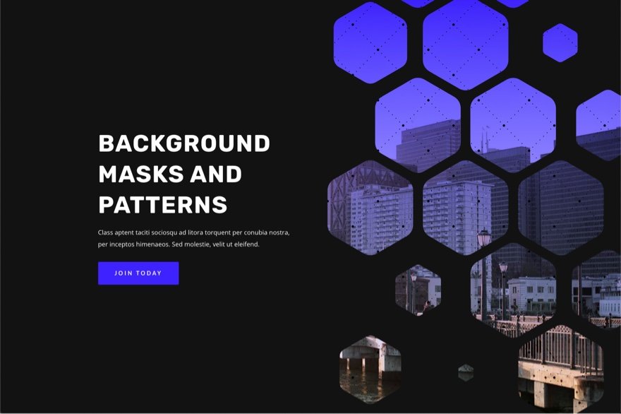
Final Preview
So here is our final design. It's the dark version of our design preview.
Concluding Words
With Divi's backdrop masks and patterns, creating a hero section for your website can be a lot of fun. The backdrop selections are simple to adjust so that the design is exactly what you're looking for. To further customize your background, there is a slew of other options (like blend modes) that you may employ. In addition, not only sections but any Divi element can be decorated with masks and patterns. So go ahead and play around with it!


