
Adding a sticky header to your website is usually a safe bet for larger screens (desktops) because there is more area than on mobile or tablet. Adding a sticky header on mobile devices with tiny viewports (particularly phones) takes a little more skill. You don't want that sticky header taking up too much of the viewport. I mean, there's no point in improving the navigation experience with a sticky header if you can't see the pages you visit. As a result, it is sometimes easier to install a sticky header specifically built for mobile.
This tutorial will teach you how to install a custom sticky header for mobile using Divi. Using Divi's built-in features (including the sticky position options), we'll show you how to display a completely bespoke sticky header that incorporates those important elements (such as a logo, a button, and a menu symbol) without taking up too much space.
Let's get started!
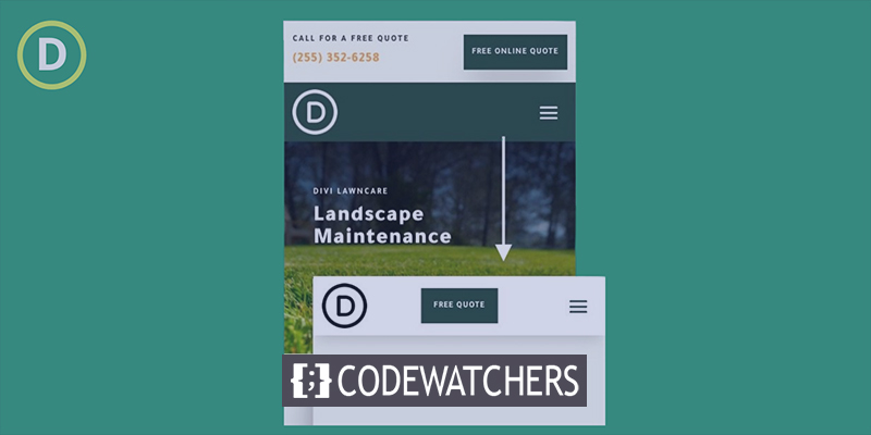
Design Preview
Here is how our design will look on the mobile.
Create Amazing Websites
With the best free page builder Elementor
Start NowTemplate Importing
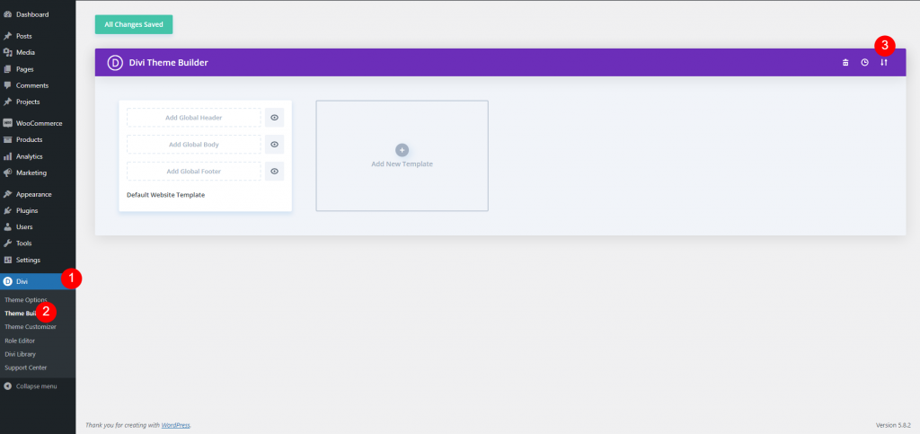
To have this design on your website, Click here to download the file. Go to your dashboard and navigate to Divi > Theme builder and click on the portability icon.
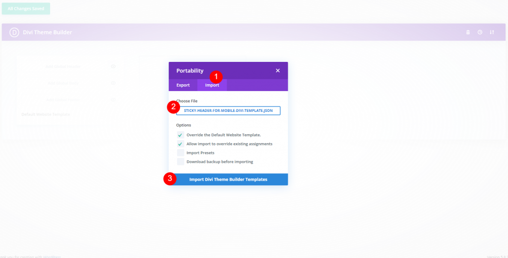
Now click the portability button and a popup window will appear upfront. Move to the import tab and upload the file.
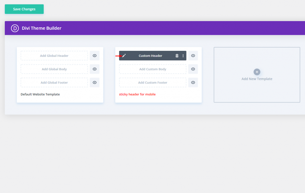
Then it will look something like this.
Optimizing Top Header Element on Mobile
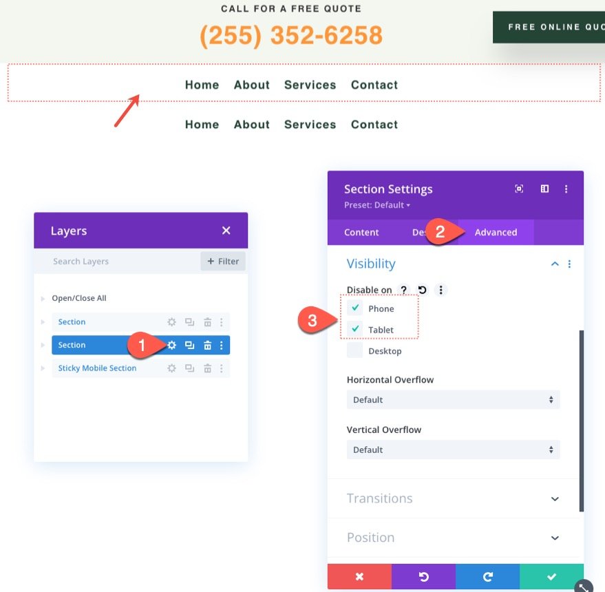
This header layout is divided into two portions. The top area includes a logo, a call to action, and a button. The bottom portion already has a sticky location and contains the menu.
We need to hide the logo in the top area on tablets and phones because we add a logo to a new sticky menu on mobile. To do so, go to the settings for column 1 in the top section's row and, on the advanced tab, pick disable on Phone and Tablet. On mobile, this will hide the whole column and the logo it contains.
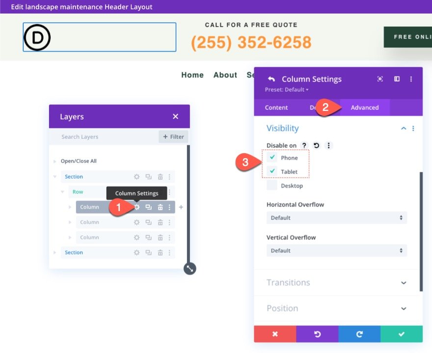
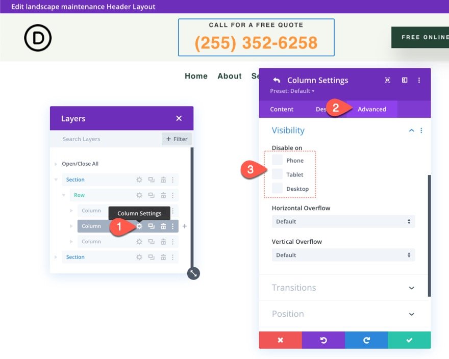
Next, on the same row, check the settings for column 2 and ensure that no devices are disabled. Because our logo will be disabled on mobile, we have space for this call to action.
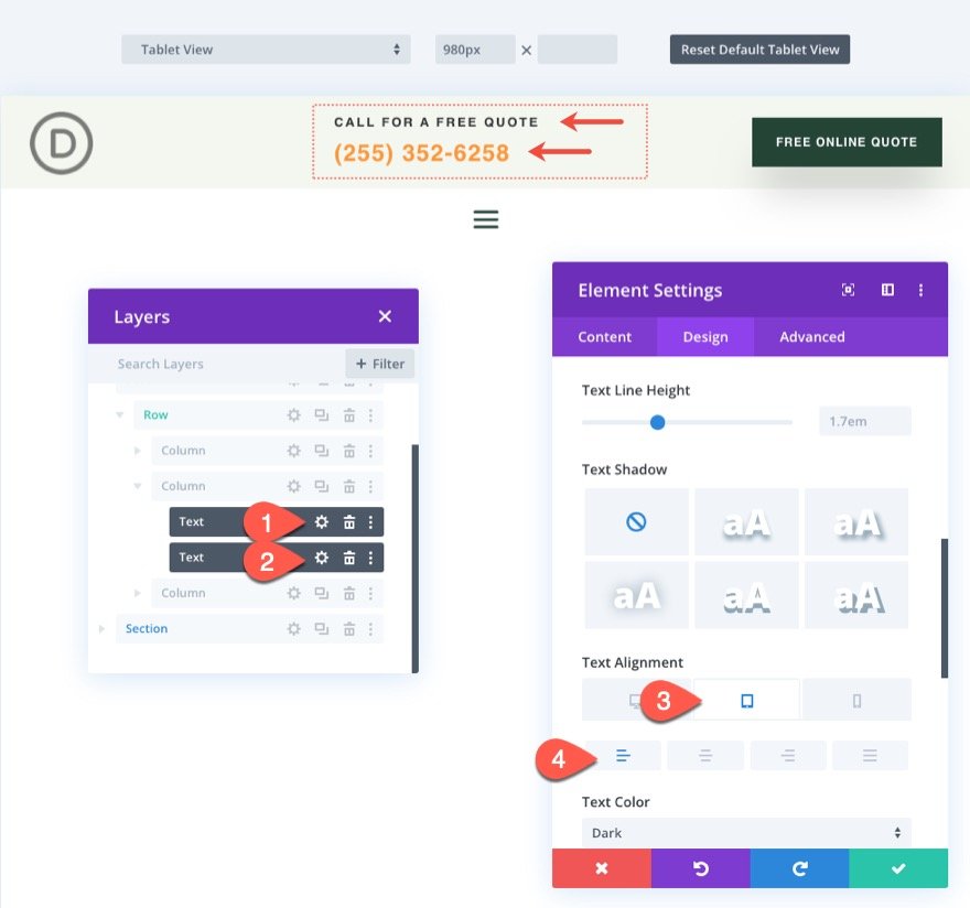
Modify the text orientation for the two text modules that form up the call to action in column 2 as follows for aesthetic purposes:
- Text Alignment (tablet and phone): Left
Sticky section for mobile
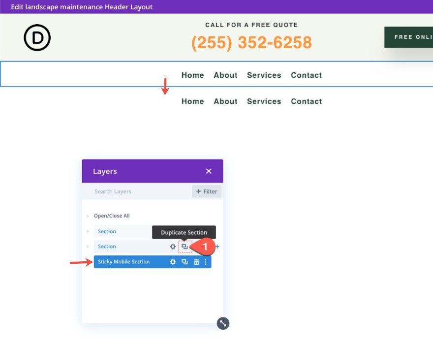
Mobile devices must reduce the height of the sticky header as much as possible so that it does not take up too much of the viewport when scrolling. As a result, we will not make the top area of the header sticky. Instead, we'll add a new sticky part that will only appear on mobile. In this manner, we may incorporate mobile-specific components while not taking up too much vertical space in the sticky state.
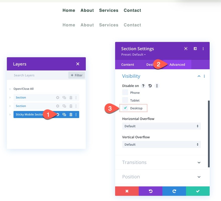
Duplicate the old bottom section that contains the menu to make the new sticky header section. You may optionally label the new section "Sticky Mobile Section" to make it easier to find later.
Because we'll be including a menu in our mobile sticky area, visit the settings for the existing sticky part and select Disable on Phone and Tablet.
Open the new mobile sticky column's settings and select Hide on Desktop.
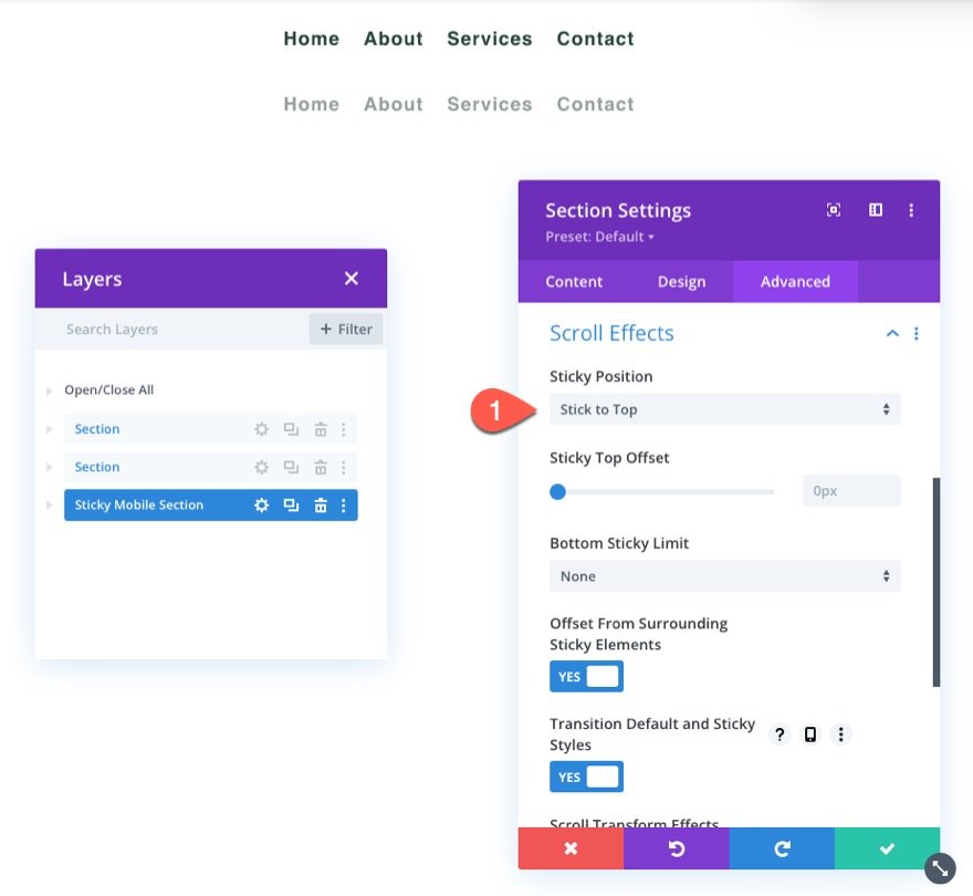
Assign a sticky location to the new mobile sticky section as follows:
- Sticky Position: Stick to Top
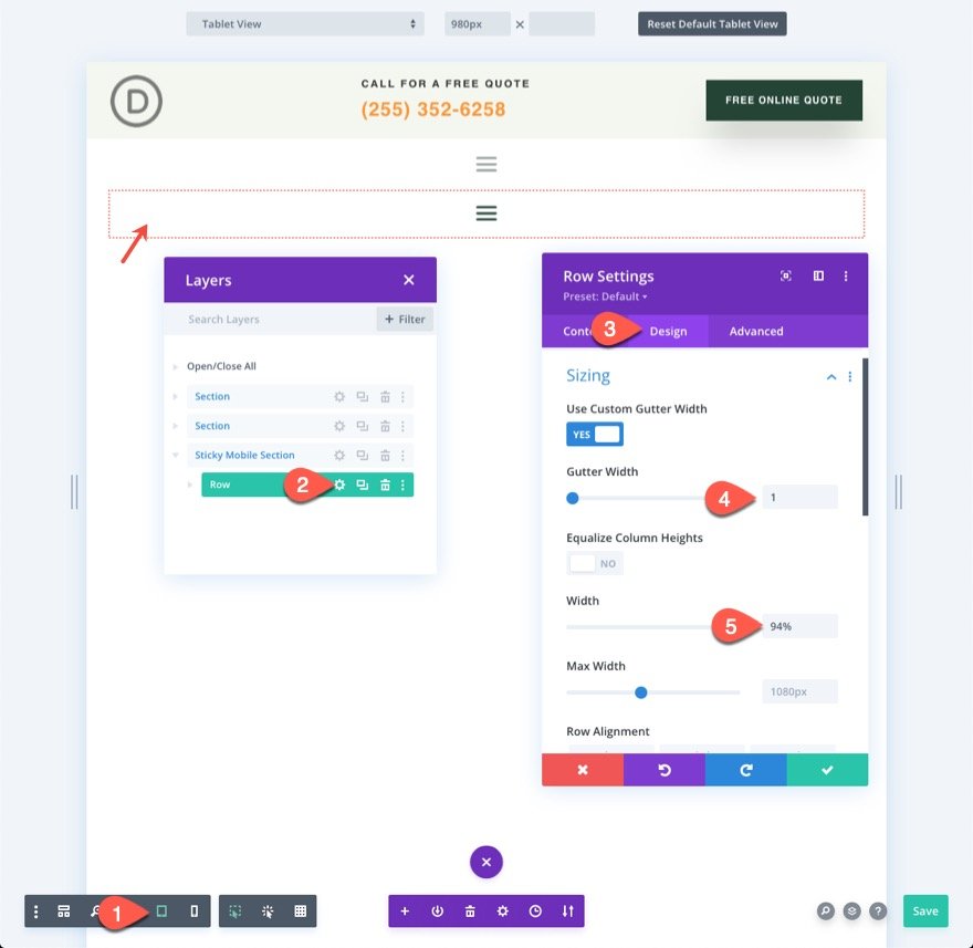
Update Row Sizing
It's a good idea to start editing in tablet view at this stage to have a better concept of how the design will look on mobile. To do so, go to the settings menu at the bottom of the builder and select the tablet icon.
Then, open the row settings and make the following changes to the sizing options:
- Gutter Width: 1
- Width: 94%
This will provide us with additional space on mobile.
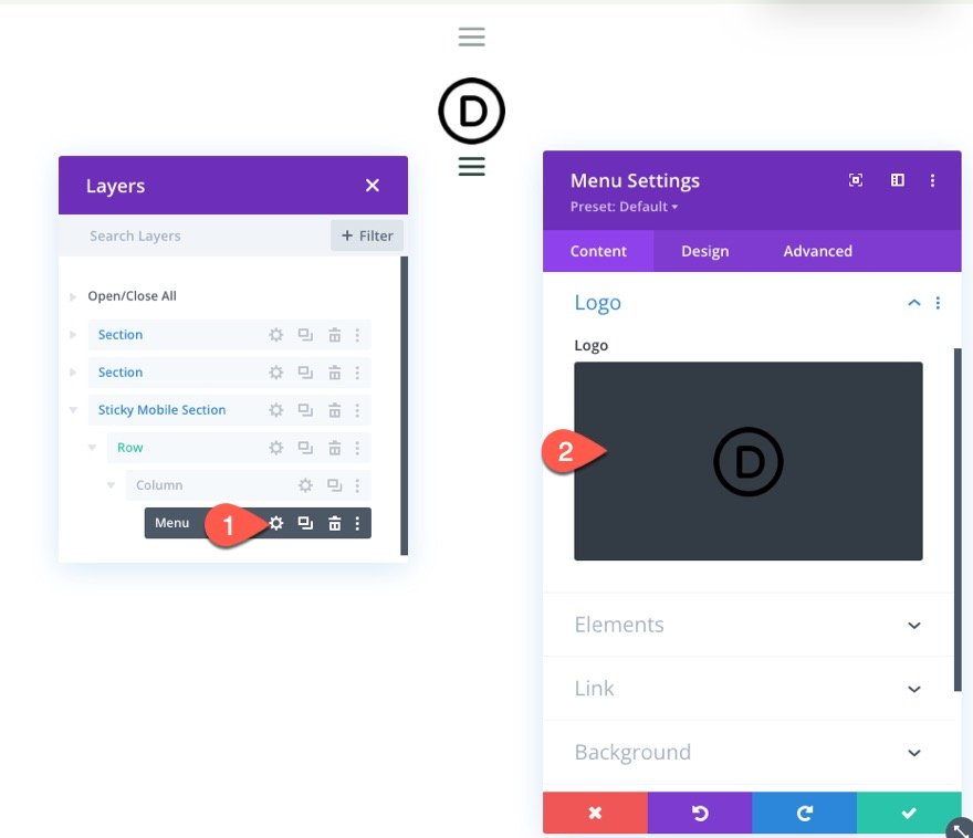
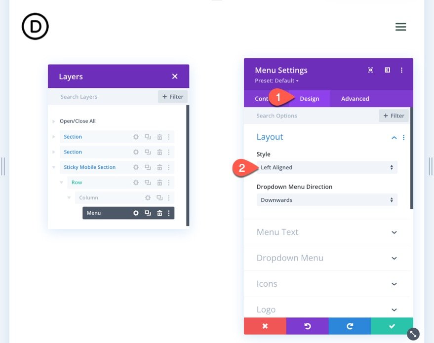
Menu Logo and Layout
Then, in the menu settings, add a logo to the menu.
Update the layout's style under the design tab:
- Style: Left Aligned
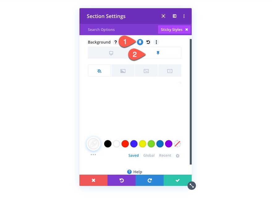
Adding Sticky State Styling to Sticky Elements
Now that the parts for the mobile sticky header are in place, we can begin optimizing the style of the elements in the sticky state.
Because the section has a sticky position, you can toggle the sticky position choices when designing the section or any child elements within it. When hovering over a style choice, you can toggle the sticky position styling by clicking the thumbtack icon.
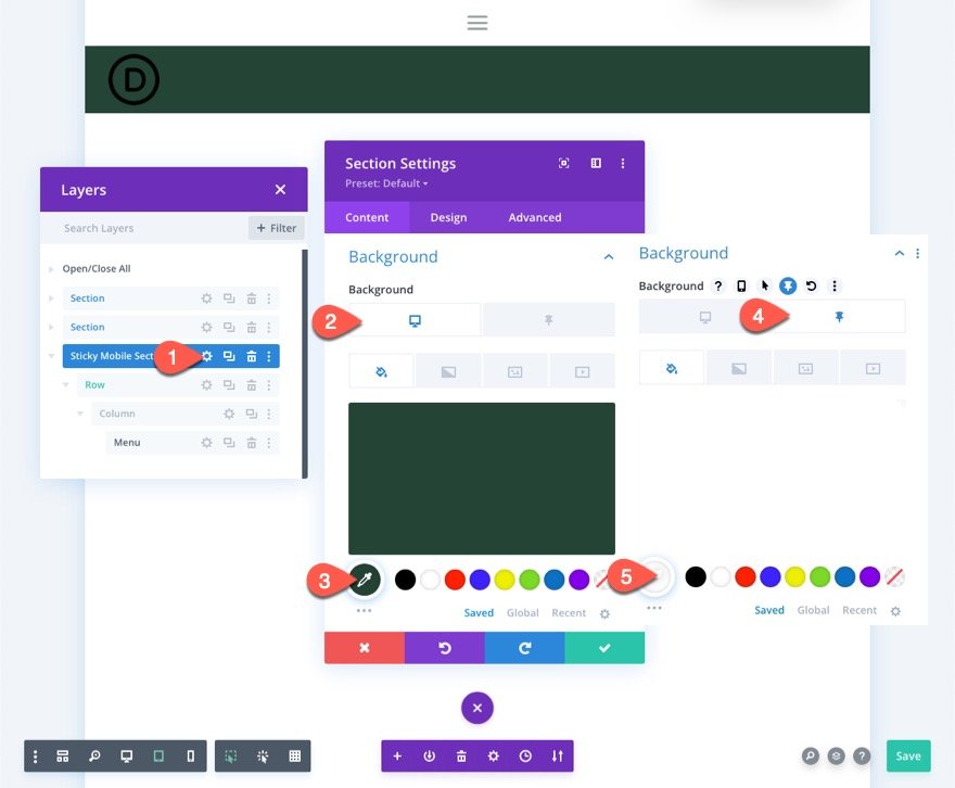
Background Color
Now add Background color to the sticky section.
- Background Color (desktop): #244435
- Background Color (sticky): #fff
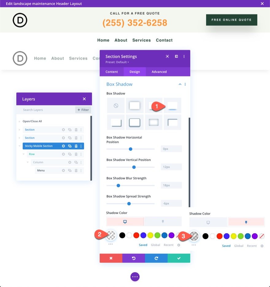
Box Shadow
From the design tab, add a box-shadow in the sticky state as follows:
- Box Shadow: see screenshot
- Shadow Color (desktop): transparent
- Shadow Color (sticky): rgba(0,0,0,0.1)
Sticky logo and icons
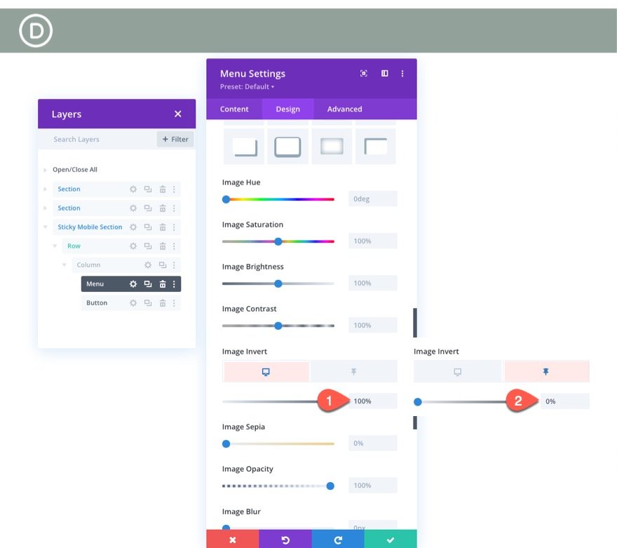
Then, update the logo image with a filter that inverts the dark logo by default into a light logo picture and then inverts it back to a dark logo in the sticky state. Update the following in the Logo options:
- Image Invert (desktop): 0%
- Image Invert (sticky): 100%
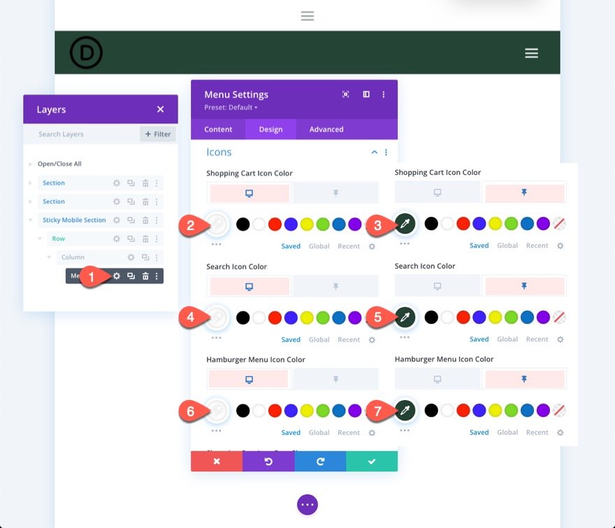
We also need to alter the color of the icons as follows:
- Shopping Cart Icon Color(desktop): #fff
- Shopping Cart Icon Color(sticky): #244435
- Search Icon Color(desktop): #fff
- Search Icon Color(sticky): #244435
- Hamburger Menu Icon Color(desktop): #fff
- Hamburger Menu Icon Color(sticky): #244435
Sticky header button
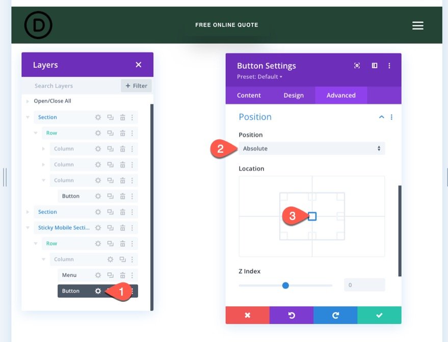
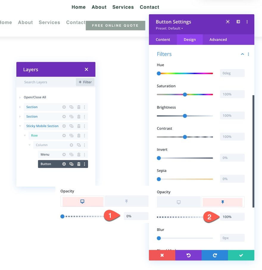
Currently, the button in the header's top part does not appear in the sticky header on mobile. However, we can duplicate the button and put it in the new mobile sticky area, appearing exclusively in the sticky mode.
Duplicate the existing one in column 3 of the top section's row to add the button. Then, paste the button module beneath the menu in the mobile sticky section.
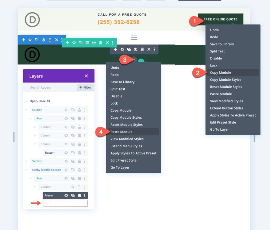
To reposition the button above the menu, visit the button settings and edit the position choices as follows:
- Position: Absolute
- Location: Center
Under the Design tab, change the opacity settings
- Opacity (desktop): 0%
- Opacity (sticky): 100%
And we are done.
Final Preview
Save the layout, assign the template to a page on your website, and save modifications in the theme builder to see the effect. Then navigate to the page to which the template has been set.
Here is the outcome.
Wrapping Up
Divi allows you to think mobile-first when it comes to those sticky headers. We recently demonstrated how simple it is to use Divi's built-in features to build a sticky header for mobile. Once you've unlocked the full potential of Divi's sticky options, you can be pretty creative with how you transition the sticky header's content. For example, you can use a filter to invert the logo from bright to dark, add a button, or change the header's full background color. Of course, that is only the beginning. You are welcome to experiment with more adjustments to meet the requirements of your future project!


