
Fullscreen hero sections look fantastic on any website, but they look more attractive on blog articles. Despite having a full-screen feature image, there are numerous design possibilities for where the title and meta information might look extraordinary. The entire thoughts are very simple to accomplish with the Divi Theme Builder. In this article, we'll look at how to incorporate a fullscreen feature image into your Divi blog post template.
Design Preview
So as we are going to make three different consecutive design modules. Let's see how they look.
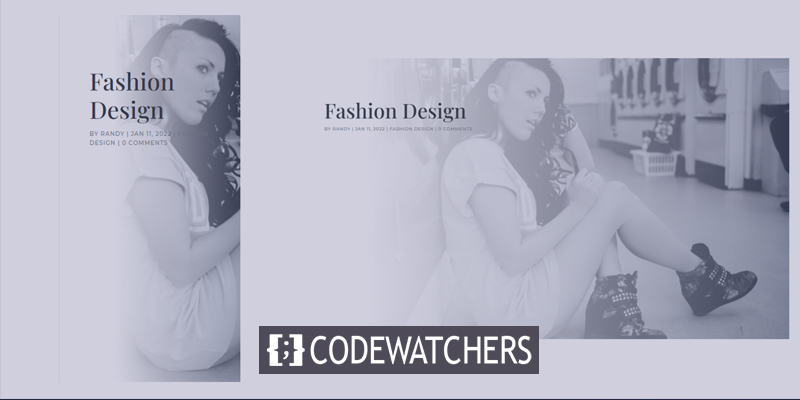
First, how the fullscreen post title module looks both on desktop and mobile.
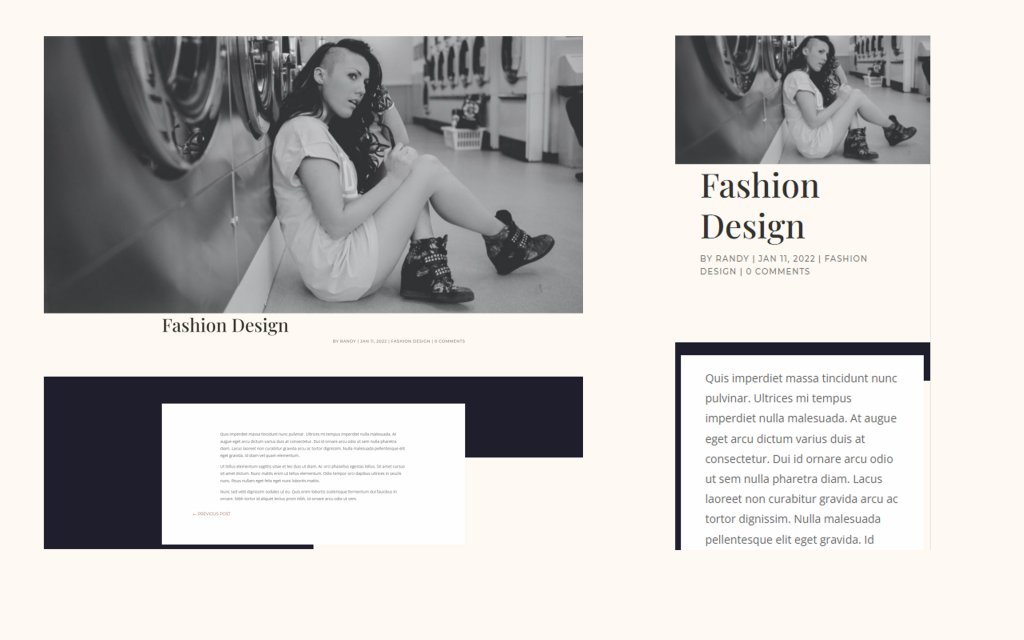
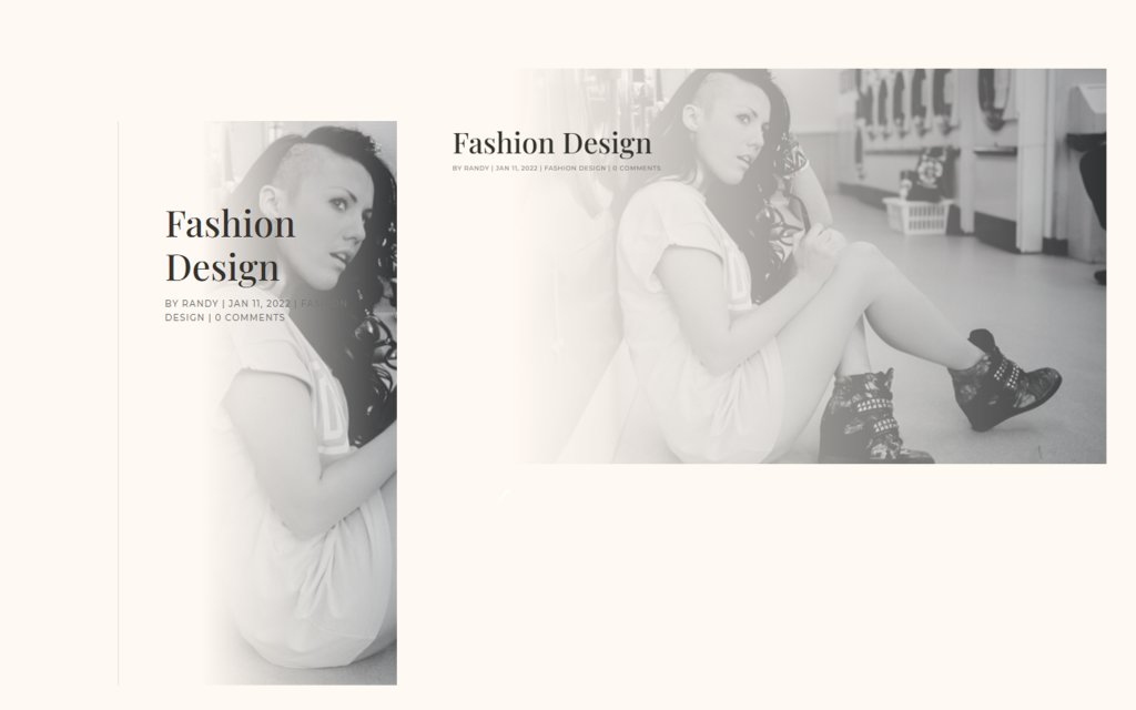
Then, how alternate fullscreen post title module with the title over background looks both on desktop and mobile.
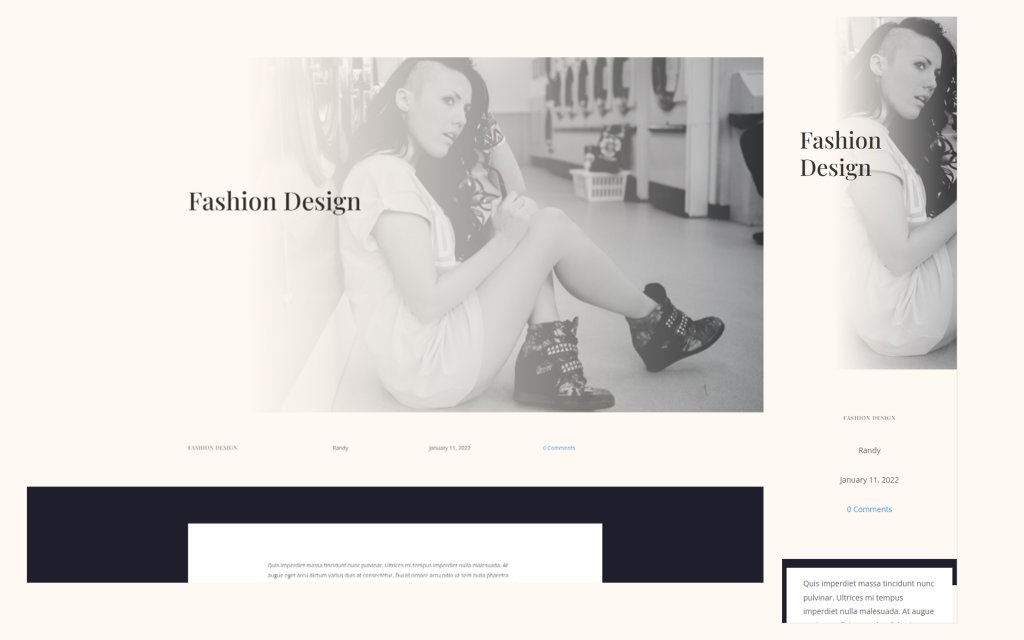
Lastly, how fullscreen hero with metadata looks both on desktop and mobile.
Free Blog Post Templates
There are numerous free blog post templates available on the Divi template store. You can pick any of them and give them an outstanding shape to enhance the beauty of your blogs. For today's post, I will be using a free template from the Divi store called Blog Post Template for Divi’s Fashion Designer Layout. Along with that, I will be also using Header & Footer for Divi’s Fashion Designer Layout. Both the templates are completely free to use.
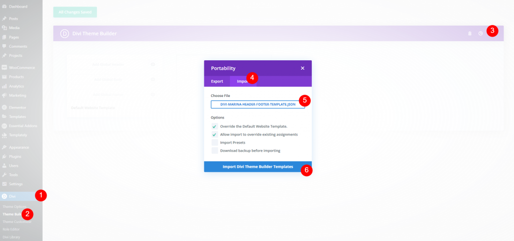
How to upload a Divi Template?
You can either upload an existing blog post template or build one from scratch. We'll upload one, however, the technique for making the fullscreen hero remains the same.
- Go to Divi > Theme Builder
- Click Portability Icon
- Go to Import tab
- Select your JSON file
- Click to Import
- Save settings
Design Procedure
We will see a couple of design methods to decorate the full-screen hero section.
Create Amazing Websites
With the best free page builder Elementor
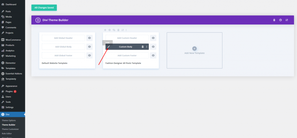
Start NowMethod 1: Full Screen Post Title
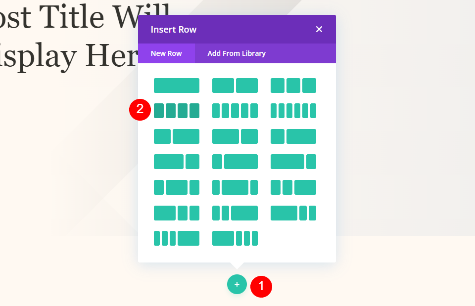
We'll make use of the Post Title Module. If you want to display all of the info at once, this is a nice option. Once you've found your layout, click the edit icon to open it.
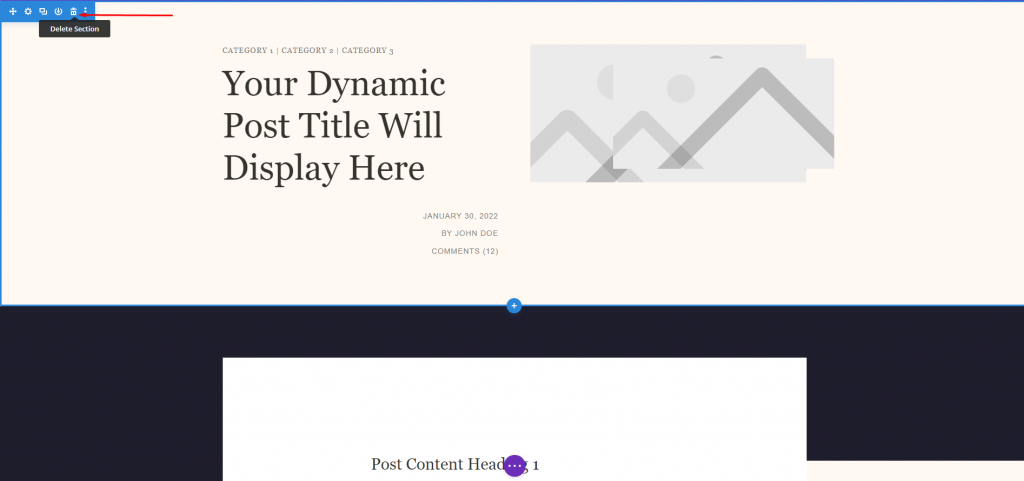
The template has a pre-built feature image section. We are going to delete that and add a new full-width section.
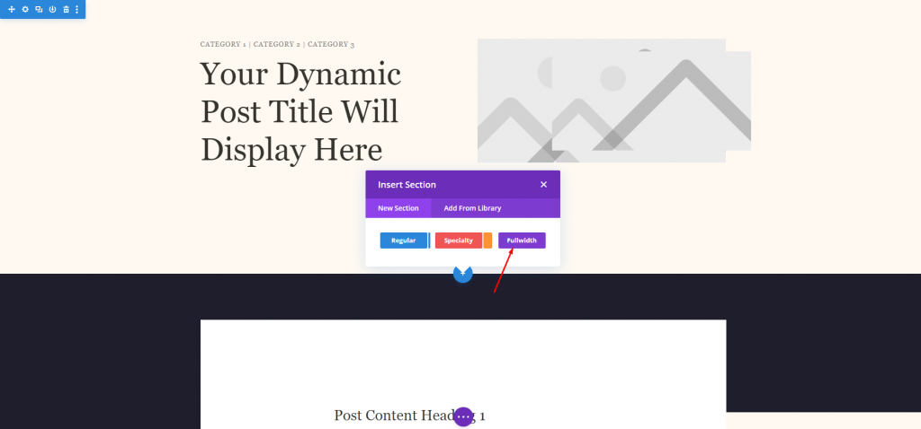
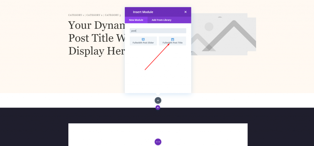
We will add a full-width post title to this new section.
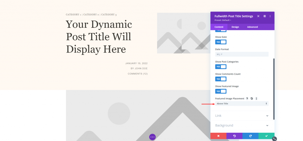
Change the featured image section and keep everything the same.
- Featured Image Placement: Above Title
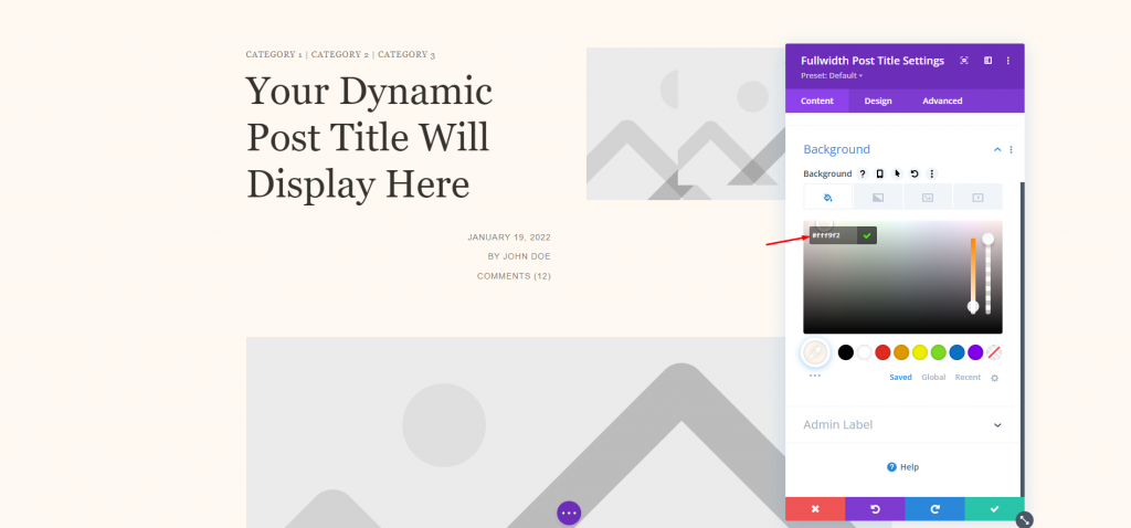
Set new background color to the module.
- Color: #fff9f2
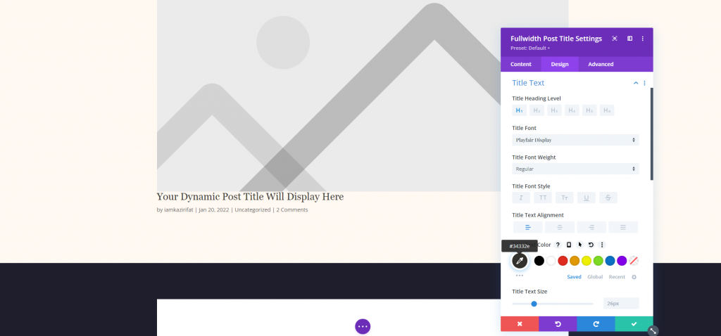
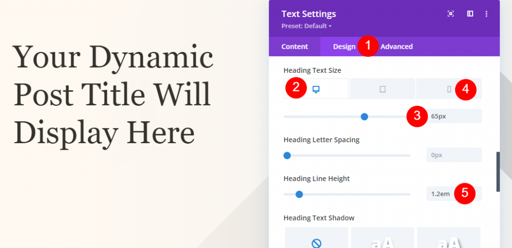
Title Text
Now from the design tab. make the following changes for the Title Text.
- Font: Playfair Display
- Alignment: Left Justified
- Color: #34332e
- Text Size: 65px for desktop, 42px for phone
- Line Height: 1.2em
Meta Text
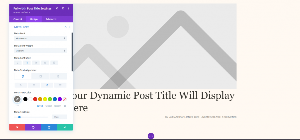
Now come down to the meta text setting from the design tab and make the following changes.
- Font: Montserrat
- Weight: Medium
- Style: Uppercase
- Desktop Alignment: Right
- Phone Alignment: Left
- Color: #7b7975
- Text Size: 14px for desktop, 10px for phone
- Letter Spacing: 1px
- Line Height: 1.6em
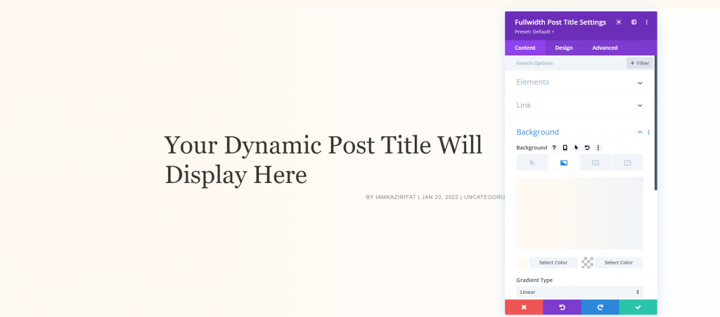
Title Background Image
Now as our goal is to bring the title over the featured image, let's go back to the content tab and change the following settings from elements and backgrounds.
- Featured Image Placement: Title/Meta Background Image
- Left Gradient Color: #fff9f2
- Right Gradient Color: rgba(255,255,255,0)
- Gradient Direction: 90deg
- Start Position: 30%
- Place Gradient Above Background Image: YES
Method 2: Fullscreen Hero with Metadata
For the information, this technique will utilize Text Modules with Dynamic Content. If you want to display all of the elements in different places, this is a fantastic solution. To proceed, upload the template and remove the first part. We'll replicate the modules and settings on the left column, but we'll walk you through them so you can configure them.
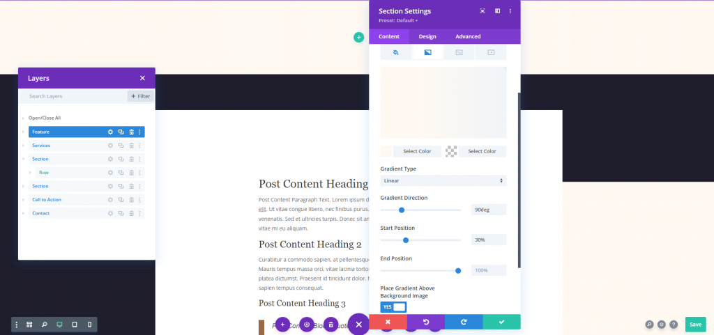
Section Settings
Open the marked section setting and make the following settings.
- Left Gradient Color: #fff9f2
- Right Gradient Color: rgba(255,255,255,0)
- Gradient Direction: 90deg
- Start Position: 30%
- Place Gradient Above Background Image: YES
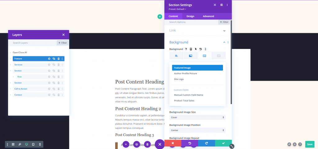
Now move to the image part and choose the Dynamic Content option.
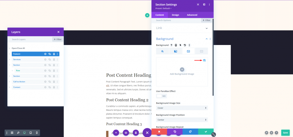
Choose Featured Image in the options.
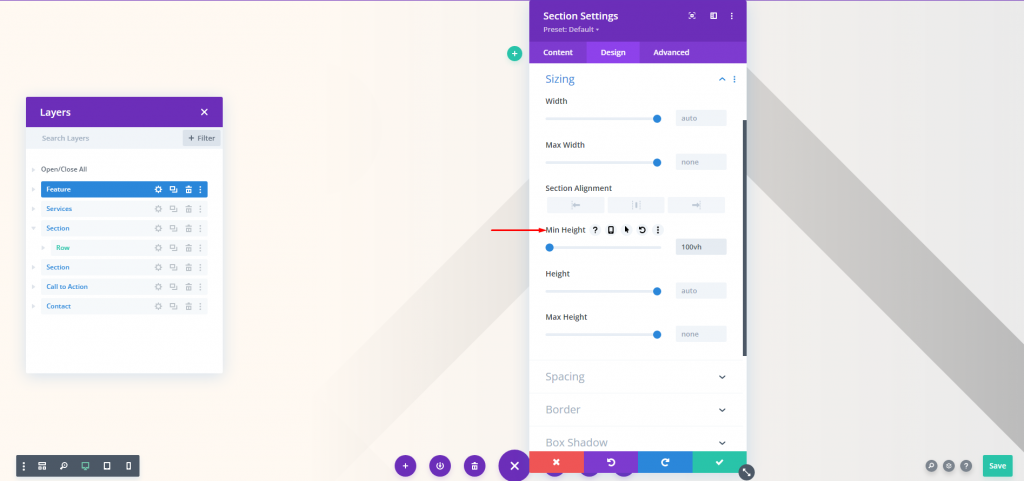
Move to the design tab and adjust the minimum height.
- Min Height: 100vh
Title Text
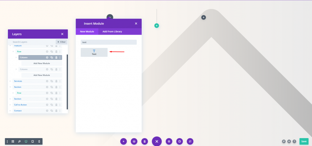
Now add a double-column row. Then add a text module to the first column.
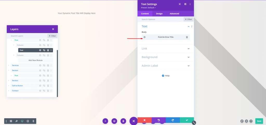
Now use dynamic content for this module.
- Dynamic Content: Post/Archive Title
From the design tab, change the following settings.
- Font: Playfair Display
- Alignment: Left Justified
- Color: #34332e
- Text Size: Desktop 65px and Phone 42px
- Line Height: 1.2em
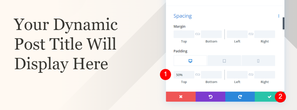
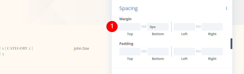
Go to the spacing settings and change the following value.
- Top Padding: 50%
Metadata Category Section
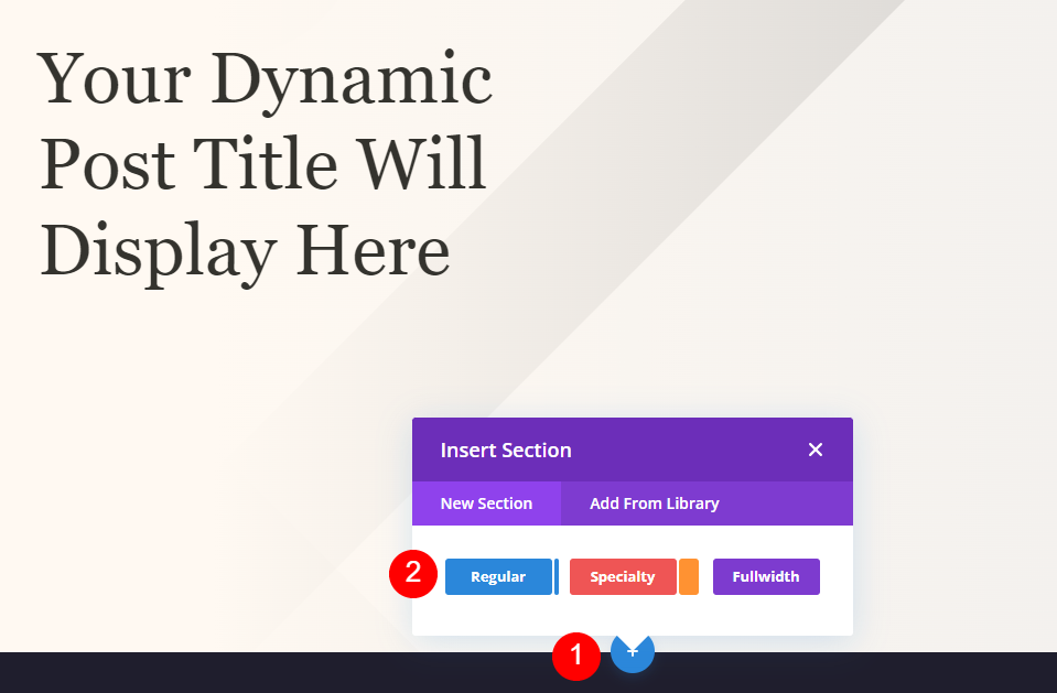
Now add a regular section under the hero section.
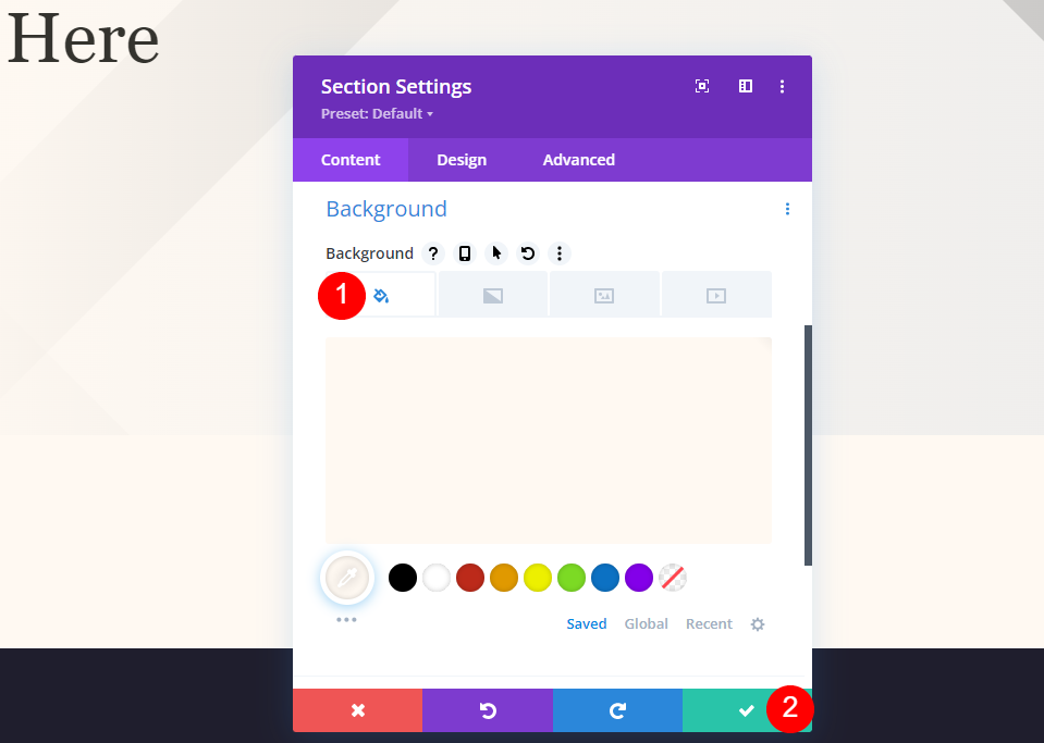
Now add a background color to this section.
- Background Color: #fff9f2
Add 4 column rows to the new section.
Metadata Category Text
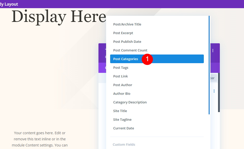
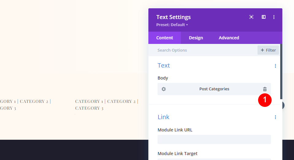
Now add the text module to the first column and add dynamic content to it.
- Dynamic Content: Post Categories
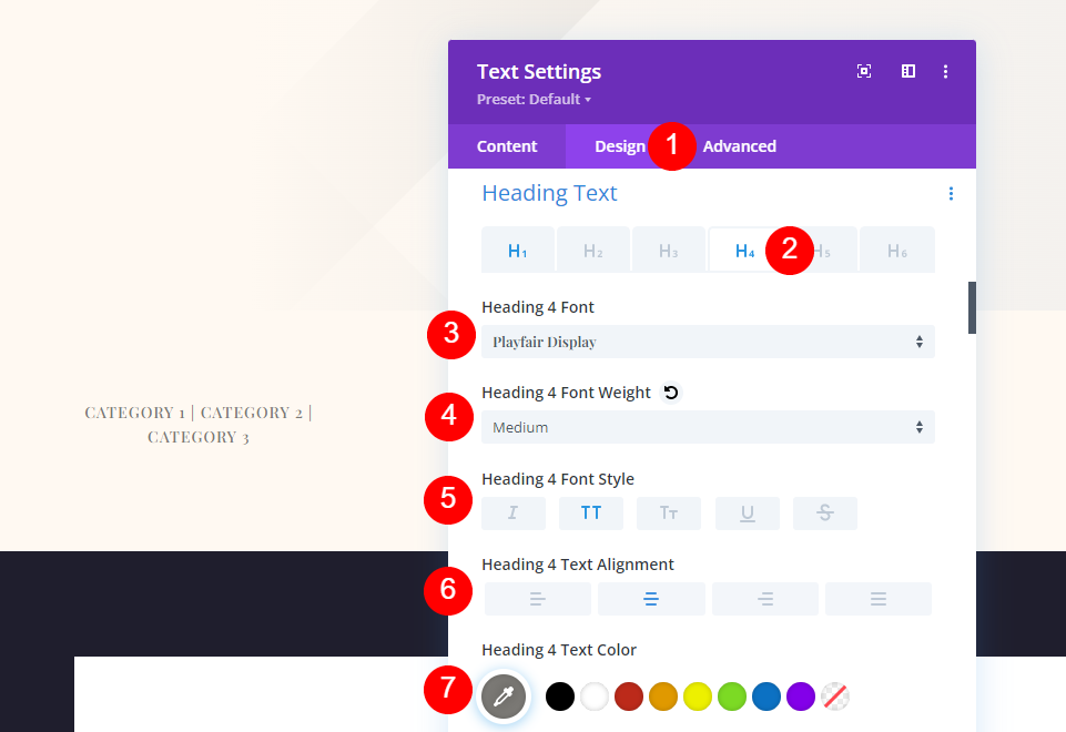
Now move to the design tab and add the following changes.
- Heading Text: H4
- Font: Playfair Display
- Weight: Medium
- Style: Uppercase
- Alignment: Center
- Color: #7b7975
- Text Size: Desktop 14px & Phone 10px
- Letter Spacing: 1px
- Line Height: 1.6em
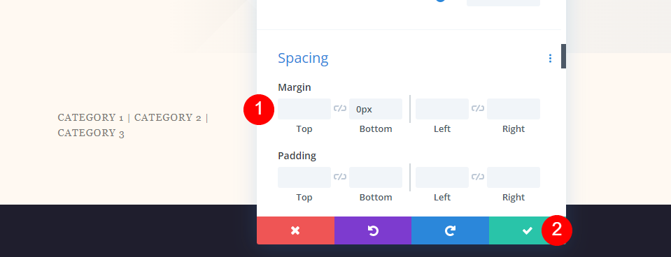
Move to the spacing settings and change the following value.
- Bottom Margin: 0px
Metadata Meta Text
Then, duplicate the category module and move it to the next column. The Meta modules all have the same settings. We'll show you how to make the first module and then duplicate it twice to make the remaining modules.
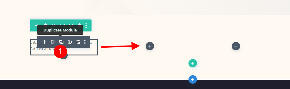
Author
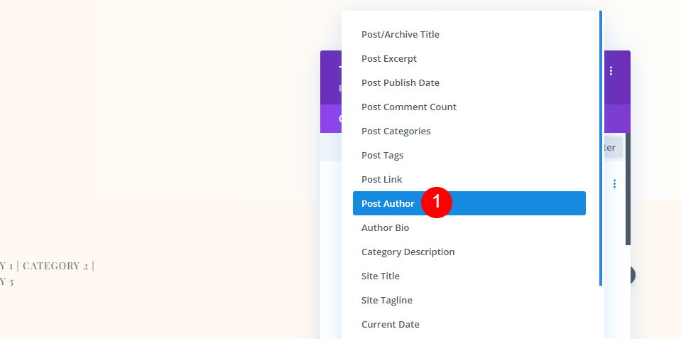
Open the settings and remove the dynamic content for Post Categories.
Choose Post Author as dynamic content.
- Dynamic Content: Post Author
In the Design tab, change the following settings.
- Font: Montserrat
- Weight: Medium
- Style: Uppercase
- Desktop Alignment: Center
- Phone Alignment: Left
- Color: #7b7975
- Font Size: Desktop 14px, Phone 10px
- Letter Spacing: 1px
- Line Height: 1.6em
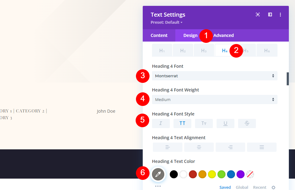
The Bottom Margin settings should be 0px.
- Bottom Margin: 0px
Date
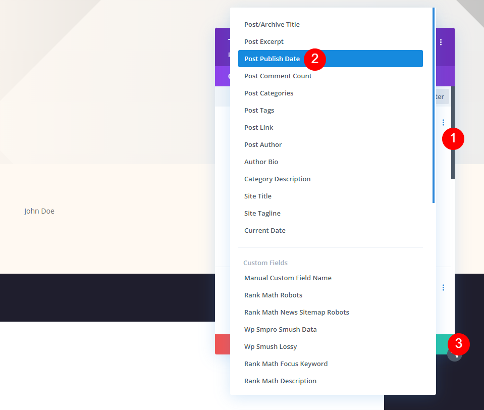
Drag the Author module to the next column after copying it. Remove the Dynamic Content, then select Use Dynamic Content and Post Publish Date.
- Dynamic Content: Post Publish Date
Comments
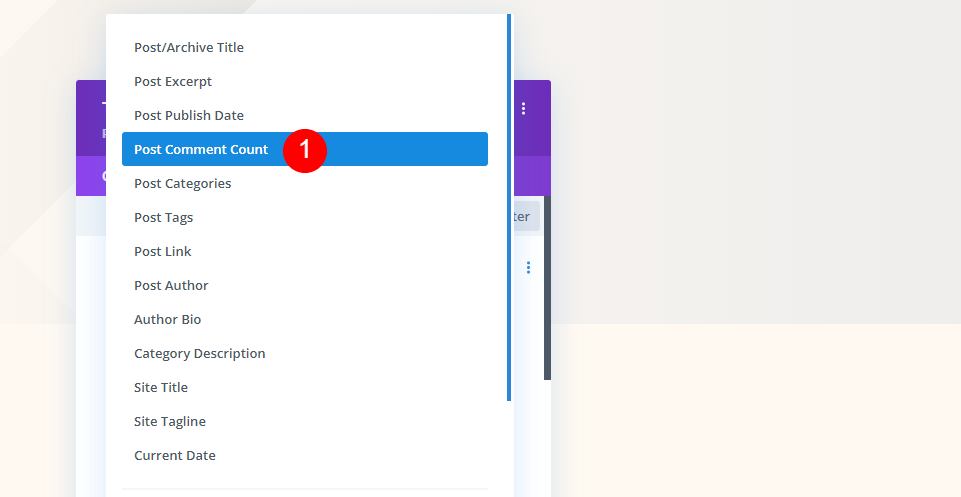
Finally, drag the Publish Date module to the last column. Delete the date and select date to use as dynamic content, same as you did with the other modules.
- Dynamic Content: Post Comment Count
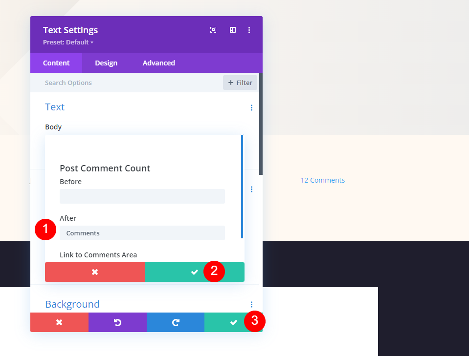
In the After field, add a space and the word Comments this time. Close the little modal first, then the settings.
- After: Comments
Final Output
So as we have made three different consecutive design modules. Let's see how they look.
First, how the fullscreen post title module looks both on desktop and mobile.
Then, how alternate fullscreen post title module with the title over background looks both on desktop and mobile.
Lastly, how fullscreen hero with metadata looks both on desktop and mobile.
Ending Thoughts
That concludes our discussion of how to add a fullscreen hero to your Divi blog post design. The Divi modules and Theme Builder offer a variety of alternatives for creating fullscreen hero sections. Any of these ways work well and have huge potential to draw more visitors. You may add a fullscreen hero to any Divi blog post design using these approaches.