
Elementor 3.10 boasts a plethora of eagerly awaited features that will enhance the appearance of your website. This release includes the introduction of the first nested element, Tabs, a new custom unit for sizing controls, a fresh container library, and additional upgrades.
Elementor and Elementor Pro 3.10 offer innovative design opportunities, unlocking endless possibilities with the inclusion of nested elements. With the new custom unit in size controls, you can design websites with a level of precision that has never been seen before. Moreover, the new container-based library and performance enhancements make these versions even more desirable.
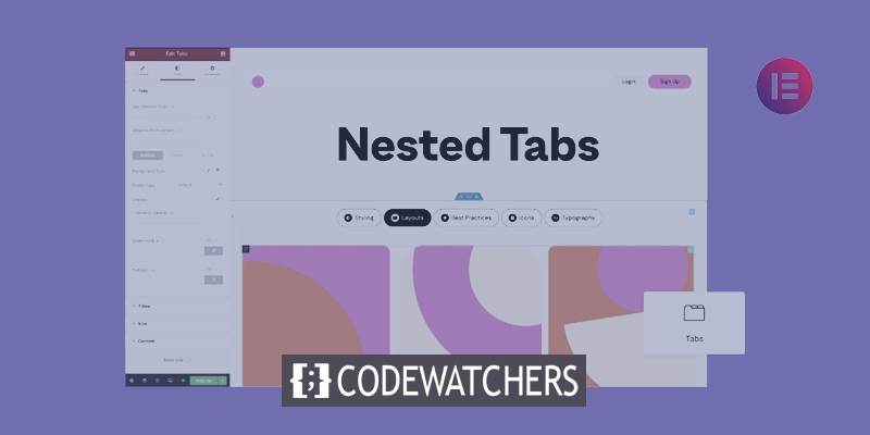
Nested Elements - Elevate Your Website’s Design
Nested Elements introduces a revolutionary method for conceptualizing the design of websites. With this feature, users can embed any element within another using the strength of Flexbox Containers. Similar to how containers can be nested within one another without limit, Nested Elements allows for the nesting of any element, whether it be a widget or container.
With Flexbox Containers now being stable, Elementor plans to incorporate the nesting capability into several existing widgets, such as the Carousel, Accordion, Tabs, and more, in future releases. Additionally, Elementor will also be introducing brand-new Nested widgets, including the Mega Menu.
Create Amazing Websites
With the best free page builder Elementor
Start NowTabs Widget
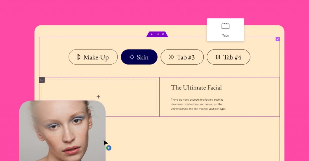
With the introduction of the new Tabs widget, users will have the opportunity to expand their design creativity and reach a high level of sophistication. The new Tabs widget, being container-based, includes three main improvements when compared to the original Tabs widget.
- Tabs and Titles – The new Tabs widget allows users to adjust the layout and positioning of the tabs, enabling them to determine the location of the tabs in relation to the tab’s content - on the top, bottom, or one of its sides. Users also have more styling options, including the ability to add icons to the tab title.
- New Content Area – The content area of each Tab will become a main container, thanks to the power of Flexbox Containers. This allows users to place any element, adjust its layout, and present any content they’d like - just like a blank canvas of the Editor.
- New Responsive Setting – To improve the design and user experience per device size, users can choose the breakpoint at which the Tab will automatically be displayed as an Accordion. This eliminates the need for creating different content for each device and improves performance.
To utilize the Tabs widget on a website, the Flexbox Container and Nested Elements experiments must be activated. Once activated, the new Tabs widget will automatically replace the existing one in the widget panel without affecting the design of existing tabs on the website.
Custom Units – Choose any Unit you Want
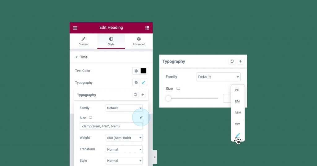
Numeric controls within the Editor are undergoing an upgrade, allowing users to select any unit of their choice and mix numeric units, as well as run CSS function calculations. The Editor contains various elements with options for sizing, including padding and margins, font size, and others. By using these sizing units effectively, the design accuracy and website responsiveness will be improved.
Before this update, users were limited to selecting only one of the following unit types: PX, EM, REM, %, or VW when adjusting padding or margins. With the upgrade, the custom option has been added, offering more flexibility in unit choices. For instance, users can choose PX for the sides and % for the top and bottom. The unit labels have also been relocated to a drop-down list to include the custom option.
Selecting the Custom option also allows users to perform calculations for the measurement of a value within the value input field, leading to greater design accuracy and responsive support.
For example, when using the custom option in the typography size controls, users can utilize the clamp() CSS function to adjust the typography size to different device sizes, or the calc() CSS function to calculate and set a value that mixes units.
In this version, the custom options will be added to the following sizing controls:
- Containers, Sections, and Columns – including custom width, border, and others, where possible.
- Typography controls – line height, letter spacing, and word spacing.
More areas will be updated in the future.
Container - Full Website Kits, Templates, and Blocks
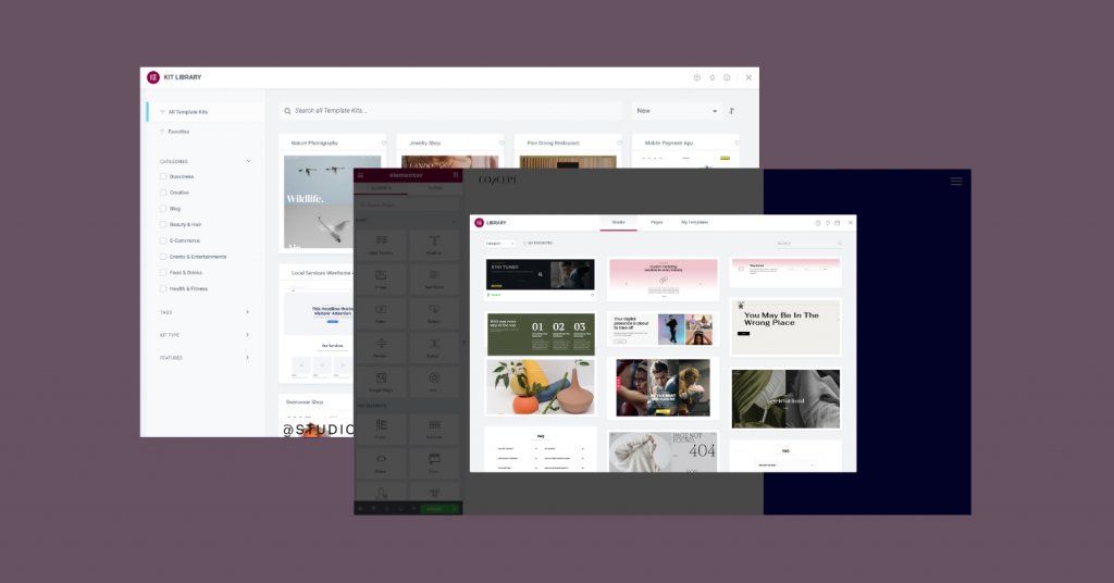
The Flexbox Containers, now marked as beta and stable for use, prompted the Library team to provide a container-based full website kit and template library. They worked hard in the past few weeks to come up with a comprehensive library, giving users a jumpstart in website creation and design when they enable the Flexbox Container experiment using the latest design trends.
Activating the Flexbox Container experiment on a website grants access to the new kit and template library. It includes updated versions of the most popular full website kits and page templates, all converted to Flexbox Containers, as well as new Website Kits and Page Templates.
The library also brings two noteworthy updates. First, mini-shops were introduced, a one-page full website kit for e-commerce websites complete with PayPal and Stripe buttons for payment collection. Second, the previous Blocks, such as the Contact and 404 pages, have been replaced with completely new designs.
Countdown Widget
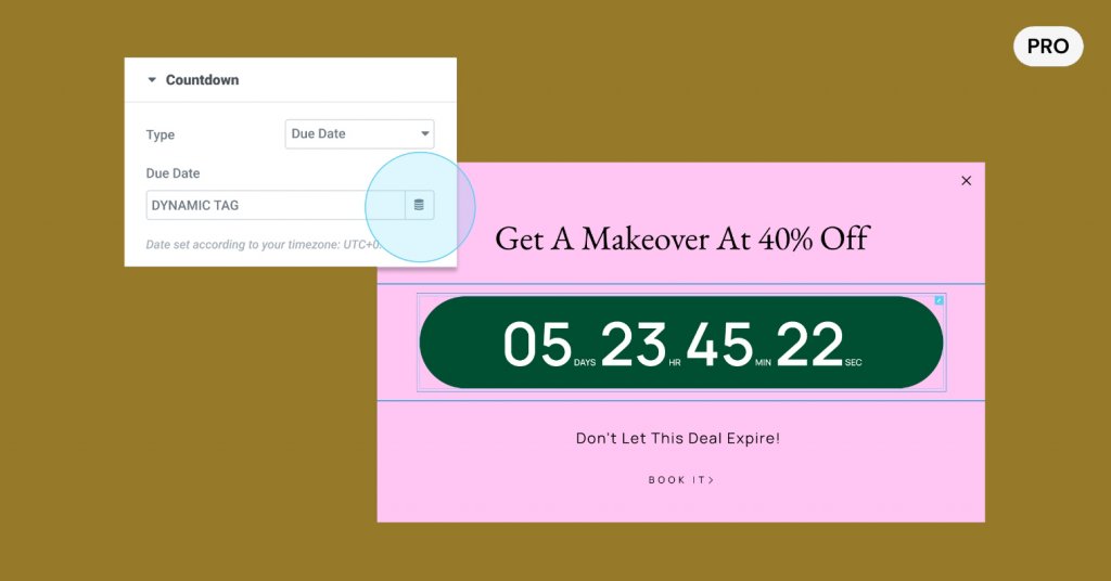
The Countdown Widget, a useful tool for generating FOMO and increasing conversion rates, now has a dynamic tag control feature for the due date. This update allows users to utilize the native WordPress custom fields, as well as custom fields from ACF and PODS, to dynamically populate the due date on each page.
With the addition of these dynamic tag controls, users can utilize the Countdown widget in a Single Post template and include a custom field for the due date in each post. This also enables website creators to deliver a finished product to their clients, while still allowing the clients to update the due date in WordPress without having access to the Editor and potentially altering the design.
Disable Google Fonts
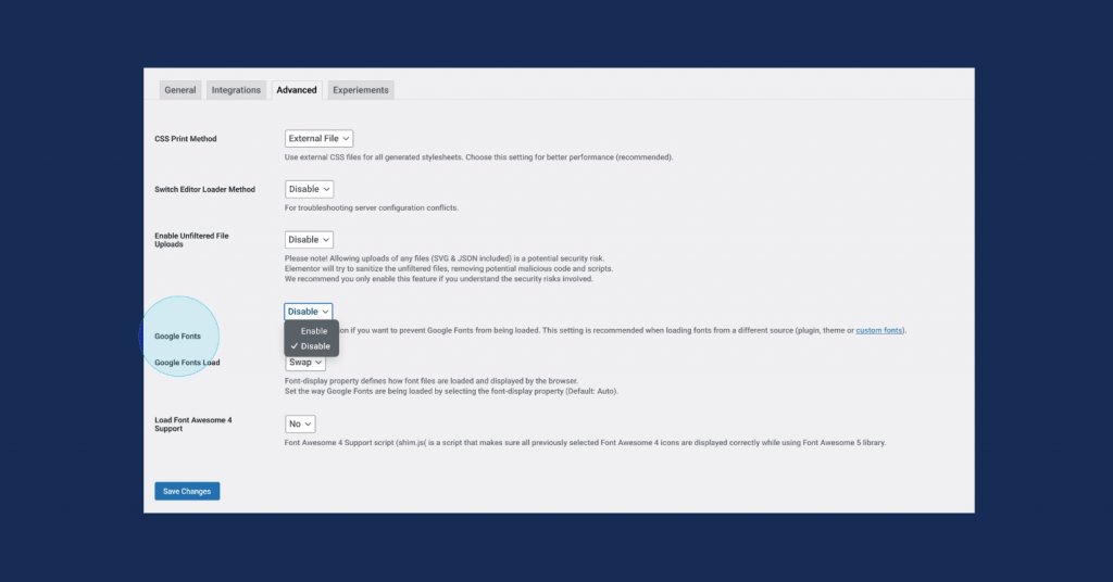
Google Fonts, an online font library that is widely used, enables users to access a variety of fonts for their websites. However, it has recently been discovered that Google Fonts has violated GDPR and privacy regulations in some instances.
To minimize this risk, Elementor offers the option to remove Google fonts from the website. When disabling Google fonts, users will no longer have access to the online Google font library within the Editor, resulting in a reduced number of fonts to choose from in the Editor, limited to only 7 font options. If a user had already used a Google font on their website but opts to disable Google fonts, all fonts on the website will automatically switch to one of the available font options. For those who still want to use their preferred font, Elementor Pro users have the option to upload locally hosted fonts through the Custom Fonts feature.
Improved Performance and Accessibility

Elementor 3.10 continues to bring about enhancements in terms of performance and accessibility. This update encompasses three performance improvement updates and two accessibility improvement updates.
Lazy Load Google Maps: The Google Maps widget in Elementor allows for the placement of maps anywhere on a website, providing a convenient way for website visitors to access location information. With this update, lazy loading of Google Map iframes has been added, contributing to a faster initial page load time.
Lazy Loading Images with Custom Sizes: The image size can greatly affect the performance of a website. In previous updates, the ability to lazy load most images uploaded to the media library was introduced. In Elementor 3.10, custom-sized images can also be lazy-loaded.
Controlling Self-Hosted Videos Preload: Videos, similar to images, can impact the speed and performance of a website, especially with self-hosted videos. With this update, the option to preload self-hosted videos, their metadata, or none of their content before the visitor presses play, is available.
Accessibility Improvements for Page Navigation: The Block Quote widget and Post Comments widget, both from Elementor Pro, have received updates to their markup to further improve accessibility for users with disabilities who utilize assistive technologies for page navigation.
Wrapping Up
Elementor 3.10 opens up a range of new design options for users to incorporate into their websites. The addition of the Tabs widget, the first feature to utilize the Nested Elements capability, provides users with the ability to create highly advanced and inventive layouts using all of Elementor's widgets in an easy drag-and-drop manner. By enabling Flexbox Containers to use this new widget, users will also have access to a new Container-based kit and template library, to jumpstart their design process. We encourage our visitors to try out Elementor 3.10 and share their thoughts in the comments section below.