
Divi MadMenu is a module designed by a third-party developer that integrates seamlessly with the Divi Builder. It adds two new modules that allow users to create unique and visually appealing menu designs. These modules come with a wide range of features, including the ability to add Calls to Action (CTAs), create popup login forms, and slide-in menus. Additionally, users can create vertical menus, providing them with even more flexibility in designing their websites. In this article, we will take a closer look at the Divi MadMenu module, examining its features and ease of use. By the end of this review, readers will have a better understanding of whether this product is suitable for their website design needs.
Modules Of Divi MadMenu
MadMenu extends the Divi Builder with two new modules. Each module is described below:
- The original module with the main features is Divi MadMenu. It has buttons, popups, slide-ins, and a variety of layout options.
- The Divi MadMenu Vertical Menu Module is a new module that adds vertical menu options to the Divi theme.

Features Of Divi MadMenu
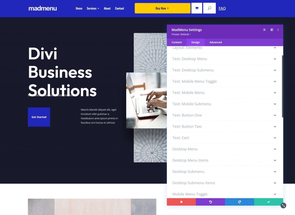
In this post, we'll look at the MadMenu Module in general. This module adds a slew of new features. Here's an overview of the Content tab and the tools it contains.
Elements
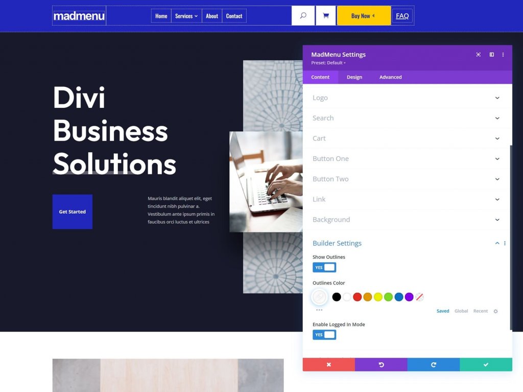
Elements are all of the items that can be added to the menu. This includes deciding whether to use the desktop or mobile menu, as well as enabling the logo, search, cart, button one, and button two. In the Content tab, each element is selected and adjusted in its own section. You'd enable them here and then configure them below.
Create Amazing Websites
With the best free page builder Elementor
Start Now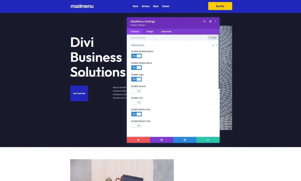
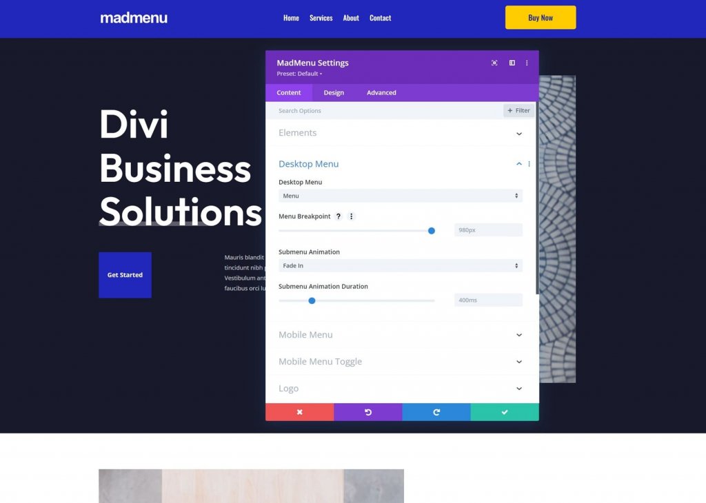
Desktop Menu
Choose the menu to display, the breakpoint that changes your menu to the mobile menu version, the submenu animation, and the animation duration.
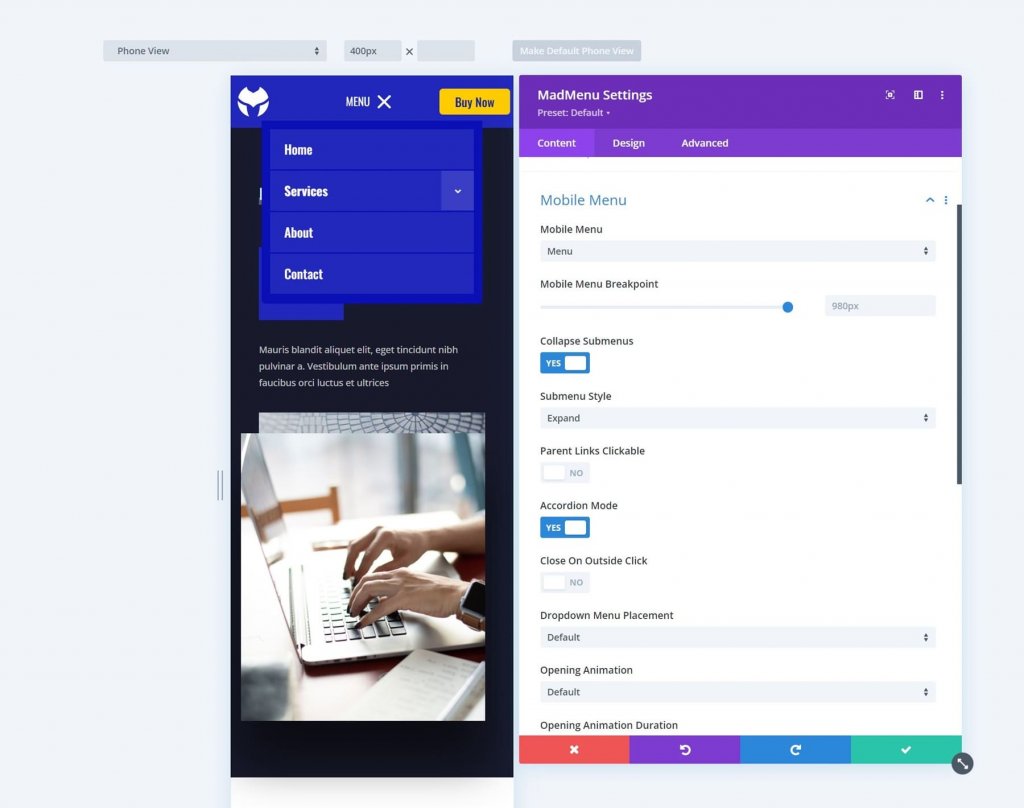
Mobile Menu
The mobile menu allows you to differentiate the mobile version of the menu from the desktop version. Select the mobile menu to display, set the breakpoint, select whether they are collapsed, close on outside click, position the dropdown menu, and adjust the animation settings.
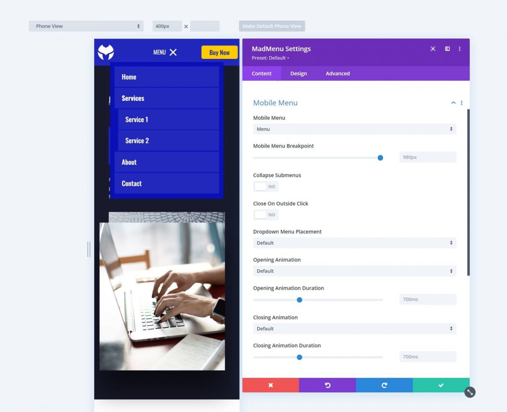
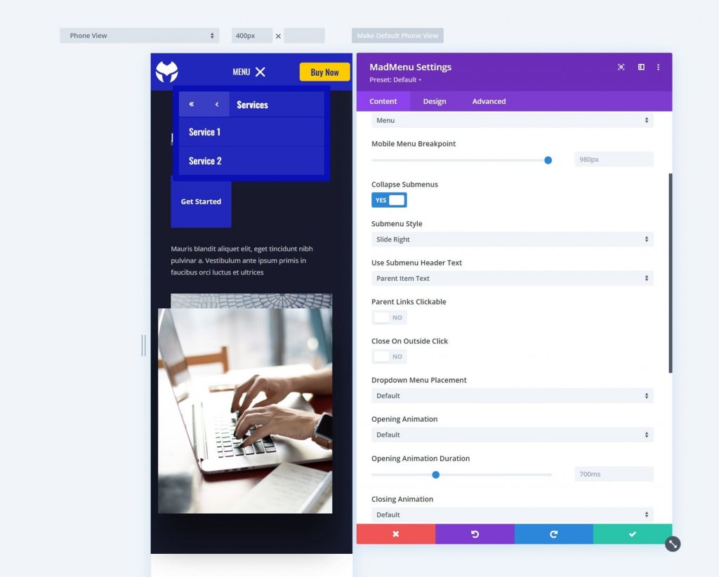
Collapse Submenus closes the submenu by default. When you collapse them, you'll be able to choose how they open when you click on them. Select Expand, Slide Right, or Slide Left. This also includes the option Use Submenu Header Text, which allows you to select from Parent Item Text, Custom Text, or No Text.
Slide Right and Slide Left move the arrows to the right and left, respectively. By clicking them, you can move the menu in that direction. Slide Right is the name of the slide. It displays the submenu as open, with arrows indicating that it is a submenu. The Parent Item Text is used for the Submenu Header Text.
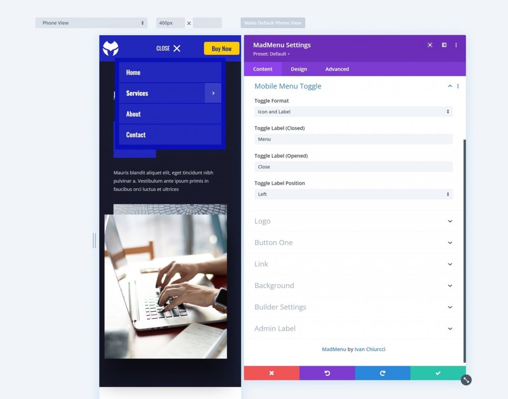
Mobile Menu Toggle
Enable this to display only an icon, a label, or both the icon and the label. Select the format, open and closed label, and label position. The position specifies whether the label should be on the right or left side of the menu icon.
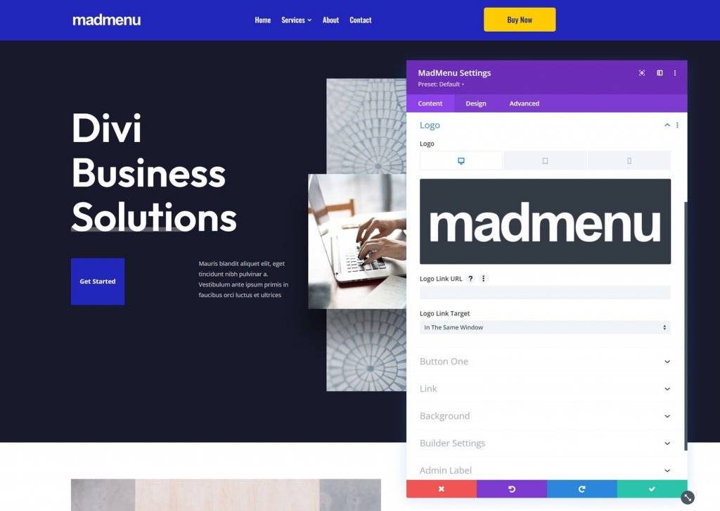
Logo
Choose the logo, enter the URL, and specify whether the link should open in the same or another window.
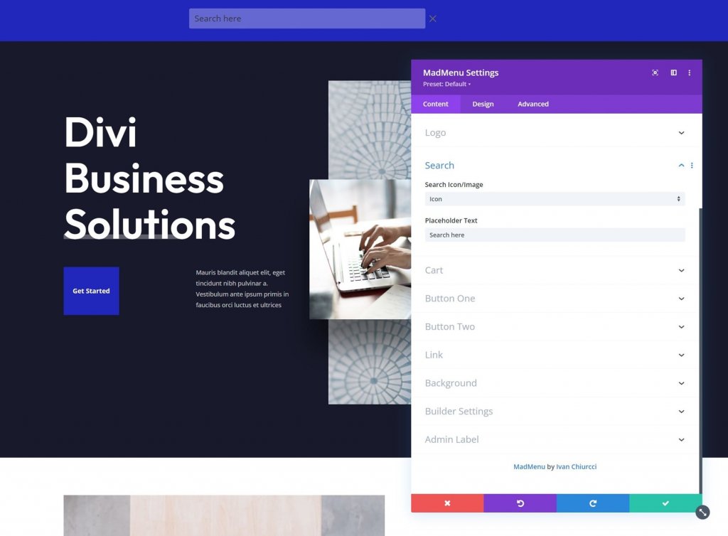
Search
Select an icon or an image and enter placeholder text. When the search icon is clicked, the placeholder text appears within the search box.
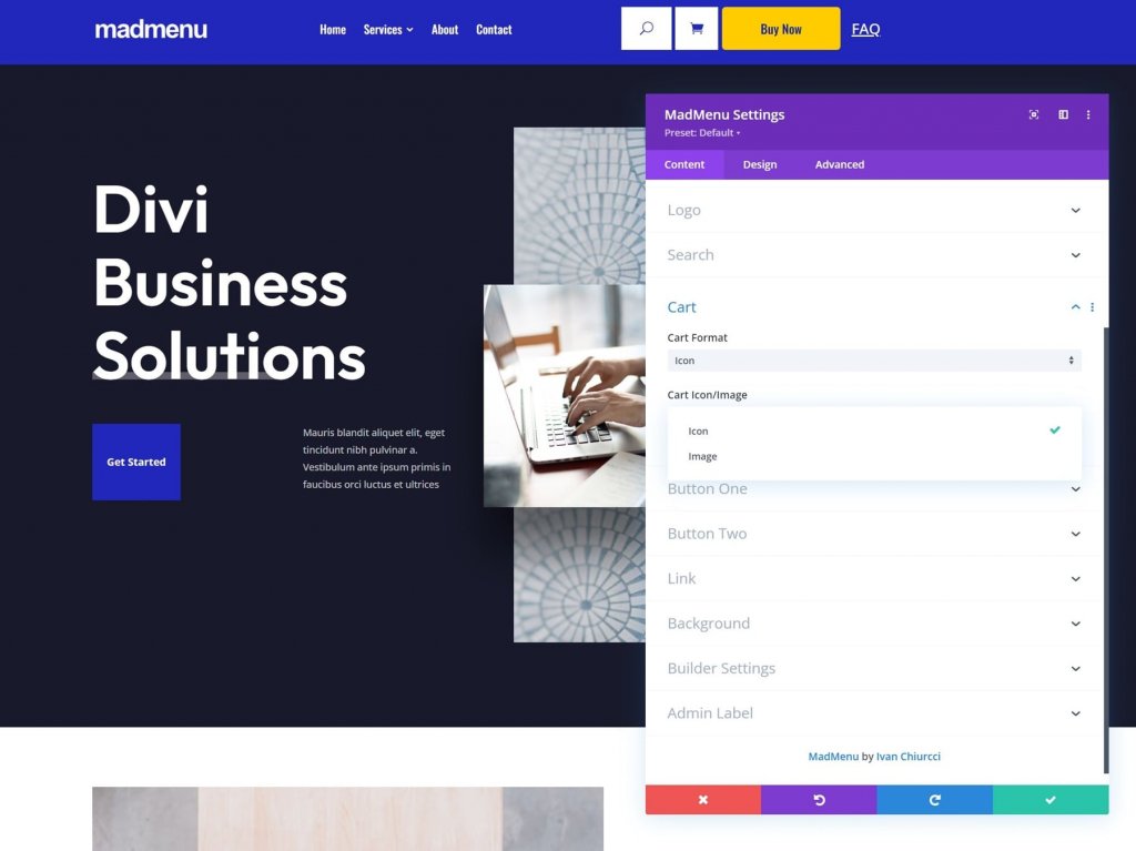
Cart
Choose the cart format and either an icon or an image. This is WooCommerce compatible and displays the number of items in the cart. The image option includes a Cart Image selector, allowing you to use any image in your media library as your shopping cart link. It has been resized to match the menu, but you can change it in the Design settings if you prefer.
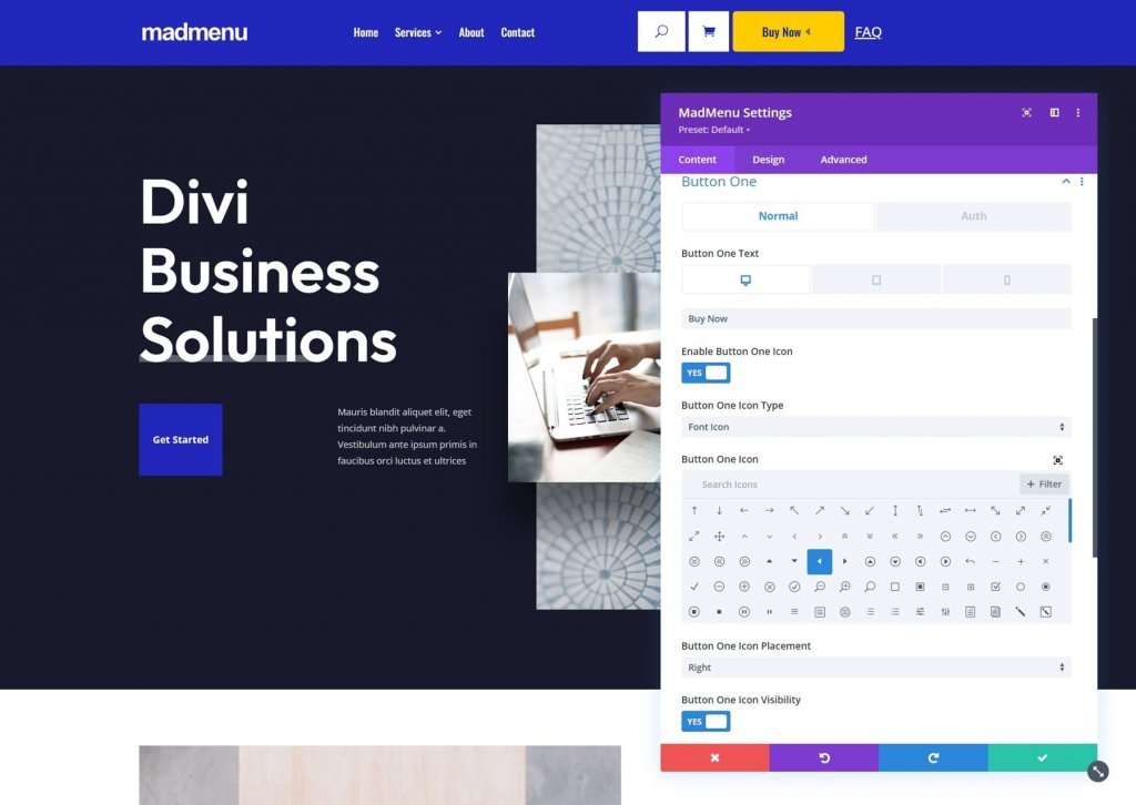
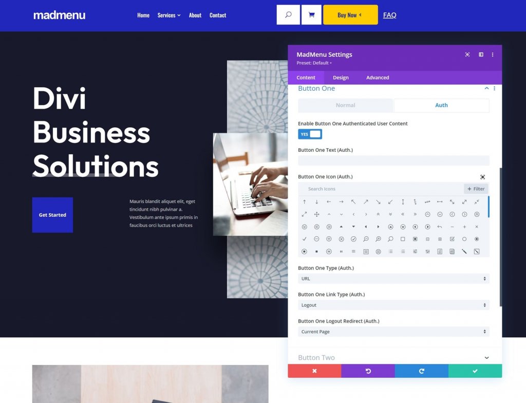
Button One and Button Two
Divi MadMenu extends the menu with two CTA buttons. You can include either one or both buttons. Add text to the button, enable an icon, and choose between a URL and a popup. Button One and Button Two have the same functionality.
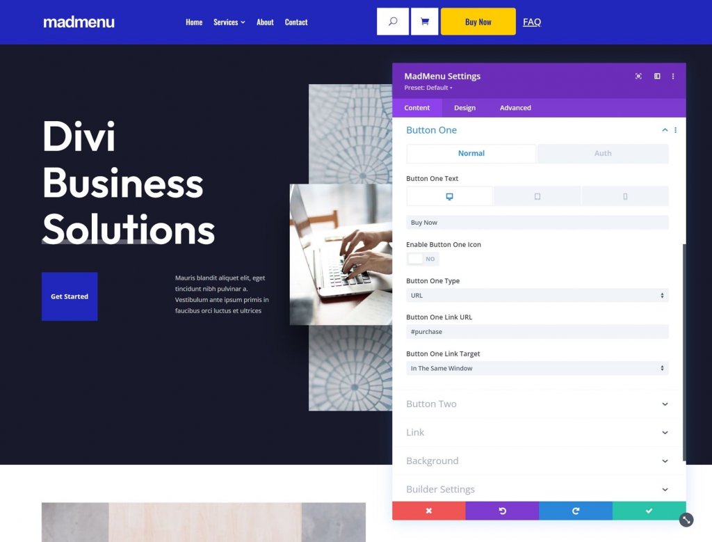
You can use an icon or an image as the button's icon. You can also specify whether or not the icon should be displayed on hover.
To enable authenticated user content, go to the Auth tab. Enabling user content brings up a new set of options where you can choose between a URL and a login form for authorization. Set the link type and the URL for the logout redirect.
Builder Settings
Show Outlines draws a border around each element. You can change the color of the outline. Enabling Logged In Mode brings up Button One and changes the text to Log Out, indicating that they are logged in.
Layout Options For Divi MadMenu
The Design tab contains a plethora of specialized settings for customizing the menu's layout.
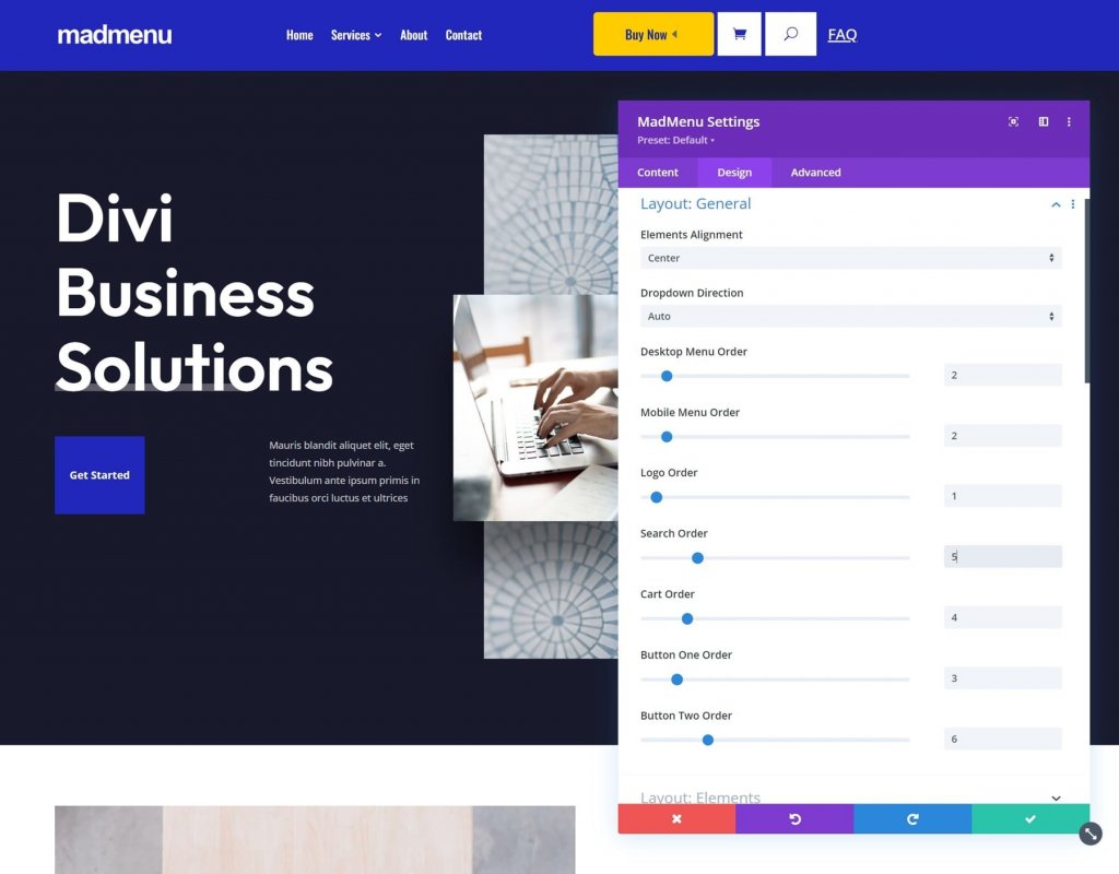
Divi MadMenu Layout General
Elements Alignment, Dropdown Direction, Menu Order, Logo Order, Search Order, Cart Order, and Button Order are all options. Combining them opens up a plethora of layout possibilities.
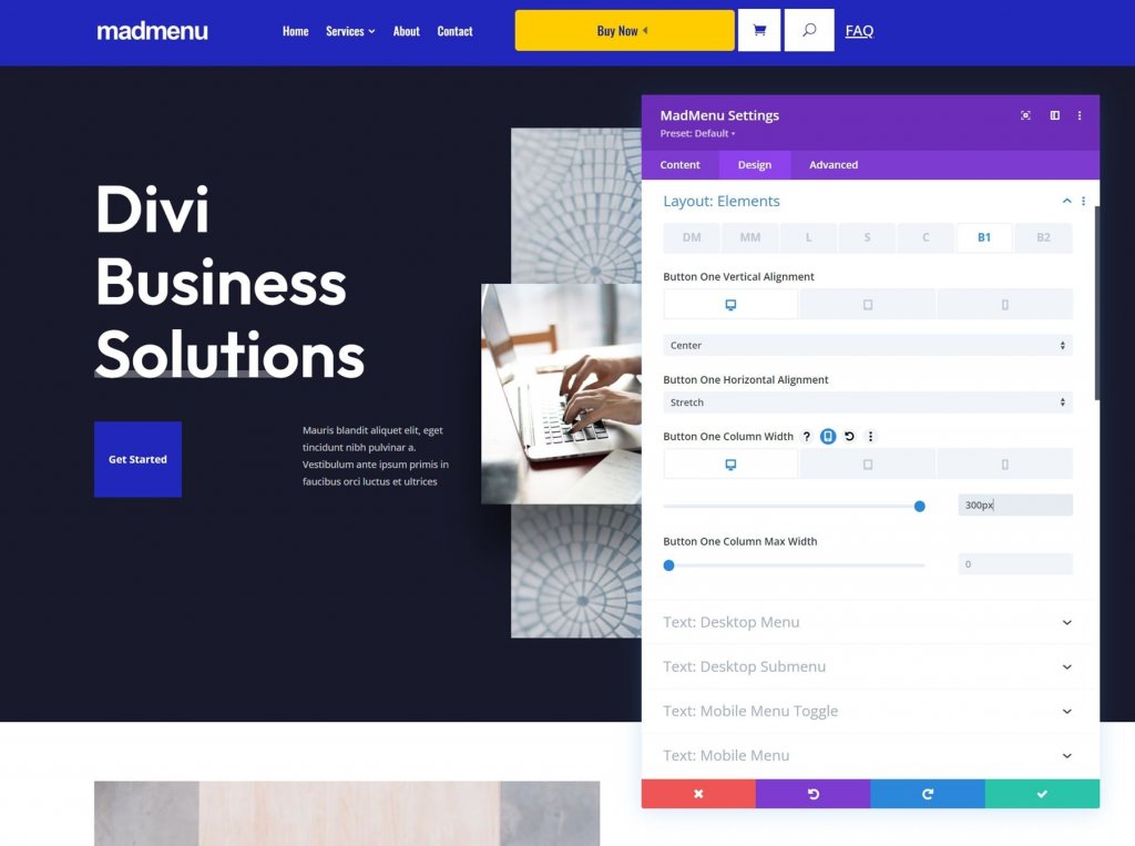
Layout Elements
These options allow you to fine-tune each of the elements individually. Change the vertical and horizontal alignment, the width, and the maximum width. When used together, they can produce some interesting layouts.
Style Options
The Mad Menu Design settings include all of the Divi module options you'd expect. Text styles, colors, borders, and more are all available.
Divi MadMenu Demo Thirteen
To get you started, Divi MadMenu includes 13 demos. Let's take a look at demo number thirteen to get a better idea of what Divi MadMenu can do. This one was chosen at random, but it's a good one. It makes use of several Divi MadMenu Modules to create an eye-catching design. We'll see desktop and mobile versions.
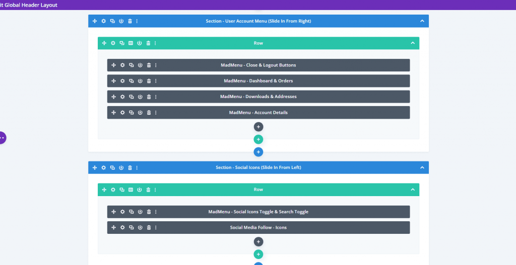
Demo Thirteen Wireframe
For the main settings, Demo thirteen employs two Divi MadMenu Modules, a Login Module, and a Search Module. The modules are depicted in the wireframe below.
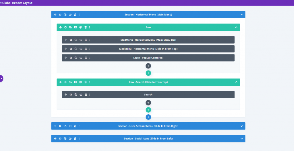
It also comes with five more Divi MadMenu Modules for creating the slide-in elements, as well as a Social Follow Module.
Demo Thirteen Design Outlook
Here's a look at the front-end demo. The hamburger menu opens the menus at the bottom. This is normally closed and will close when the other menus are selected.
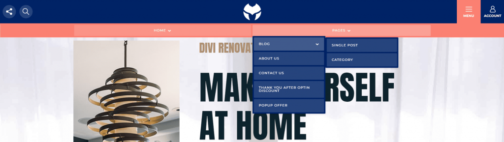
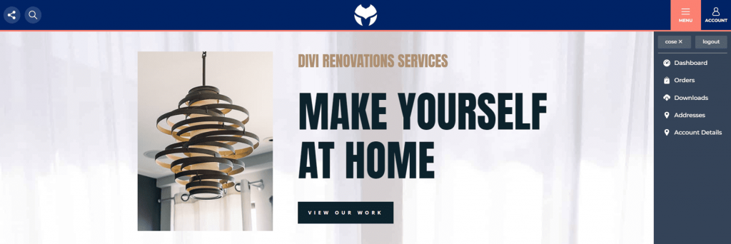
From the right, the account icon opens a slide-in menu. It has a close button, a log-out button, and links to the person's account pages.
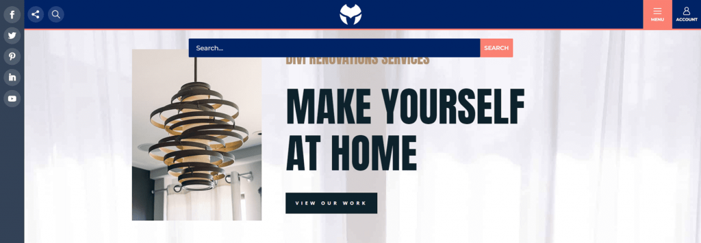
From the left, the social media icon opens a slide-in menu. The search icon displays a search box beneath the header. These are the only two menu items that will appear simultaneously.
Final Words
This concludes our analysis of Divi MadMenu for Divi. In this post, we've barely begun to scratch the surface. Both modules are simple to use and offer numerous design and layout options for Divi menus. The slide-in options are visually appealing, and the popup option makes it simple to create unique logins. To create CTAs, add up to two buttons per module. Create multiple layouts with a single Divi MadMenu Module or add more to create unique headers. The demos look fantastic and serve as a great starting point for your own designs, or you can use them as is.