
With the many style options available in Divi's Filterable Portfolio Module, users can individually alter each module element. The overlay that appears when the user hovers over the project's photos is one example of this. The overlay is easy to style, and you can use CSS to make additional changes. To assist you in creating a distinctive style for your projects, we'll walk you through how to alter the project overlay in Divi's Filterable Portfolio in this post.
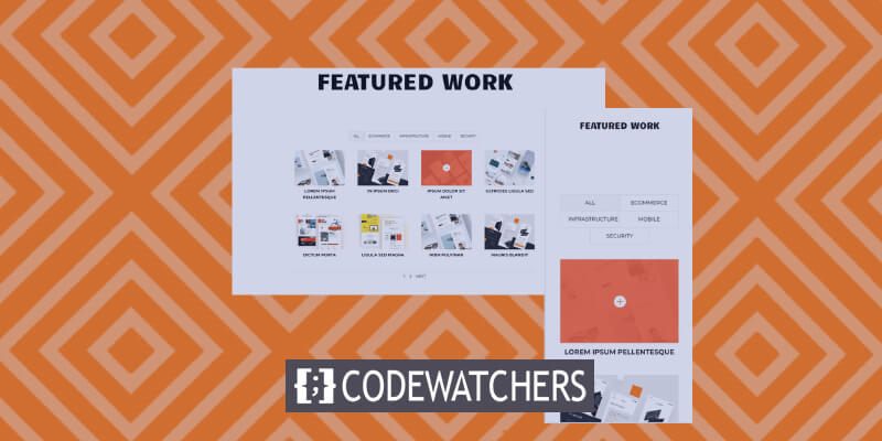
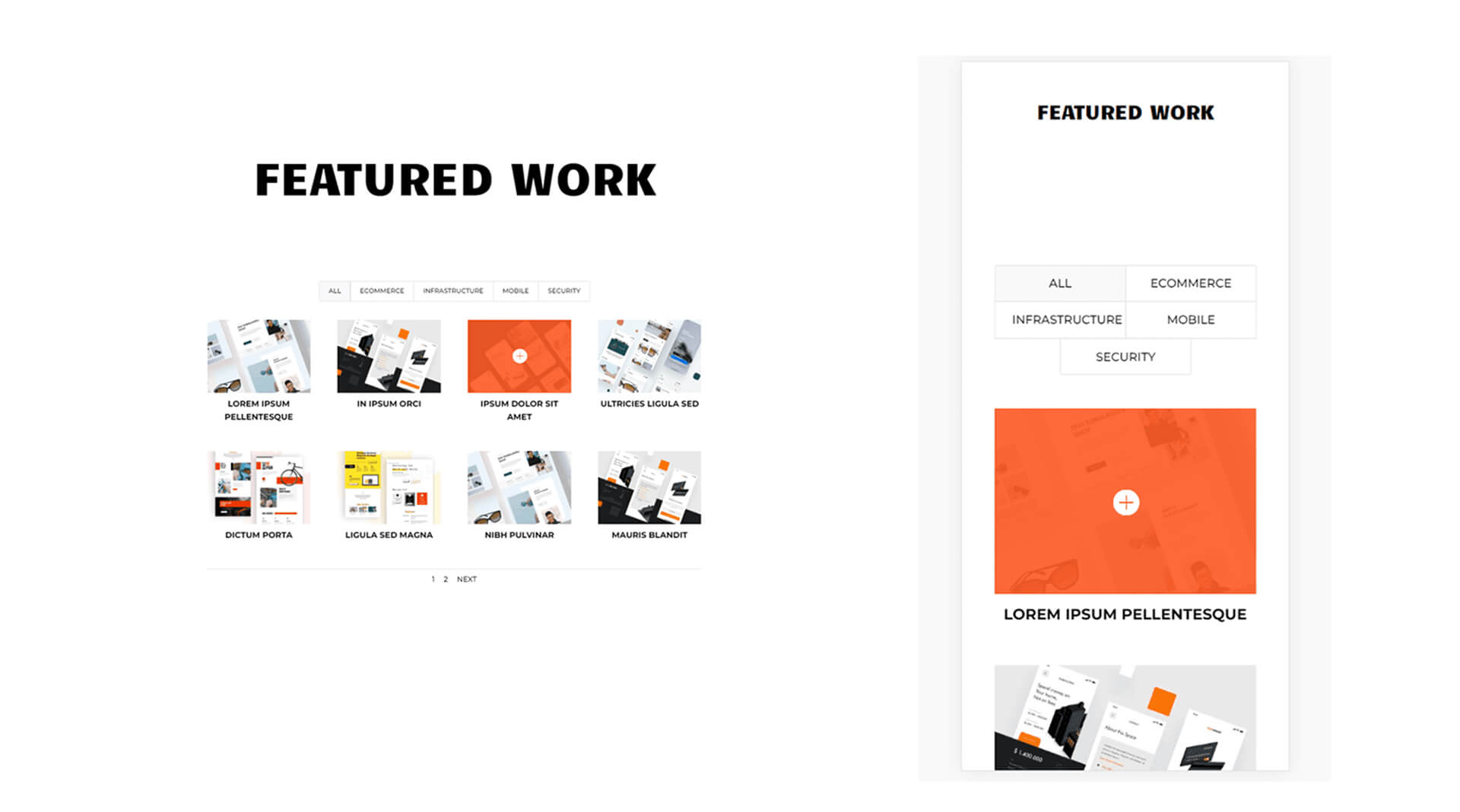
Design Preview
A sneak peek at what we will be building in this tutorial Even though phones lack a mouse to hover over, I've provided examples using them. It is a good idea to build them with phones in mind, as the overlay will be displayed when the user clicks on it.
Enable Overlays On Filterable Portfolio Module
The Filterable Portfolio Module does not come with overlays enabled by default. This is because the overlays are limited to the Grid layout. By default, the layout is set to Fullwidth. To see the overlay, we must activate the Grid layout.
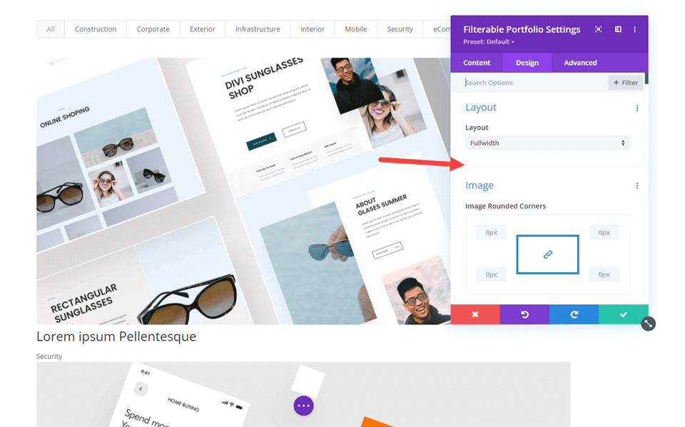
Choose Grid as the layout option to make overlays visible. Navigate to the Design tab in the Filterable Portfolio Module to accomplish this. Layout is the first option. Press the menu icon and select Grid. Next, under Overlay, you'll notice an additional set of options. These consist of the Hover Icon Picker, Zoom Icon Color, and Hover Overlay Color.
Create Amazing Websites
With the best free page builder Elementor
Start Now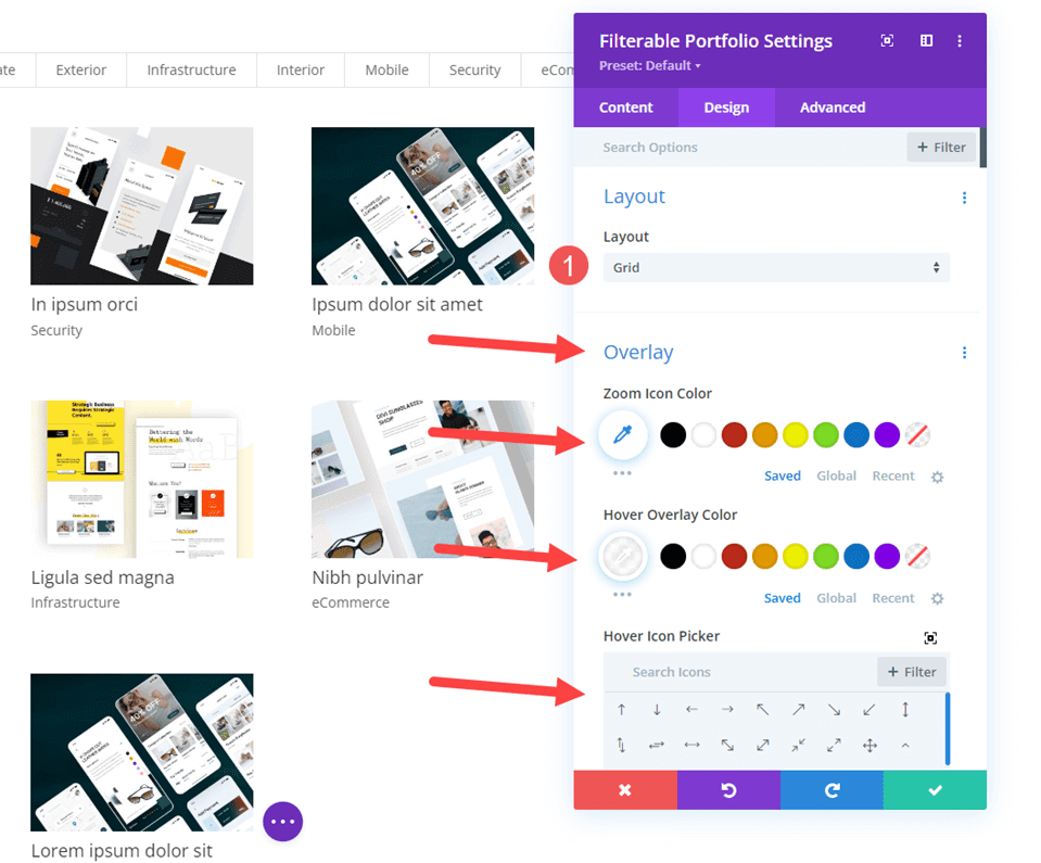
Adding Filterable Portfolio Module
First of all, we need to add a new section below the hearo section.
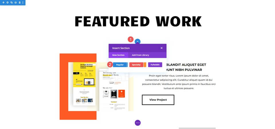
Then, we are going to add a single column row.

Now its time to add a filterable portfolio module. We can now choose the content and style the module.

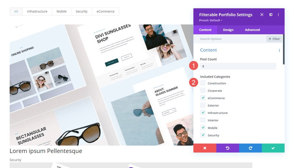
Filterable Portfolio - Content
Set the Post Count to 8 first, so that there are two rows of projects in four columns. Next, choose your categories from the list of Included Categories.
- Post Count: 8
- Included Categories: your choice
Filterable Portfolio - Element
Next, disable Show Categories by scrolling down to Elements; the remaining settings will remain as they are.
- Show Categories: No

Filterable Portfolio - Layout
Then, choose the Design tab and choose Grid for the Layout, which activates the Overlay option. For the time being, we'll keep the overlay at its default setting; in the following part, we'll construct three distinct overlays.
- Layout: Grid

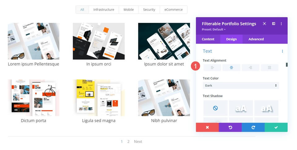
Filterable Portfolio - Text
Select Text by swiping down and aligning it center.
- Alignment: Center
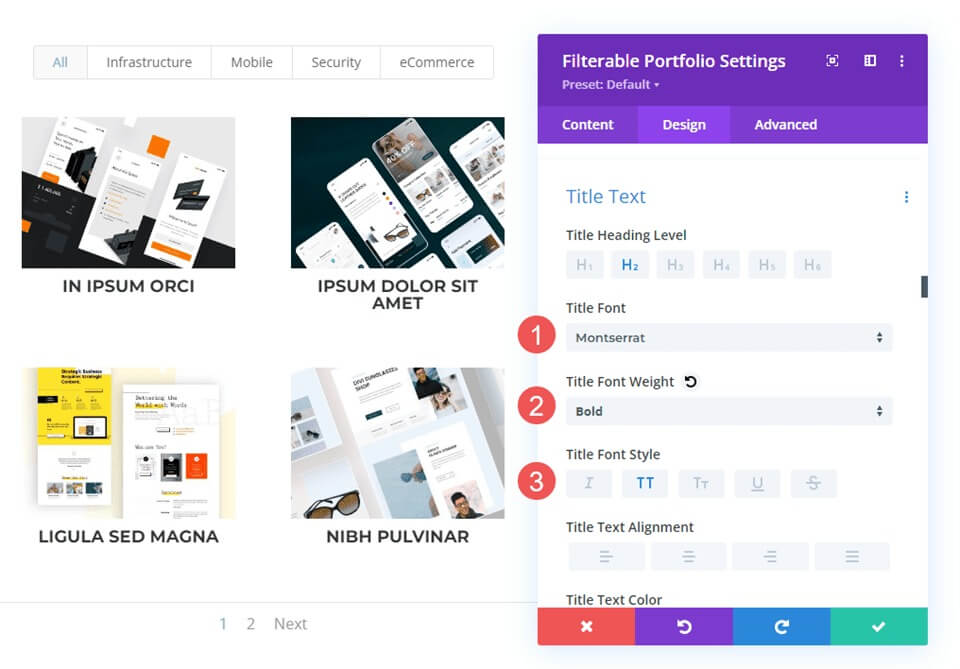
Filterable Portfolio - Title Text
Navigate to Title Text, select Montserrat as the font, Bold for Weight, and TT for Style.
- Font: Montserrat
- Weight: Bold
- Style: TT
Next, leave the Font Size at its default value, adjust the Line Height to 1.6 em, and set the Color to black.
- Color: #000000
- Line Height: 1.6em

Filterable Portfolio - Filter Criteria Text
After that, select Filter Criteria Text by scrolling down and changing the Font to Montserrat, Style to TT, Color to black, and Line Height to 1.6em.
- Font: Montserrat
- Style: TT
- Color: #000000
- Line Height: 1.6em

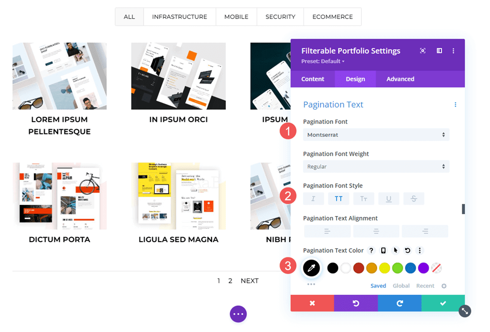
Filterable Portfolio - Pagination Text
In the end, select Montserrat as the font, set the Style to TT, and set the Color to black. Save your work, and we'll proceed to build three unique overlays.
- Font: Montserrat
- Style: TT
- Color: #000000
Custom Project Overlay Creation
For this example, we will make the overlay so black that the image hardly shines through. This one features a white icon overlaid with an orange overlay.
Select the color white for the Zoom Icon. Put rgba(254,90,37,0.9) as the Overlay Color setting. We will utilize the standard hover icon for this one. After closing the module, save your preferences.
- Icon Color: rgba(254,90,37,0.9)
- Overlay Color: #ffffff

Custom CSS
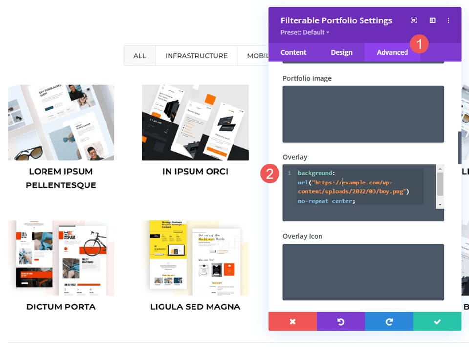
Next, we'll reposition the icon and swap out the featured image using some basic CSS. Go to Overlay and Overlay Icon by selecting the Advanced option and scrolling down.
Fill in the Overlay field with this CSS. This allows a user to hover over the featured image and see an image from your media library. The settings are center and no-repeat. Put the image you want to display in place of the URL.
Overlay CSS -
background: url("") no-repeat center;
We will then reposition the symbol. In the Overlay Icon CSS area, enter this CSS. Additionally, we'll include CSS for phones and tablets. Hover is usually not displayed on tablets or phones since the user clicks with their finger rather than using a mouse to hover. When the user clicks the image, the hover overlay does appear. Considering this, it's safer to include tablet and phone settings than not to.
The image will now display the image from our library and the icon will shift to the lower right corner.
Desktop CSS
margin:50px 86px;Tablet CSS
margin:40px 60px;Phone CSS
margin:70px 100px;
Final Words
This concludes our look at Divi's Filterable Portfolio Module's project overlay customization. The module's design can be greatly influenced by the straightforward settings. With CSS, you can further adjust the overlay and icon to match the look of your website. With only a few straightforward configurations or brief CSS lines, your project overlay may look fantastic on any Divi layout.