
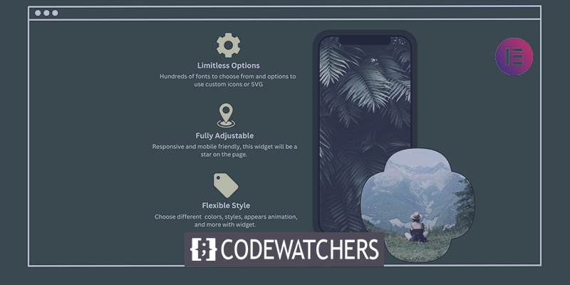
Icons and text, each in its own right, have strengths and flaws that make them a perfect pair when creating a website. An icon alone might be too ambiguous, without any context or fixed meanings. The text might look bland, and it certainly won’t attract that much attention. Put the two together, and you’ll get the best of both worlds. Often, you’ll see the pairing when listing features, services, or any other elements that need to be shown as distinct, yet a part of the group.
This pairing is so prevalent that a lot of premium themes come with a shortcode to quickly insert an icon with text as a design element. If your theme doesn’t, don’t worry. Thanks to Qi Addons for Elementor, the web’s biggest collection of free Elementor addons, you’ll be able to add all the icons with the text you need in no time. All you’ll need is Elementor and the Icon with a Text widget.
Adding Icons with Text
To use the Essential Addons for Elementor plugin to add icons with text in WordPress, you'll need to take a few simple steps. First, you need to download and activate Elementor. This is a popular page builder that you may already have installed. If not, you can download it from the WordPress repository.
Once you have Elementor installed, you can proceed to install Qi Addons for Elementor. You can do this by going to the WordPress repository and searching for it, then clicking on install and activate.
Create Amazing Websites
With the best free page builder Elementor
Start Now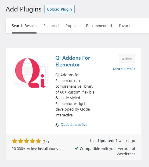
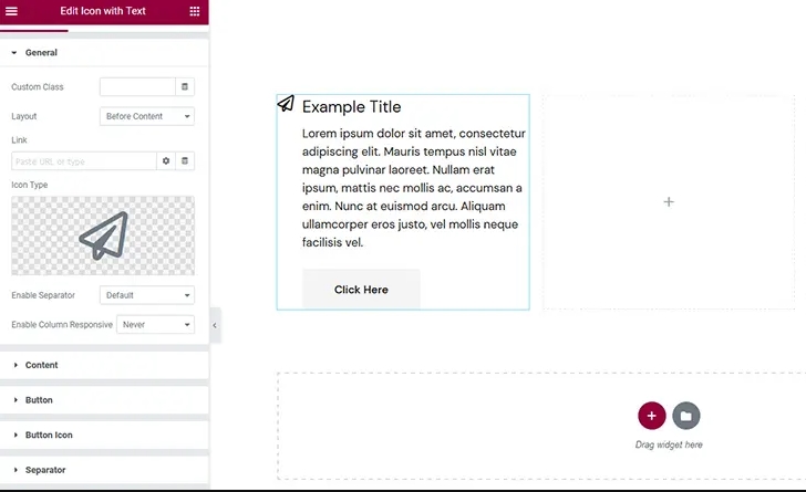
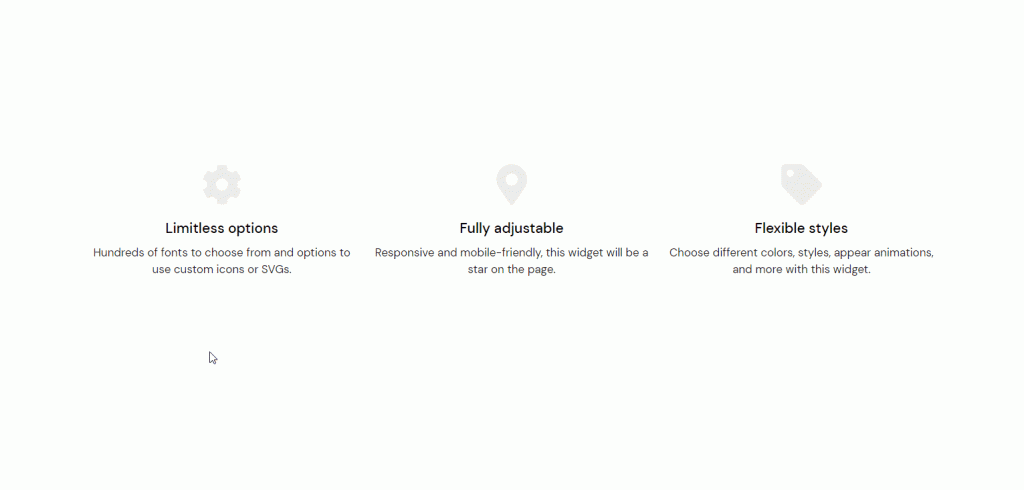
After that, the best way to get used to the widget would be to go to a page where you might want to add an icon with text and – get to it. We, on the other hand, made a section with three columns because we ended up making three icons with text. Just finding the widget and dragging it to the leftmost column did the trick. Our first icon with text was now ready to be changed.
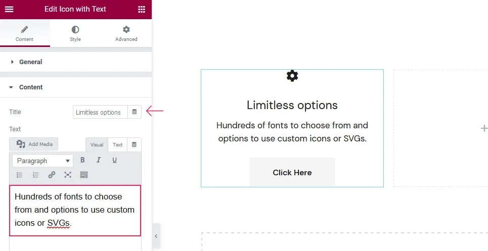
Editing the Content of the Icon with Text
There are a lot of tabs in the Content section of the plugin option, but don't worry. This just means that you'll be able to change your design in a lot of small ways. On the first tab, General, you can choose how the icon and text are laid out if you want to add a link to the icon, and a few other things.
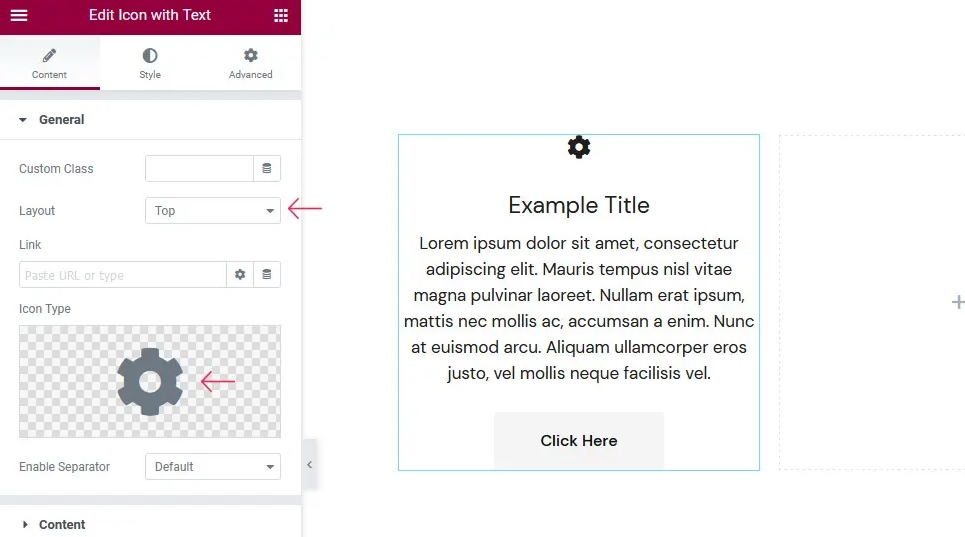
This is also where you choose the type of icon you want to use if you want to use a separator, as well as some responsiveness rules for the columns. We switched to the top layout as our first change. We changed the icon to a cog from the library of icons, and then we were ready to move on.
On the Content tab, you can change how the text looks in the column, or even get rid of it altogether. You can also change the text itself and use a few limited styling options. You'll also get to decide how the text is lined up.
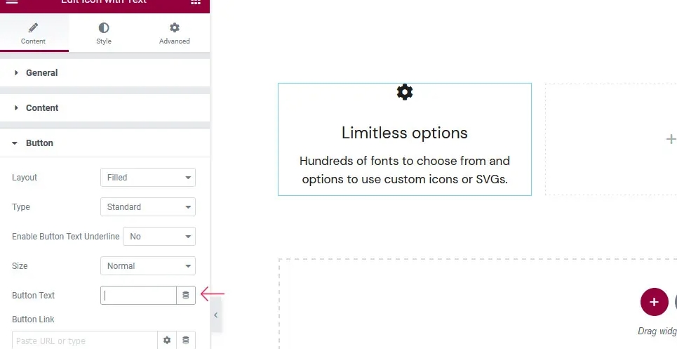
On the Button and Button Icon tabs, you can choose how your button should look, how big it should be if it should have an icon, where it should be, and which link it should lead to.
The Button Text option on the Button tab is the most interesting thing about these two tabs. If you erase the text, you can get rid of the button completely.
The last two tabs in the Content options are for the separator and the animation for when the content shows up. You can choose the layout, position, border-image, and icon for the separator. You'll also be able to choose from different animation styles and set how long each one takes.
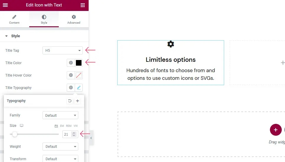
Styling the Icon with Text
When you use text to style your icon, the Style tab will be the first one that comes up. There, you'll find options that let you choose the title tag, the title's regular color, the title's hover color, and the title's font, size, and weight. You can choose the color and style of the font for the text.
We only made a few small changes to the default settings here. We changed the title tag to H5, changed the color of the title to black with the hex code #000000, and made the title 21 pixels wide.
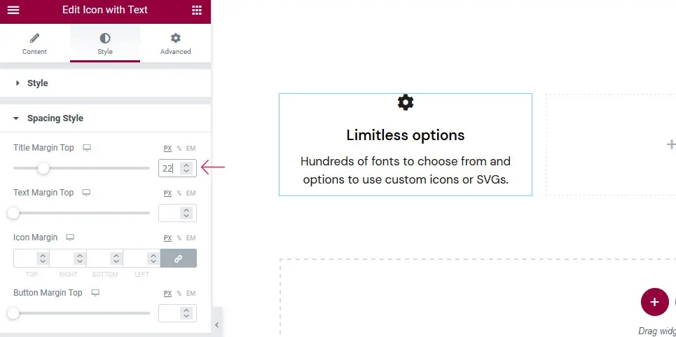
On the Spacing Style tab, setting margins is the main thing to do. You can choose the top margin for the title, the top margin for the text, the margin around the icon, and the top margin for the button if you have one.
Again, we chose to make only small changes by making the top margin of the title 22 pixels.
If you want to put your icon in a box or not, the options you see in the Icon Style tab will be very different. If you do, you can choose from a number of options for the box's shape, size, and color. If you don't, you'll only be able to change the icon's size, color, and animation when the mouse is over it.
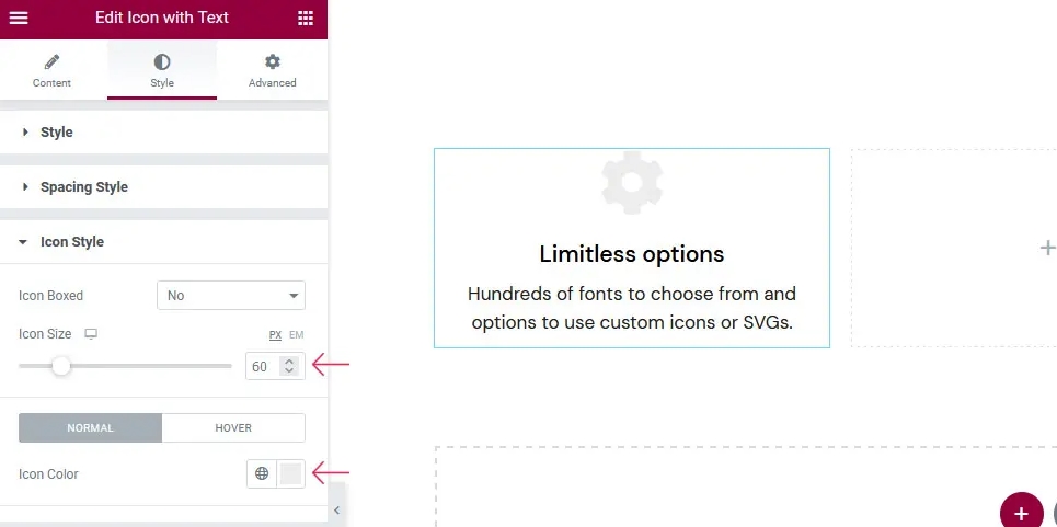
We have chosen not to put our icon in a box. But we made our icon 60 pixels wide and changed its color to #ececec. We've given it a slight up-and-down movement when it's hovering.
With the other tabs, you can change how the buttons, button icons, borders, underlines, separators, and separator icons look and how they are styled. We chose not to use any of those elements in our design, but if you go a different way, here are all the size, color, margin, and hover options you'll need to make your icon-and-text buttons and separators stand out.
Wrapping Up
With Qi Addons for Elementor, it's easy and fun to add interesting and useful designs to your website, like the icon with text. You can choose from many different options, far more than the ones we looked at in this demo. Feel free to check out all of them and find the best way to use this addon's features together.


