
Do you want to create a header that gets smaller as the page loads? As a visitor scrolls down the page, a shrinking header will be a nice effect to impress the visitor. Even if you don't plan on using this effect, it's worth thinking about whether it would be a good addition to your website.

Here, we'll teach you exactly how to utilize Elementor Pro to shrink the header of your WordPress site. With the help of some custom CSS, we'll show you exactly what you need to do to get the job done.
What is a Shrinking Header?
A shrinking header is the exact same header that you see when a website appears but it gets a little smaller when you start to scroll. To begin, there is a standard top header. The header will "shrink" as the user scrolls down the page, and you can adjust how much it shrinks and how translucent it gets.
Although it gets smaller, the header is still there when you scroll down the page. There are various options, such as fully burying the header and only revealing it when the user scrolls back up.
Create Amazing Websites
With the best free page builder Elementor
Start NowAdvantages Of a Shrinking Header
If you use a shrinking header, you'll have more room for your content itself. There is less competition for attention from the full header, which means you can focus on your main content.
If you totally hide the header as a user scrolls down, you won't be able to give users access to your whole navigation menu at all times.
To some extent, this gives you extra room for your content while still allowing you to display your complete menu. To top it all off, this effect is aesthetically pleasing and adds a little extra visual candy for your website's visitors as they explore it.
How to Create a Shrinking Header
When you have your premade header ready, you are good to go. The rest of the post will guide you to shrink it. You'll be needing a lot of custom CSS. However, we'll give you the code you need and show you how to change it to match your site.
Edit With Elementor
To get started, edit the header template with Elementor Theme Builder.
To edit your header template using Elementor, go to Templates Theme Builder in your WordPress dashboard and select Edit With Elementor.
Basic CSS Housekeeping
You'll need to clean up your header a bit before applying the CSS code you'll see in the next sections.
The first step is to access the header section's settings. Set the HTML Tag drop-down to the header on the Layout tab.
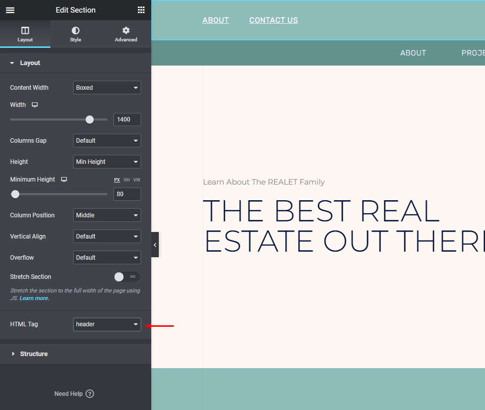
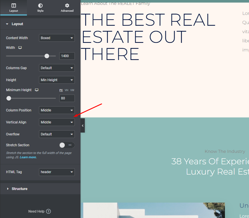
There should be no minimum height and the vertical alignment should be set to the middle in the layout tab.
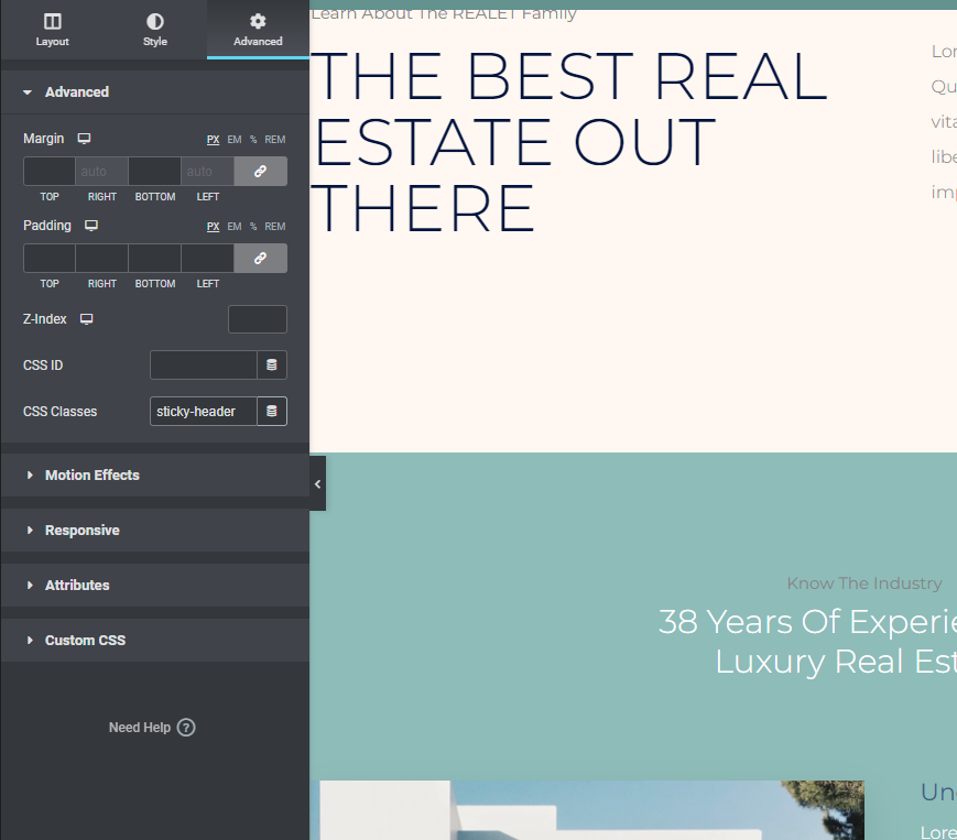
Go to the Advanced tab and change the header section's CSS Class to stick-header.
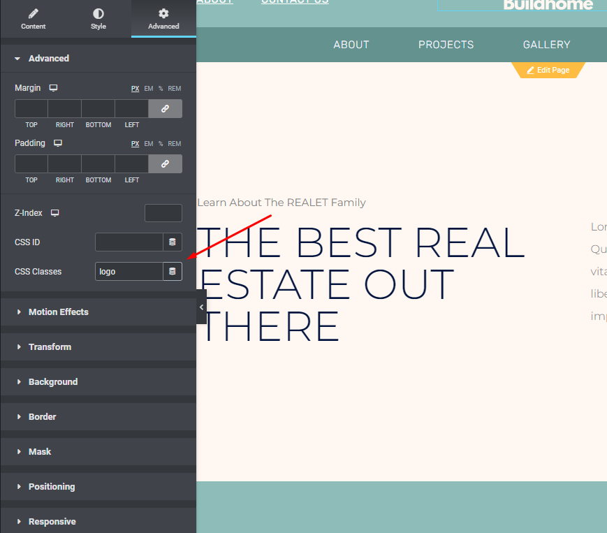
Finally, open the image widget containing your logo and select the Advanced option from the drop-down menu. Then, in the CSS Classes area of your logo picture, enter logo:
Motion Effects to Make Your Header Stick
Elementor's Motion Effects functionality may be used to keep your header at the top of the page while viewers scroll down.
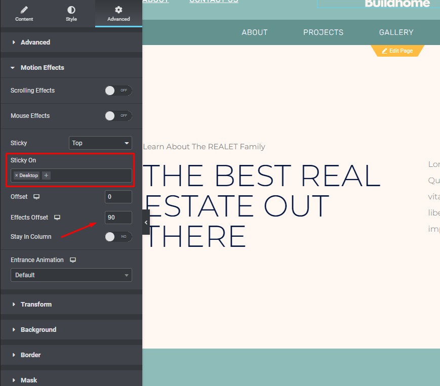
You can access the section's header settings by clicking on them. Afterward, click on the Advanced page and check out the Motion Effects options
- Assume that Top is selected under Sticky in the drop-down menu.
- Please eliminate any other devices that are not listed in the "Sticky On" box.
- The Effects Offset should be set to 90 (the height of your header).
Custom CSS
The last step before we finish is adding the custom CSS code. Here's the basic code you'll use. We'll go over how to customize it in the next sections:
The following CSS code will:
- To access the hamburger menu, go to the Elementor interface's upper-left corner and click it.
- Theme Style can be selected from the Global Style drop-down menu.
- Select Custom CSS (it will be blue instead of the "regular" Elementor red once the Theme Style interface has opened)
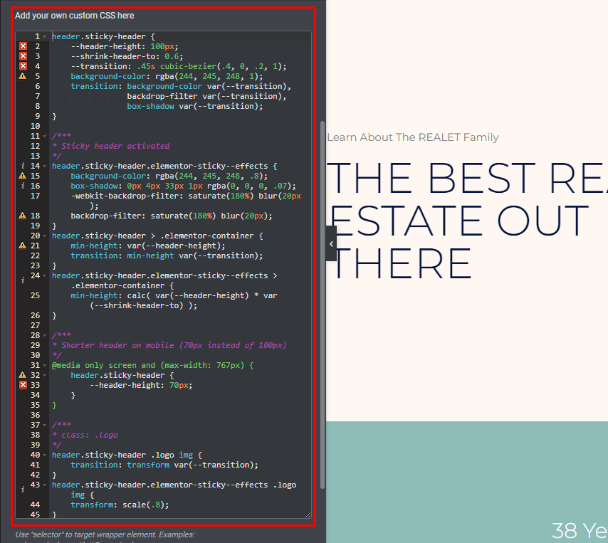
/***
* class: .sticky-header
*/
header.sticky-header {
	--header-height: 100px;
	--shrink-header-to: 0.6;
	--transition: .45s cubic-bezier(.4, 0, .2, 1);
	background-color: rgba(244, 245, 248, 1);
	transition: background-color var(--transition),
				backdrop-filter var(--transition),
				box-shadow var(--transition);
}

/***
* Sticky header activated
*/
header.sticky-header.elementor-sticky--effects {
	background-color: rgba(244, 245, 248, .8);
	box-shadow: 0px 4px 33px 1px rgba(0, 0, 0, .07);
	-webkit-backdrop-filter: saturate(180%) blur(20px);
	backdrop-filter: saturate(180%) blur(20px);
}
header.sticky-header > .elementor-container {
	min-height: var(--header-height);
	transition: min-height var(--transition);
}
header.sticky-header.elementor-sticky--effects > .elementor-container {
	min-height: calc( var(--header-height) * var(--shrink-header-to) );
}

/***
* Shorter header on mobile (70px instead of 100px)
*/
@media only screen and (max-width: 767px) {
	header.sticky-header {
		--header-height: 70px;
	}
}

/***
* class: .logo
*/
header.sticky-header .logo img {
	transition: transform var(--transition);
}
header.sticky-header.elementor-sticky--effects .logo img {
	transform: scale(.8);
}
Customize CSS
This CSS may be customized to meet your specific needs, so let's go over how to do that now. Using a code editor such as Visual Studio Code or Atom is recommended over editing CSS directly in the Elementor interface. Windows, Mac, and Linux users can all benefit from these open-source editors.
CSS Custom Properties will be our tool of choice (or CSS Variables). These controls let you fine-tune the decreasing header effect. If you make a single change to a custom property, the entire CSS code will be updated to reflect that change.
There are a total of five factors that you can adjust, in total. You don't even have to change them if you don't want to – just keep them as-is if you like the way they function!
To help you out, we've included the five CSS variables and their default values below:
- –header-height: 90px;
- –opacity: 0.90;
- –shrink-header-to: 0.80;
- –sticky-background-color: #0e41e5;
- –transition: 300ms ease-in-out;
If you look at our example code, you'll notice that we've included a few custom properties in place of the double dash "–". After the colon and before the semi-colon, all that's left to do is make a small edit.
Changing the header height to 100px, for example, would appear like this before and after:
- Before: –header-height: 90px;
- After: –header-height: 100px;
Let's get introduced with these variables.
Sticky Background Color (--sticky-background-color)
The backdrop color of the "shrunken" header, which displays when visitors scroll down, is controlled by the Sticky Background Color property. Changing the color doesn't have to match the color of your header if that's not what you prefer.
In the Digital Agency template, for example, the header background has a gradient at first. The header's color turns to a solid blue as visitors scroll down and the header gets smaller (you can see this in the example video from the beginning).
Header Height (--header-height)
In Elementor, the Header Height attribute determines the height of your header - it must match the height of your header section. Setting this to 90px was a nice beginning point in the instruction.
However, if you do decide to alter the height, be sure to do it in the CSS property as well as in the header section settings.
To avoid issues with the shrinking effect, we don't advocate header heights greater than 100px.
Opacity (--opacity)
The degree to which your decreasing header is translucent is controlled by the Opacity property:
- 0 means that the header will be invisible.
- 1 means there will be no visible header at all (no transparency)
Opacity is set to 0.9 in our example code, making it almost entirely opaque. This number can be changed to suit your requirements. Reduce the value to zero to make it more obvious.
Shrink Header To (--shrink-header-to)
When a visitor begins scrolling down, the Shrink Me attribute determines how much your header and logo will shrink. This means that your header and logo will decrease to 80% of their initial size, for example.
Transition (--transition)
If the Transition attribute is set to "shrunk," the header will shrink from its original size to that value.
It's best to leave something as-is, but you have the option to change it if necessary.
So the updated CSS for the shrinking header will be -
header.sticky-header {
	--header-height: 100px; /* Set your own header height */
	--shrink-header-to: 0.6; /* Shrinks to 60%, values: 0.1 to 1 */
	--transition-timing: .45s cubic-bezier(.4, 0, .2, 1); /* values: .1s to 0.5s (or more), replace "cubic-bezier(.4, 0, .2, 1)" with "ease" if you need a simpler transition */
	background-color: rgba(244, 245, 248, 1); /* Set your own background color */

	transition: background-color var(--transition-timing),
				backdrop-filter var(--transition-timing),
				box-shadow var(--transition-timing);
}
header.sticky-header.elementor-sticky--effects {
	background-color: rgba(244, 245, 248, .8); /* Set your own background color on scroll */
	box-shadow: 0px 4px 33px 1px rgba(0, 0, 0, .07); /* Delete this line if you don't want shadow on scroll */
	-webkit-backdrop-filter: saturate(180%) blur(20px); /* Delete this line if you don't use transparency on scroll */
	backdrop-filter: saturate(180%) blur(20px); /* Delete this line if you don't use transparency on scroll */
}
header.sticky-header > .elementor-container {
	min-height: var(--header-height);
	transition: min-height var(--transition-timing);
}
header.sticky-header.elementor-sticky--effects > .elementor-container {
	min-height: calc( var(--header-height) * var(--shrink-header-to) );
}

/***
* class: .logo
* Add the class "logo" to your logo to scale your logo to 80% on scroll
*/
header.sticky-header .logo img,
header.sticky-header .logo.elementor-widget-theme-site-logo img,
header.sticky-header .logo .elementor-icon svg {
	transition: transform var(--transition-timing);
}
header.sticky-header.elementor-sticky--effects .logo img,
header.sticky-header.elementor-sticky--effects .logo.elementor-widget-theme-site-logo img,
header.sticky-header.elementor-sticky--effects .logo .elementor-icon svg {
	transform: scale(.80); /* Shrinks logo to 80%, values: 0.10 to 1 */
}
header.sticky-header .logo .elementor-icon svg {
	width: auto;
}
Ending Thoughts
It's very easy to work with Elementor since it has become one of the most wanted page builders for tons of web devs around the world. Having such an interactive design will bring more visitors to your site. If you have any questions, feel free to ask. We have a vast number of Elementor tutorials on our site, go check them and let us know what should we cover next.