
Having high-quality content on your website is crucial, but equally significant is how visitors engage with the site. The user experience is directly influenced by various factors, one of which is navigation. Ensuring that individuals can easily locate the desired page is paramount. Therefore, it's rare to encounter a website with more than a few pages that lacks some form of menu. However, the adequacy and usability of this menu are essential considerations.

Your objective should center around achieving straightforward and intuitive navigation. Regardless of the page visitors land on, they should be able to navigate with just a few clicks. If they encounter difficulty in finding what they seek, frustration may lead them to exit the site.
How To Improve Your Website Navigation
Make Your Logo Stand Out
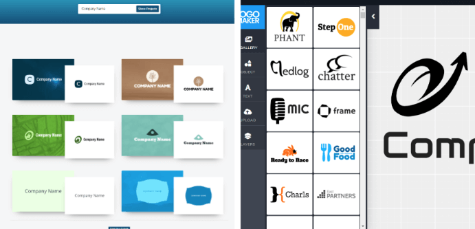
If your logo blends in with your menu, it might go unnoticed, particularly if it's not in the usual top left position. Ensure your logo stands out by keeping it separate from menu items. This enhances visibility, boosts brand exposure, and simplifies site navigation by clearly delineating elements in the header. It also facilitates locating and clicking on the logo when necessary.
Link Logo To Homepage
Many individuals have developed the habit of clicking on a website's logo to navigate to the homepage, as this design is prevalent across numerous sites. It serves as the most straightforward and instinctive method for visitors to reset their browsing, regardless of their current page. In cases where websites contain a plethora of pages, individuals may easily become disoriented and seek to return to the homepage for orientation, particularly when accessing the site via a mobile device where navigation can be more challenging.
Create Amazing Websites
With the best free page builder Elementor
Start Now
Additionally, incorporating a link to the homepage in the logo is advantageous for users who arrive at a website through search engine results and land on an inner page. Clicking on the logo provides them with a convenient route back to the homepage if they wish to delve deeper into the site's content.
Responsive Menu
Ensuring your menu is visually appealing across all devices is crucial. Given that roughly half of the global web traffic originates from mobile devices, investing extra time or resources into hiring a skilled web designer or purchasing plugins to optimize navigation for mobile users is highly recommended.
Consider implementing a hamburger menu even on the desktop version of your website if it suits the design and functionality. While typically associated with tablet and smartphone interfaces, using this style of menu across all resolutions can sometimes enhance the overall layout consistency. This approach minimizes layout adjustments when visitors switch between desktop and mobile browsing.
Remember, your entire website needs to be mobile-friendly. If your current setup falls short in this aspect, refer to our article for guidance on improving mobile compatibility.
Fix Broken Links
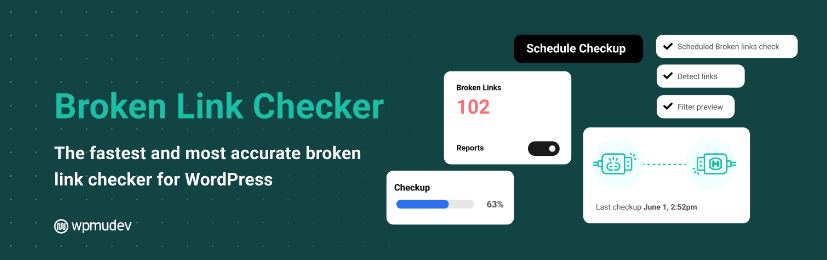
Web pages deteriorate over time, leading to potential errors. It's estimated that a web page typically lasts around 100 days before issues arise. Consequently, links may break as pages age, whether they're on your own site or linked from elsewhere. The presence of 404 error pages frustrates visitors, often prompting them to leave.
It's crucial to address broken links, particularly for large websites where numerous pages and links make manual checks impractical. WordPress offers various plugins to detect broken links across pages, posts, comments, and directories. Among these, Broken Link Checker stands out as one of the most effective solutions.
Use Breadcrumbs
Breadcrumbs serve as invaluable aids for website visitors navigating through multiple pages, particularly on content-rich sites. However, their utility extends beyond mere retracing of steps; they also serve as location indicators.
Whether your website boasts an extensive array of pages or just a handful, breadcrumbs guide visitors in understanding their journey and facilitate returning to previous pages effortlessly.
This functionality proves especially beneficial for sprawling websites where tracking the path to the current page might involve traversing through several links.
For WordPress users, incorporating breadcrumbs into their site is easily achievable through various methods. One approach is utilizing plugins like All in One SEO, which offers a user-friendly breadcrumbs feature.
Alternatively, employing shortcodes provides a convenient means to integrate breadcrumb functionality into a WordPress site without the need for extensive coding or theme file modifications.
To implement breadcrumbs using a shortcode on your WordPress site, adhere to the following steps:
To set up a shortcode for breadcrumbs in WordPress, you can either:
Access your WordPress dashboard, navigate to "Appearance," and select "Editor." Then, open the functions.php file.
Alternatively, you can use FTP to access your WordPress installation. Navigate to the theme directory (/wp-content/themes/your-theme-name/) and locate the functions.php file.
Once you have the functions.php file open, add the provided code to create the desired shortcode for breadcrumbs.
// Breadcrumbs shortcode
function custom_breadcrumbs_shortcode() {
    ob_start();
    // Your breadcrumb code here
    return ob_get_clean();
}
add_shortcode('breadcrumbs', 'custom_breadcrumbs_shortcode');
Replace the placeholder comment "Your breadcrumb code here" with the appropriate code that produces the breadcrumb navigation for your website. This code can be custom-made or sourced from a breadcrumb plugin that supports shortcode functionality. Ensure that the code generates the HTML structure for breadcrumbs.
After making the necessary changes, save the modifications to the functions.php file.
You can now utilize the [breadcrumbs] shortcode within your posts, pages, or widgets to showcase the breadcrumb navigation. Simply insert [breadcrumbs] at the desired location where you want the breadcrumbs to be displayed.
Remember to update or publish your posts or pages to witness the breadcrumb navigation in action.
Short Menu Items
The navigation must be user-friendly, enabling people to quickly locate what they need. Therefore, it's crucial to employ concise names. The menu shouldn't be cluttered with lengthy page titles or detailed descriptions of products/services.

Even a few extended names can render the entire menu unreadable, especially on mobile devices. Opting for succinct terms like "Contact" instead of verbose phrases such as "Get in touch with us" is preferable. Lengthy names can frustrate visitors who struggle to find their desired option, leading them to abandon your site for a competitor's. Menu item names must remain relevant and easy for users to understand.
Use Drop-Down Menu
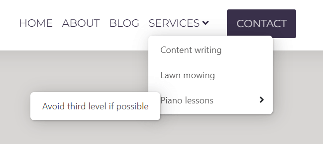
Consider prioritizing items for the menu; while some may be desired, they might not warrant a first-level placement. This is where drop-down menus prove beneficial. By incorporating one or a few drop-down menus, the site maintains a tidy and structured appearance while offering visitors a broader selection. However, exercise restraint in their use – typically, a couple of drop-down menus suffice. Aim to employ only second-level menus, as third-level menus can impede navigation, particularly in mobile view.
Sticky Menu
If your website boasts extensive content and requires users to scroll down multiple times on certain pages, it may be advantageous to implement a sticky menu. This feature enables visitors to swiftly navigate to any section of the site without the need to scroll back up. By incorporating a sticky menu, users can seamlessly browse through pages, reducing the time spent navigating up and down. Additionally, the persistent visibility of menu items encourages exploration of other pages, potentially increasing engagement and, in the case of an online store, fostering a higher likelihood of completing a purchase with prolonged site interaction.
Add “Back to top” Button
While seemingly insignificant, it's surprising how few websites feature a "Back to top" button. Nowadays, many websites are packed with information on their homepages, and those that utilize continuous loading may consist of just a single page. In such scenarios, a "Back to top" button becomes invaluable. Although it may seem like a minor addition, its presence can significantly enhance the overall user experience of your website.
Use a Fat Footer
This term refers to a footer containing numerous links, serving as secondary navigation. Occasionally, there are pages you wish to link but prefer the main menu to feature only crucial links, avoiding the use of second or third-level menus. Website owners often overlook their footer, yet it offers ample space for additional quick-access links. Anything added there is just a click away and displayed in a non-intrusive manner, not disrupting browsing.
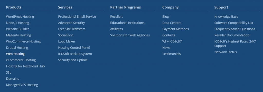
Aside from typical pages like Contact, About, and Terms, you can include links to any noteworthy products or services found on the inner pages. Examples include an order status checker, sponsorship information, or service documentation—content not suitable for the main menu but vital for quick discovery.
Visiting Page Highlighting
When a visitor lands on a page, you have the option to emphasize the menu item through underlining, highlighting, or making it bold. For pages not directly linked in the menu, it's helpful to indicate the corresponding menu section. This ensures visitors remain oriented, especially in the case of numerous pages, by always knowing their current page or section.
Add a Search Bar
This feature proves invaluable for expansive websites teeming with content. Whether it's integrating a compact search bar adjacent to the main menu or a dedicated search button alongside menu items, users can effortlessly navigate through the site. Functioning as an integral component of site navigation, the search option aids users in locating desired information swiftly. Depending on preferences, search results can display either direct links to specific pages or comprehensive paragraphs from page content. By streamlining the search process, this feature enhances user efficiency and satisfaction
How To Test Website Navigation
The appearance of the site navigation might seem flawless to you, but it may not be as optimal for others. Despite adhering to the aforementioned suggestions, there could still exist unnoticed issues. Therefore, it's crucial to promptly identify and address any potential concerns. Here are several approaches to accomplish this:
Use analytics software
By utilizing an analytics tool like Matomo, you can produce a heatmap for your website. This heatmap visually showcases the areas of your website that are most and least frequented.

Additionally, Matomo can generate a Click map, pinpointing exact locations on your website where users click. If you observe frequent clicks on certain menu links and minimal activity on others, it may be beneficial to consider making adjustments. Through the heatmap, you can also gauge whether users scroll down to the footer. If they do, it indicates the importance of investing additional effort into creating a comprehensive footer.
Use A/B testing
Essentially, A/B testing involves experimenting with various versions of an element to determine which performs better. For instance, you might test different menu item names, styles, or the number of items in menus. By analyzing the engagement metrics for each version, you can determine the optimal choice.
Preview Website On Different Devices
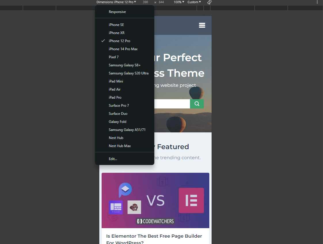
The layout of navigation elements might appear satisfactory on your computer, but what about other devices? Access the Developer tools in your preferred browser (usually by pressing the F12 key on your keyboard or Control + Shift + M) to switch between desktop and mobile views. You can effortlessly choose various devices – such as phones, tablets, laptops, or even TVs – and observe how the site's navigation will appear on each of them.
Wrapping Up
When addressing navigation, many website owners tend to merely include a handful of items in a menu and believe their task is complete. However, in actuality, there exist numerous subtle enhancements that can significantly improve the user-friendliness of your website. Implementing these can give you an edge over competitors. While navigation isn't the sole determinant of website traffic, users will undoubtedly value the ability to effortlessly browse your site and locate what they require, irrespective of their device. Providing a good user experience heightens the likelihood of users returning to your site in the future.